

Why Responsive Web Design Must Be Customer-Centric


Ever wondered when you are at a grocery store the milk always seems to be at the back of the store, when that’s all you really need?
Many have stated that this is to lure customers further into the store and entice them with other promotions and products, to increase that basket value. However, why this sounds plausible, it’s not the number one reason, convenience is.
Keeping that milk cool and ensuring it does not spoil is a top priority, and when you take into account that milk is delivered in refrigerated trucks to loading bays at you’ve guessed it, the rear of a store, then you can start to see the logic.
How is this relevant to customer-centric website design? Well, ultimately, it’s all about meeting the demands and expectations of the customer, you want a website that is easy to navigate while ensuring that you maximize opportunities to increase that average order value or conversions, sound familiar?
Read on, as below are some top tips to ensure your website is customer-centric.
It’s Not About You
For marketers like myself that want to make things look ‘pretty’ with yet another re-design, this is a tough, yet important takeaway. The aesthetic appeal of your website is not down to what you think looks great, it’s down to what your customers demand and expect.

To ensure that your website is customer-centric, it’s pivotal that you first understand your audience. A lack of or a poor understanding of your target audience will only likely adversely impact your conversion rate.
Put this into action
Make data-driven decisions, for instance, use Google Analytics to understand your audience, and behaviors. Pay attention to other key metrics such as conversion rate, and if in e-commerce, your AOV (Average Order Value) by product or landing page.
If you would like to make changes to your website, then remember, it’s always a good idea to run split tests before committing to wholesale website changes. By running an A/B test you can see if your customers concur with your changes, by measuring the impact on conversions.
Ease of Use
As a key touchpoint for customers, your company website should provide all of the information that your customers and prospects alike seek. Not only that, for your customer to be truly customer-centric your website should be clearly organized and categorized.
A website which is difficult to navigate will likely adversely impact your bounce rate, and of course again your conversion rate. After all, if you are unable to find the information you require, then why hang around?

Image courtesy of https://imgflip.com/
Put this into action
There is an array of ‘website graders’ out there, which will help you to understand how your website is performing in terms of UX, and CRO (Conversion Rate Optimization), in fact here are 7 tools you may want to try.
While these tools can be useful, remember, you’ll have data in the form of web analytical tools such as Google Analytics at your disposal, where metrics such as average time on page, bounce, and exit rates should help to paint a bigger picture for you.
Bonus tip: if you have goals defined within Google Analytics, then review ‘Goal Flow’ and ‘Funnel Visualization’ under ‘Goals’ to gain further valuable insights, such as where your prospects drop off during the checkout or conversion process.
Speed
To provide the best user experience you want your customers and prospects alike to be able to access the information they require quickly. You could offer a fantastic user experience, where website resources are easy to find, however, if your website is taking too long to load, then it’s likely that a large proportion of visitors will simply impatiently give up.
While it goes without saying that a fast website offers added convenience, speed is also a key ranking factor in realms of SEO. Furthermore, in July 2018, Google confirmed that they will be using mobile page speed as a ranking factor too.
Put this into action
Use Google’s PageSpeed Insights. This intuitive tool will score your website based on it’s page load time, and provide you with invaluable insights on how to speed up.
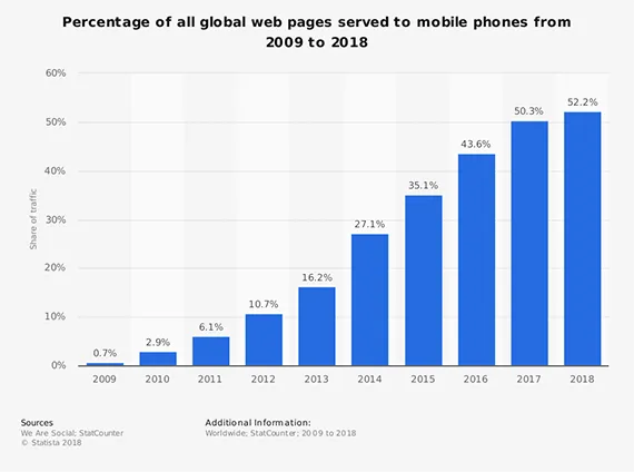
Responsive Design
It almost goes without saying that any website today must include a responsive design to ensure it is fully accessible for mobile and tablet visitors. With various touch-points across multiple devices, it would be naive not to cater to your customers’ needs across all devices, and potentially miss out on conversions.
Put this into action
If your current website is not responsive then you will want to address this right away. You could enlist the help of a website designer, or a web design agency.
Alternatively, you may want to consider doing this yourself using a Content Management System (CMS) such as WordPress with Divi, which will enable you to create great looking responsive websites using a visual builder without all the technical know-how.