

Responsive web development: What designing tools & techniques you should know
Due to the excessive use of the smartphones, the field of websites is witnessing a sudden change. Since the last decade, responsive website designing has been the center of attraction as most of the entrepreneurs are inclining towards creating it. Responsive web designing allows a website to be displayed on any smaller device apart than the computer and enables the users to access the features of the website for a smoother interaction.

Due to the excessive use of the smartphones, the field of websites is witnessing a sudden change. Since the last decade, responsive website designing has been the center of attraction as most of the entrepreneurs are inclining towards creating it. Responsive web designing allows a website to be displayed on any smaller device apart than the computer and enables the users to access the features of the website for a smoother interaction.
Making your site responsive is an inevitable part of website development. Designing a responsive website ensures your website to be promoted on the smartphones in an easily accessible way. But if you are a novice and are confused where to start with, here are some important tools & techniques revealed for helping you to create a fabulous responsive website.
Grid-Based Layout
One of the easiest ways adopted by the designers for creating a normal website into a responsive one is placing it in a grid format. With the help of the grids, switching a website from portrait to landscape has become flexible. The texts, images and other contents are automatically adjustable in the grid based design. Designs that support CSS frameworks like the BOOTSTRAP and adopt some best custom grid generators like Gridset, Gridpak, Gridulator, YUI Grid Builder, Adobe Edge Reflow etc. These generators go great with various CMS like the WordPress, Drupal & Joomla and with the graphics applications such as the Fireworks & the Photoshop.
Wireframing For Responsiveness
Wireframing has a smart role to do in the UI design. It’s rather the user than the design itself. Laying out the content and the functionality on a page on the basis of the user requirements and demands. In the field of website development, it sketches out the basic structure of the page before adding the content, giving the user an earlier visual for a review. Wirefy, Axure, UXPin, Rubber Cheese, Fluid UI, Visio, Pidoco are some software with the help of you can wireframe on the web.
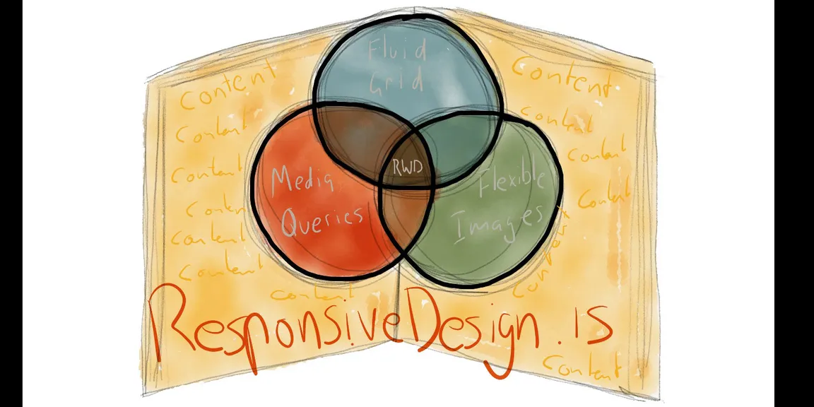
CSS3 Media Queries & Frameworks
CSS3 Media Queries allows the content to be adapted to different screen resolutions. It enables the content layout to adapt the width of the browser. Well, with simple CSS, the fluid grids help to create some awesome photoshop style layouts that can be custom according to your choice. BOOTSTRAP is the framework that facilitates the prototyping. It has a huge collection of the custom designs from where you can pick up the responsive elements by downloading a complete version with minified CSS, Jquery plugins, thus creating it quick and simple.
