Top 11 Animation Tips to Make a Difference to Mobile User Experience
The quality of animation can make or mar the Mobile User Experience. Hence, it's important for mobile app creators to pay attention to it.

WYSIWYG or what-you-see-is-what-you-get, the term is not just limited to technology enthusiasts. It has found resonance in the consumer segment as well. Mobile app creators need to incorporate this theme into their UX (User Experience) leveraging the right animation strategy, if they want their clients to benefit from and, ultimately, the end-users to stay connected with the app. In other words, the concept helps in humanizing technology, making it more interactive and trustworthy which, ultimately fuel intended business endeavors like driving productivity, customer acquisition, customer satisfaction and ROI.
Thus, UX designers have a significant role to play. On the one hand, they have to provide the fundamental framework to mobile app developers to show their craftsmanship and, on the other, they need to have a playground created where users can take the shot they want.
Image Credit: UX Booth
1. Spontaneous Visual Feedback
Remember, Mimosa pudica or the touch me not plant. When its leaves are shaken or touched even slightly, they fold inward or droop. In fact, it’s that very characteristic that has got it the name.

Image Credit: Science ABC
Likewise, the in-app animation should respond to the user’s actions in a way that’s intriguing. Imagine, you pressed or hit an in-app button, but it showed no reflection of what you did. If you were new to the app, you might have concluded that the app was not responding, though it was.
On the contrary, on watching a button that compresses or decompresses or undergoes a change in color affirms that the app is responding well to your action. In other words, the visual feedback gives a sense that the app, its content, and services are well under the user’s control.
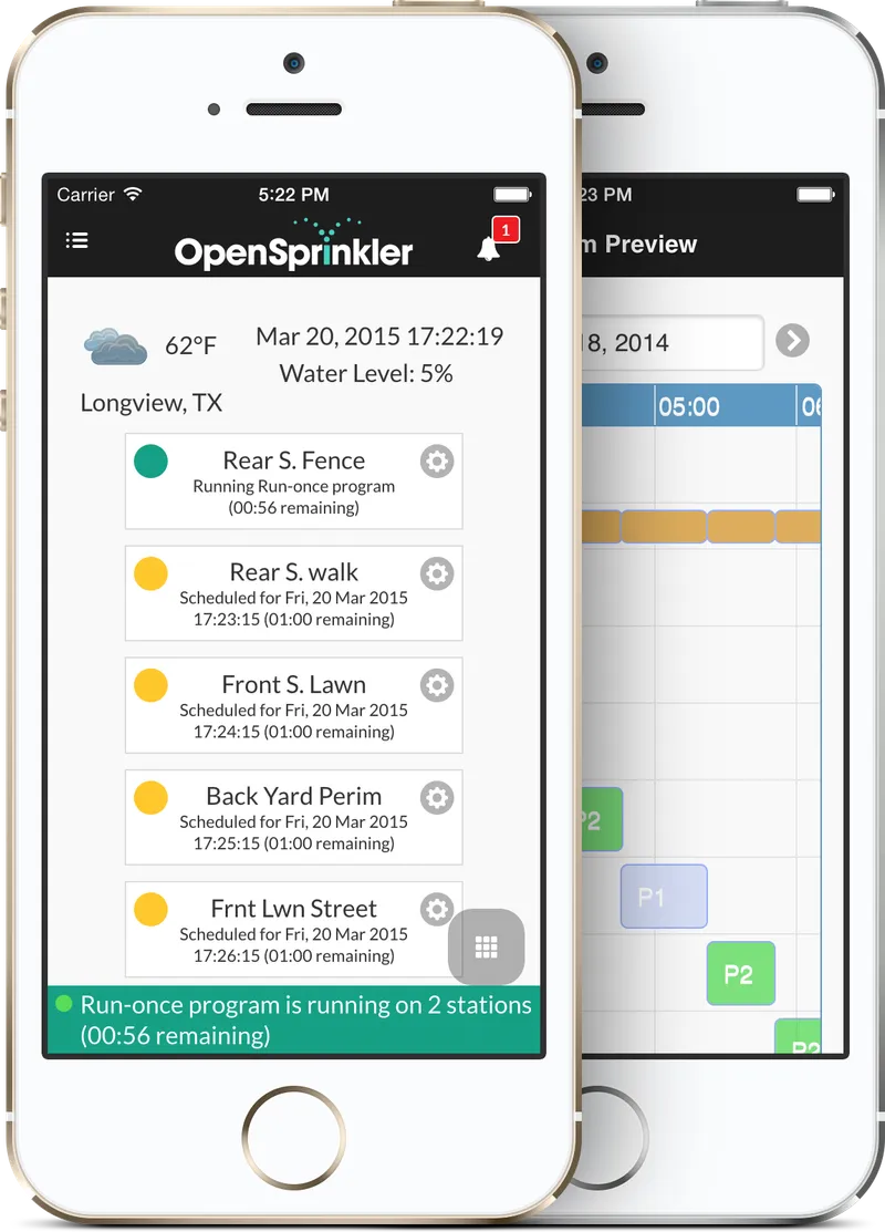
Image Credit: Samer Albahra
2. Animation-Based Navigation
The traditional menu-based navigation system is gradually giving ways to animation-based navigation structure. Different sections of an app can be assigned with different animation patterns or types to drive user engagement. However, the animation should correlate seamlessly with the navigation of users and let them find the information or services they are looking for in a quick and easy manner. It should serve as a content facilitator or assistant not that of a barrier.
3. Displaying Transition
The animation should depict well the transformation of in-app elements like buttons, menu bars, photos and pictures to drive user engagement. For instance, the immersive experience with Peek and Pop feature of iOS (that allows users to drill down into the app content with 3D Touch) would go away in absence of transition. Likewise, selection and de-selection of menu bar, photos, etc. should be complemented well with the transition mechanism.
4. Delivering Consistency
We love consistency in everything that we do in life and that reflects in our attitude and behavior when we use apps. Yes, app users expect a high degree of consistency in their app. Hence, usage of familiar yet platform-standard icons and their terminologies and standard text styles is preferred. Moreover, the UX designers must keep in mind the target device resolution.
5. Stick to Physical Laws
The animation doesn’t mean fantasy, rather it should be realistic. For example, if a user swipes his or her finger on the screen in some direction then he or she means to explore items in that particular direction only. Likewise, if he or she presses a Submit or Play button, then 3D touch or any other similar feature must respond to him or her accordingly. Designers need to keep them grounded to the physical laws while creating an animation to that effect. This increases understanding and enjoyment for the users and, therefore, keep him or her glued to the app.
6. Maintaining Aesthetic Integrity
Honesty is the best policy. This principle of life is relevant in-app animation too. An animation that fails to relate to the objectives or theme of the app is of little use. However, remember, aesthetic has different connotations in different contexts. For example, a subtle and unobtrusive animation is desired for a manufacturing app like HaasConnect that enables engineers to track the progress or status of the machine, but the same concept will be senseless for a gaming app that promises fun. Here the animation should encourage them to discover and take an adventurous course while playing the game.
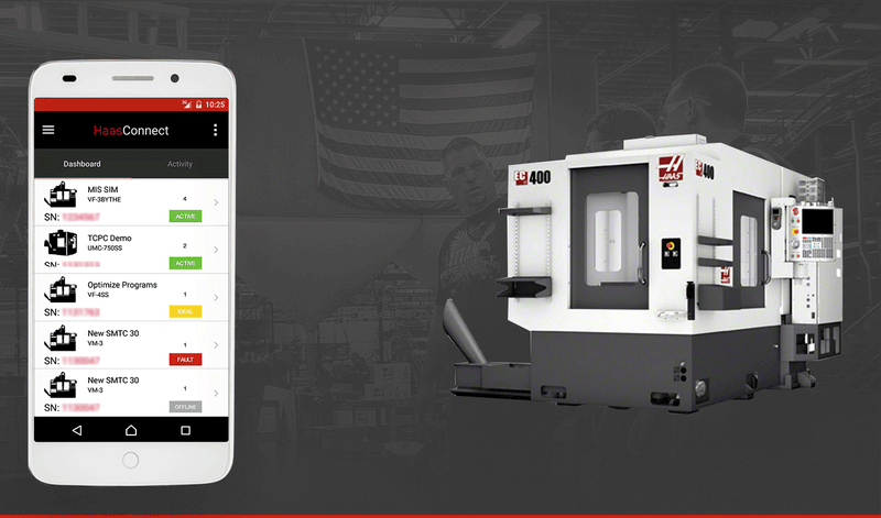
Image Credit: Root Info Solutions at Behance
7. Revealing App Status
Whether it’s getting logged in or logged out of the app, uploading documents or photos, sending messages, playing back audio, or doing anything else, users want to be in the know as for how the processes in the app are proceeding. The animation of your app must demonstrate everything well.
8. Structuring Information
Hierarchical Integration of app sections with UI is required, however, how the associated UI elements of each section will interact mutually is another key aspect that animation must depict.
9. Giving a Hint
Using fluid animation to differentiate between active and inactive in-app elements like icons, tabs or menus is a good idea to keep users engaged and let them understand that their action is getting materialized and the app is going to deliver what they intend. Eliminating ambiguity from the user’s mind, it keeps them connected with the business.
10. Including In-app Guide
Incorporating animated user-manual is a good idea to educate users about the functioning of the app. Make sure that the animation complements the instructions, keeping the texts legible and, is appealing to the target audience. For a beginner, the manual can be offered along with the flash page of the app. However, there is no harm in keeping it accessible to your existing users anytime through the menus button.
11. Fostering Custom Animation
Stick to a pro-user custom animation to make your app stand out in the market and have an unforgettable impression on your target audience. While you do so, make sure that graphics and in-app elemental transitions stay in control of users. A custom-designed app, earns you an identity besides driving user-engagement and conversion.
Key Takeaways
Above all, we can conclude that animation should simplify the UX or the interaction, keep users in the control, engaged, and at times like assistant provide them the due support, thereby, enabling them to derive the warranted performance from their app. Relying on a reasonable animation is as much important as emphasizing on a captivating one. Achieving a subtle balance between the two, app owners or their creators can keep themselves relevant.
Must Read: 17 Things Users Expect an App to Do
Hope you found the information useful. Share your inputs that can make app UI and UX better and more engaging. Also, feel free to register your dissent, if any.