Product Psychology 101: Don't make users think too much while using your website or app

One of the major factors that contribute to a great user experience is ease of use. It comes from making the interface simple enough that the users get into a flow while using your product.
While you may think that creating simple and easy interfaces to ensure great user experience is very obvious, it turns out that people somehow tend to forget this very basic fact.
A lot of websites and apps try to put a lot of information and calls to action on a single screen. Or, sometimes, even the most important information that a user should know is not there on the screen. What that creates is clutter. If you own a mobile app product, the real estate is even smaller and the same thing can make your app unusable, or your products undiscoverable, just because of clutter. Clutter is the complete opposite of simple interface and it just creates confusion. Users exit your website or mobile app, confused.

Even some of the most experienced product owners, designers and managers I have interacted with justify placing everything on a single page by saying that they are trying to reduce the user’s effort (number of clicks) to complete an action.
The results are:
- High bounce rates
- Low click through rates (CTRs)
- Low conversions
- Thousands of marketing dollars wasted
This, by far, is the least understood topic and I have gone on endless debates making people understand the Mental Load and Progressive Disclosure Theory. I thought I should throw some light on the complete picture so that people out there can make simple, effective and easy-to-use products.
To interact with a product, there are different kind of loads associated and not all loads are equal.
To understand this we will have to first know what a load is. And what the different types of load are.
Imagine you are trying to book a flight ticket on a website. You check the available flights according to dates and time suitable for you and maybe the airline brand. You may also think about your budget to choose your flight. After this you check your credit card balance and see if it has sufficient balance, so that you can proceed to pay. Then you click some buttons and finally make the payment.
This whole process involves
- a) Things that you are thinking while interacting: cognitive load
- b) Things you are looking at on the screen: visual load
- c) Buttons you are pressing, mouse moments, taps etc: motor load
While interacting with product interface, any kind of an effort is a load and, as I said earlier, not all loads are equal.
Most to least expensive: cognitive > visual > motor.
It means it takes more effort for our brain to process cognitive tasks than any other tasks.
Users in a study had to go through more than 10 clicks in order to complete an action. On completing the task, they looked up smiling and said, ‘That was easy!’
This was because each step was logical and gave them what they needed to see. There was no confusion, no clutter. They did not have to think before performing those actions.
Daniel Kahneman, in his book Thinking Fast and Slow explains two different ways the brain forms thoughts:
- System 1: Fast, automatic, frequent, emotional, stereotypic, subconscious
- System 2: Slow, effortful, infrequent, logical, calculating, conscious
It is System 1 that forms decisions, and that system is emotional, subconscious, relies on nature and intuition.
When we make people think, by clutter or not, placing the proper information or steps, we make them switch to System 2, and, as written above, System 2 is slow, conscious, creates friction, and people give up on your products.
Trade-offs.
We should always try to minimise cognitive load, as it makes people think and breaks the seamless flow.
The trick here is to make the users not think.
If there is a step that makes them think, replace cognitive load by a lesser expensive load (motor load or visual load).
On a website’s home page, you can detail what you do and all your services and products. That will increase visual load and clutter. Users won’t also be able to understand your business because of overwhelming information and that will in turn increase the cognitive load.
A better idea would be having an image in the background or a running video on homepage that explains what the business does. This considerably reduces the cognitive load by adding a visual element.
Also, having a little text and a simple primary call to action makes users understand what action to take. Removing distractions also reduces cognitive load. Users now have one action to take on a screen, and thus no confusion or load.
Progressive disclosure is one other way that helps you reduce cognitive load. In this method, you only provide information people need at that moment. When people hover or click on the items, they get a little more detail about the thing that they want to know.
This way people are not overwhelmed by too much information and can navigate effortlessly to the section that they want to explore. People, in this case, are not thinking now. Also, they are not getting confused or irritated because of too much information.
So, what we achieved here is a little more motor load (additional click) but lesser cognitive load (which is expensive). So, this is the trade-off we did to achieve simpler and easy-to-use interfaces.
To use progressive disclosure, an important point to remember is that you should understand your users and you should also know what they want at each step. If you structure information in such a way that they are not able to figure out, navigating to which section will show them the thing that they are looking for, then the whole purpose of doing this is lost.
I’m not the kind who would just accept things in theory. So here is a real-life example of how I used the same concept to increase CTR (clicks/views) of listing pages in Urban Ladder’s core catalogue app by over 240 percent. The app has more than a million downloads. So, the data set is huge enough to prove that this works.
Please note: In the images, the blue dot represents the user’s clicks.
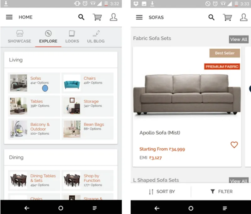
Fig 1: Old version of Urban Ladder app. Family listing was with all the products open on that screen.
Previous version navigation experience of our app: Clicking on sofas would have taken you directly to sofa listing with products there. Though the information and the family categorisation was there but to reduce the number of clicks the items were placed there itself. That actually overwhelmed the users with too many products and too much clutter. Also, due to very less real estate on mobile, many categories remained undiscoverable. Users would have to scroll too much to find the right category. This created a very bad user experience, thus resulting in lesser clicks and higher user exits (low CTR of ~30 percent) meaning, out of 100 users, 70 people exited the pages.
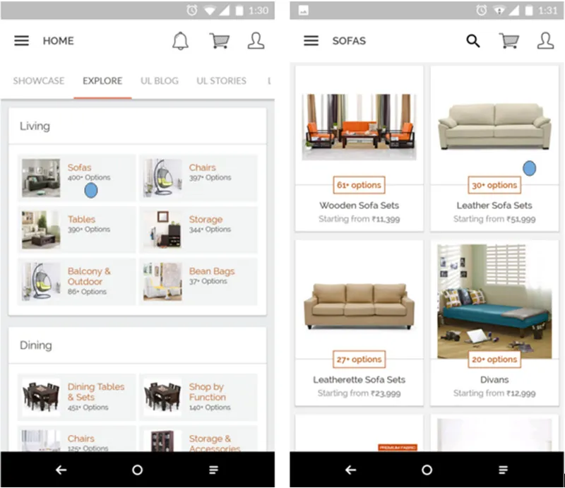
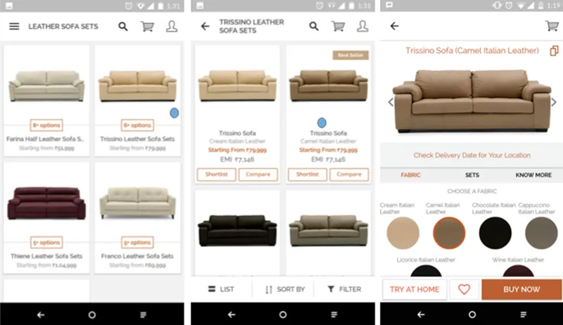
Fig 2: Latest version of Urban Ladder app. Screens a user has to go through in order to reach a product page.
Latest version navigation experience on app: To reach a sofa product page from the catalogue, user has to click four times. But since we have divided the product by materials and by families, it is easier for the users to navigate to the product they really want, than to scroll through a list of thousand sofa items. Clearly, highlighting the number of options available and the price range helps the user navigate. We don’t need to show all options upfront.
We reduced user’s cognitive load of trying to think which sofa he wants by scrolling through a list of sofas to directly showing them sofas, classified by design and material. This only increases a little motor load as the user only has to click an extra time, but the cognitive load is significantly reduced.
The CTR for family and product listing pages is ~105 percent, which essentially means that all the people who come on the family pages click. Some people click, go to product page, come back to this screen and click again, hence the number is greater than 100 percent. Before the changes were made, it was 30 percent, now it’s 105 percent (more than a 240-percent increase).
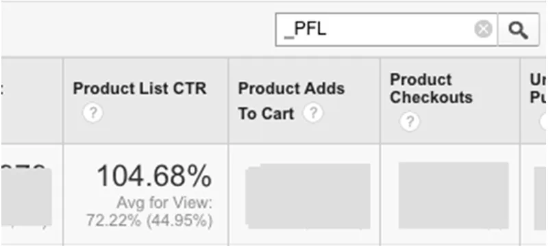
Fig 3: GA Snapshot: PFL is product family listing
So, believe me it works
To close this, I would say, just remember two things,
Bonus tip: This analysis is not for games. To make games interesting and challenging, designers consciously increase either or all of the three loads.
This article is second in a series of posts that I am writing for the product owners, managers or anyone who wants to build or manage great products. Below is the link to the first post, if you are interested:
Psychology Basics 101 : for product owners, managers or anyone who wants to build great products …
(Disclaimer: The views and opinions expressed in this article are those of the author and do not necessarily reflect the views of YourStory.)