Intuitive design: How you can use these 8 steps for better user interfaces

Discoverability, affordance, comprehensibility, responsive feedback, predictability, efficiency, forgiveness, and explorability are key elements of interface design, as this book argues.

Launched in 2012, YourStory’s Book Review section has insights from over 180 titles on entrepreneurship, creativity, innovation, leadership, design and digital transformation. Also see our list of Top 10 Books of the Year for Entrepreneurs for 2018, 2017, 2016, 2015, 2014, 2013 and 2012.
Effective user interfaces call for a design approach that goes beyond jargon, ambiguity, subjectivity and personal ‘gut’ judgments, according to the book Intuitive Design: Eight Steps to an Intuitive UI by Everett McKay.
The book offers a practical and actionable definition of intuitive design, along with dozens of examples and even quizzes illustrating these principles. The framework and glossary are useful for new designers, experts, and entrepreneurs, particularly those with a mobile-first business model.
Everett McKay is Principal of UX Design Edge and has over 30 years’ experience in user interface design. His other book is UI Is Communication; he was earlier at Microsoft and has an MS in computer science from MIT.
Software is eating the world (in the words of Marc Andreessen), and the world needs intuitive self-explanatory software more than ever before, explains UX consultant Jan Miksovsky in the foreword.
The seven chapters are spread across 214 pages, along with a five-page glossary of terms. Here are my four clusters of takeaways from the book. See also YourStory’s d-Zen section for more resources on design.
I. Why user interfaces need to be more intuitive
The earlier era where tech users expected documentation and training is quickly disappearing, and today’s mainstream mobile-first users no longer need this approach based on ‘RTFM’ (read the fine manual). “A new generation of users demand intuitive, easy-to-use products,” Everett begins. “A modern user manual is optional, not required,” he adds; designs should be intuitive so that they reduce complexity, errors and productivity loss.
The poor UX and complex UI of many incumbent products have opened the door to a number of startups with better design and business models. Many companies, unfortunately, still regard design as an afterthought, or believe that efficiency is the only product consideration and that usability can be figured out by the consumer.
The author points to examples of how difficult it was even for trained sales staff to show how the Blackberry Z10 worked; how users had to struggle to learn WordPerfect; and how Microsoft made an unnecessary expensive bet by removing the Start button from Windows 8. He also shows a number of unintuitive interface elements in Apple devices and the Uber app.
II. Intuitive design
Misconceptions about intuitive design are that it involves ‘dumbing down’, it involves only familiar elements, and that it can only be experienced and not defined. Everett defines intuitive design as something that is immediately self-explanatory to its target user. Users are able to successfully complete tasks on the first try, without making mistakes.
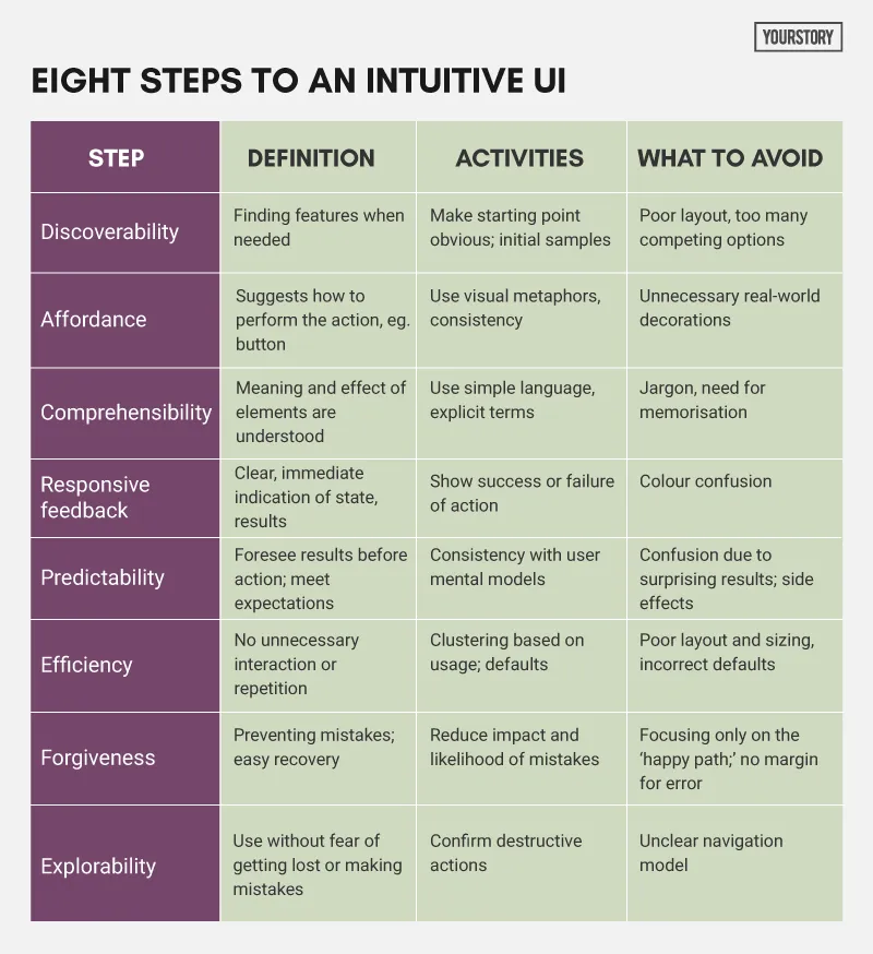
Everett defines eight elements of intuitive design (see my summary in Table 1 below): discoverability, affordance, comprehensibility, responsive feedback, predictability, efficiency, forgiveness, and explorability.
The above properties are situated in an interaction lifecycle with a sequence of physical and mental steps: set a goal, find the starting point, perform actions, observe actions, assess results, and go to the next step or go back to fix problems or mistakes.
Practices that make it intuitive include onboarding during empty states, proximity of related elements, judicious use of hidden elements in dynamic display, use of common affordances (eg. buttons, boxes, arrows, checks, switches, flashing; long presses, swipes), optional use of sound and haptic feedback, and natural mapping (physical and cultural contexts).
Other recommendations are clustering together of frequently-used elements; effective error handling (problem statement, explanation, resolution); allowing multiple letter cases in certain fields; keeping enough space between elements; confirming destructive actions; allowing edits, undo and abandon where practical; and specifying clear commit models (explicit save or instant commit, eg. auto-save).
The author also recommends usability testing activities building on these above principles, such as an extra emphasis on navigation confusion (eg. frequent use of Back) or where users correct, redo or abandon tasks (eg. frequent use of Cancel); icon comprehension test; and eye-tracking to improve discoverability.
III. Other elements of design
The book has further discussion on design elements such as familiarity (not necessary or sufficient for intuitiveness), consistency (conformity across applications), and learnability (from other users). Everett adds that designers should familiarise themselves with app platform guidelines.
Design often involves tradeoffs with technical, cost and business considerations, and so there are situations when elements may need to be unintuitive. For example, too much emphasis on discoverability may lead to cluttered screens; too much comprehensibility may lead to too much explanation. Shortcuts may not have affordance either and need to be remembered by frequent users (or documented in manuals).
In some cases, onboarding (app overview) and coach marks (explanation on demand) may also be necessary. In any case, the choice of “strategically unintuitive” design should be deliberate and not accidental, the author recommends.
One chapter covers design issues in the context of an entire task flow, and not just a single interaction. In that regard, there should be instruction headings on individual pages or sections, to explain the purpose of the page. This, in turn, impacts the design of individual elements.
Another chapter addresses the use of streamlined cognitive walkthroughs to evaluate designs by asking questions such as how will the users know what to do at the current step, how will they know they did the right thing, how will they know they did the wrong thing, and how can they correct a mistake they make. Each of these can be addressed by combinations of the eight elements of intuitive UI.
IV. Maturity frameworks
Other useful contributions of the book are maturity frameworks and models for design. For example, based on the level of intuitiveness, a UI can be graded as fully intuitive, sensible, learnable, guessable, trainable, and ‘beyond hope.’
‘Sensible’ interactions lack discoverability and affordance but can be deduced through experimentation. Guessable elements are advanced or optional, whereas trainable involves documentation and training. Further sub-gradations involve single or multiple trials by users.
Another proposed framework is called The Seven Levels of UX Persuasion: personal opinion (gut instinct); technology and code; mechanical usability and business goals; design principles and guidelines; usability and real data; scenarios and personas; and emotional brand design.
“No matter how rational you think your users are, people react emotionally. So factors like beauty, delight and branding can be very persuasive – assuming the basic functionality is properly designed,” Everett explains.
As additional activities and exercises, the author asks readers to reflect on abandoned or formerly useful products, products that have become simpler or more complex over the years, ratings on app stores, the design of clocks on car radios, unintuitive design of Snapchat, and even re-design of the QWERTY keyboard.
In sum, an effective design comes from a combination of usability testing, expert evaluation, and application of core objective parameters of intuitive design.