

Five UX insights we gained after user testing

For a consumer-centric product like Pricebaba, change is the only thing that is constant. Made by a bunch of geeks who wanted to build an amazing research engine that helps people buy electronics better, there’s never a shortage of feature ideas. Often though, it is very easy to go overboard with deploying features, but a realitycheck of the true effectiveness of your product is equally important. So, since last year, we paused from time to time, stepped outside our world to see what the real user has to deal with when he or she visits Pricebaba.com.
Armed with a set of predetermined tasks, we made random people perform them on the street, in shopping malls, near railway stations, with us silently observing on the side. This exercise, now internally called 'Project Dragon Scroll', was an eye-opener to how basic the UX problems for a user can really be.
We collated all our findings into a few common problem statements and, over time, made UX improvements to address many of them. Here are a few examples of those:
1) 'Hit enter for more' placeholder in the search box.
One of the tasks we made users perform was finding the lowest price of a preselected mobile phone. We noticed that a few of them would type the phone name in the search box, and kept waiting for something to happen, instead of choosing from one of the auto-complete suggestions. So, to nudge the user into looking at more options, we simply placed a small placeholder saying 'Hit Enter For More' whenever the user would start typing a search query.
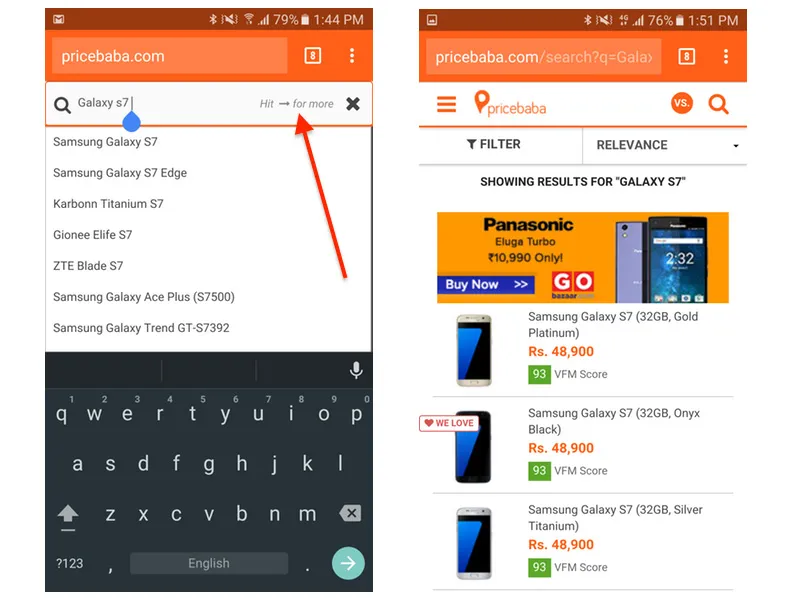
Hitting the 'enter' button on the physical keyboard of a computer or the arrow key on the software keyboard on a smartphone takes the user to a search result page, where products matching the search term are shown in a filterable list. Just to make sure this implementation was dummy-proof, we even hyperlinked the placeholder text, so even if you were to click that, you’ll be taken to the search results page.
2) People want to see latest products on sale
Some of our traffic land on Pricebaba.com’s list pages while searching for prices of electronics on Google. The default sorting order for all list pages on Pricebaba (and majority of e-commerce/price comparison sites) is by popularity. But popularity is largely dependent upon the kind of marketing push a particular product receives; a highly advertised product will have more people looking for it, thereby influencing what products show up on the top of our list pages.
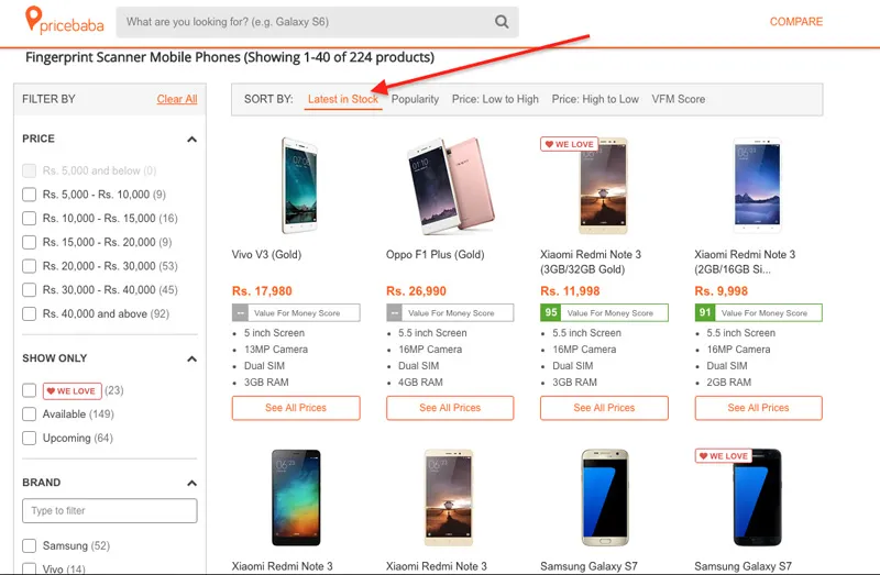
We had a hunch that many users come to us just to see what’s new in the market. We validated that hunch using Hotjar’s in-page survey tool, where we asked people landing on Pricebaba list pages what they wanted to do. And true to the theory, a majority of people said they wanted to see latest products on sale. So, we gave them just that by adding a 'Latest in Stock' sorting method, that would show products that have just begun selling up front. We’re closely keeping an eye on how many people are actually sorting it that way; maybe some day we will switch to that as the default sorting order.
3) Adding visual cues to zooming of HD images
People love looking at pictures of products when they’re on a product page; at least that’s what we deduced from clicking an image to expand being the third highest event triggered in Google Analytics. But in our field testing, we realised that although power users know this as expected behaviour, the common person didn’t know that clicking on an image would zoom it full-screen.
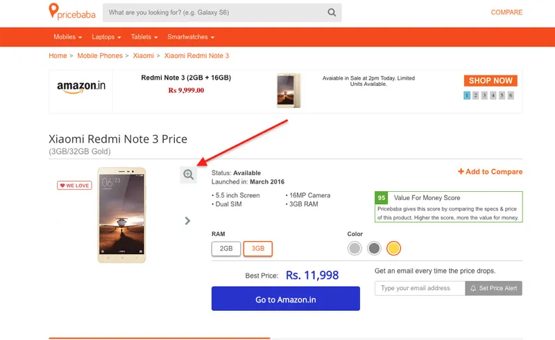
So we added a simple magnifying glass icon at the corner of the image. Just doing this helped this activity jump from the third to the second-most used event in Analytics.
Problem solved.
4) Setting filters to 'minimum' instead of absolute values
We didn’t have to go too far to know about this problem, as Pricebaba’s CEO himself brought this to light while using Pricebaba to recommend a phone to somebody. It was a rather embarrassing moment when he chose a few filters on a list page, only to have some some old, irrelevant options thrown up. The problem lay in offering only absolute values for numeric filters — so he chose Rs 40,000 and above as the budget, and 2GB of RAM, not realising that most phones at the time in that price range had more than 2GB.

So we changed all relevant numeric filter values to a minimum threshold, so instead of making a user explicitly choose '2GB RAM', we started showing 'Minimum 2GB RAM' or instead of showing '16GB Internal Storage', we now show 'Minimum 16GB Storage'. This is because if a user has selected a price range, he or she should not be penalised if a higher capacity is available in their budget. We think when somebody says I want a phone with '2GB RAM', most users won’t mind (we’re hoping they’ll be pleased) if they’re shown mobile phones with more than 2GB RAM also.
This practice is now applied to every category we add, and the real-world feedback we’ve received about how easy it has become to narrow down on a product is reassuring enough for us to keep it this way, even if it isn’t industry-standard behaviour.
5) The search box when clicked should automatically open the keyboard
Last but not the least, we noticed that some people would click the search button when using Pricebaba on a mobile, and continue staring at the screen. It was obvious that if somebody is clicking the search box, that person wants to type in something. So, user testing helped fix such basic boo-boos, as the on-screen keyboard now automatically kicks in upon hitting the magnifying glass.
In closing, at the end of our first field testing experience, we honestly were surprised with how small things can totally wreck the user experience when building a product. Spending time on the field with our users has helped us build some small delights into Pricebaba. I hope you are able to nudge your team into spending a day on the field testing with real users.
(Disclaimer: The views and opinions expressed in this article are those of the author and do not necessarily reflect the views of YourStory.)