Five ‘must-haves’ for your first business card
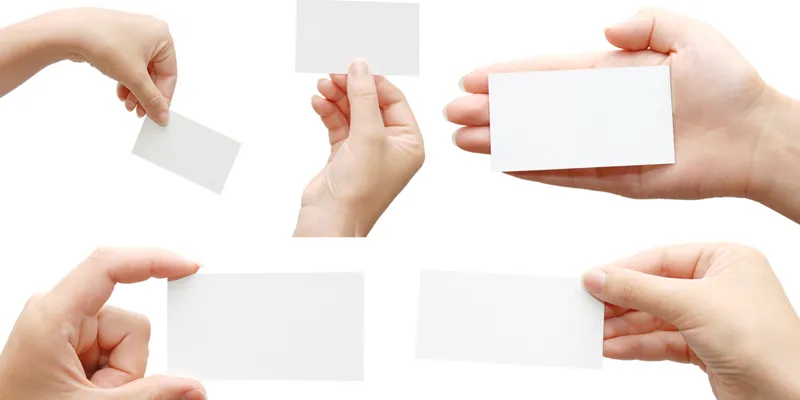
For a founder, getting his or her first business card printed is some sort of a seminal moment. This is the perhaps the first tangible piece of material created by founders to announce their entry into in the startup club.
I remember fretting and fussing over my first card, rejecting the first few designs after approving them for print! Here are a few quick tips that can ensure you get the most of this exercise.

Image: shutterstock
Form
Form trumps content but not for this product, which has such a high functional characteristic. While non-standard sizes may help you momentarily stand out, this is short-lived. It is not necessarily worth the effort or price one pays for non-standard sizes and shapes. The standard size for a business card is 3.5 by 2 inches, but that does not restrict you from creating different shaped cards.
Standard business card size cost less as print shops optimise to generate the most from a sheet of paper for this size. Standard sizes also fit snugly into card holders and pockets, avoiding dog ears that odd shapes invariably pick up within days. Also remember that you should be able to print your card while travelling or choose from a variety of print shops. Hence standardisation in form helps, though that should not restrict you in being creative with the content.
Feel
A good business card should feel like a good handshake – flexible but firm. Avoid thinner papers, but do not go overboard on thickness. Paper thickness is rated in “gsm”, and 300gsm media of any make is ideal for a business card. While thicker cards convey stability (explains why these are favoured by wealth managers), these are impractical to handle and stock. If you want a textured feel to your card, use off white textured papers. But do remember these work best when your logo is without details and there is plenty of white space to allow the texture to be appreciated.
Large swathes of flat colours do not reproduce well on textures. Laminated or non-tearable cards are useful if you expect to hand these to those in a manual work environment (are you going to be enlisting vegetable vendors for your hyperlocal startup?). Finally, using standard stock papers like 300gsm gives you the freedom to print your card anytime, anywhere without worrying about specific paper stock availability.
Flow
A well-designed business card influences how the recipient absorbs information. To create one, decide the sequence in which you want the user to receive your information (for example, FreeGo >> Co-founder >> Ajay). If you want the brand to be highlighted first, make it the primary optical area, and provide 10 per cent of the business card, ideally on the left top with enough white space around the logo.
If you do not have a logo, ensure the brand name font is about 2.5 times the next largest font. The eye roves from top left to bottom right and we appreciate visual information in clumps. You can help the user navigate to the next highlighted group – the name and designation, which should be in the top right quadrant or the next largest font size.
Function
The functional use of a card should not be undermined while trying to be creative. It is important to use the seven square inches to convey all the basic information. Company name, your name, designation, email, and telephone are de-rigueur. In the startup phase, I always leave my mobile number for potential customers, employees, and investors to reach me right away.
Also, instead of putting down your office address or the official company name, use the space to do a five-word elevator pitch. For example, if you run FreeGo, a ride sharing startup, do not waste space on FreeGo Ride Technologies (India) Pvt. Ltd., instead clear the clutter to put in “Free rides with friends.”
Fonts
Since the business card is such a functional product, getting the right readability is critical. Keep the number of fonts and font variation used to a bare minimum. Two is the limit for font typefaces (for example, Arial and Helvetica are typefaces). Each formatting variation also counts as a different font (from a visual variation perspective) and increases clutter. Hence, Arial size 11 and Arial size 9 count as two font variants, even if from the same family.
Finally, do not use cursive and flowing fonts types on a business cards unless you have very little information and can afford space for large font sizes. Good fonts to use include Impact, Tahoma, Helvetica, Garamond, Arial, and Myriad Pro.
An important feature of the business card is the ability to have it printed on-demand, anytime, anywhere. Keep a print ready in your email or Google drive so you can order it on-demand with any local print shops or printing apps like Pi. For tips on how to get your business cards print ready, visit PrintWithPi.com.
About the Author
Manish Sharma is the Co-founder and CEO of Printo. He was earlier Co-founder of DBS Internet Services and New Economy Venture Group, and Global Director of Solutions for Pipal Software. He graduated from University of Oxford and Bombay University.
(Disclaimer: The views and opinions expressed in this article are those of the author and do not necessarily reflect the views of YourStory.)


