5 key differences between a website design and an app design
What’s better, a website or an app? Web designers often struggle with this question. While it can be tough to choose between the two, both mediums are used to convey information and promote brands.
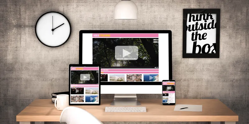
A major difference between a website and an app is that the two are accessed through different devices, a computer and a smartphone respectively.

Image : shutterstock
When you type a URL to access a website on your mobile browser, you don’t reach a regular website; specifically, you reach a mobile website. A mobile website contains a smaller interface, to be used on phones and tablets.
But before you go ahead and form an opinion, it’s important to understand the differences between the two.
Screen-size
While designing, you must take into account the change in screen size of the two interfaces. A smaller display implies lesser pixels. Thereby in apps, features like heavy graphics and picture galleries are a strict no-no.
You have a keyboard at your disposal while accessing a website, but it can be difficult to manage the same with your smartphone. This is where touch functions come in. Seemingly minor aspects such as the location of touch buttons can go a long way in making your app more accessible.
Contextual
Most people access websites from their desktops or PCs, while being seated. In apps, there is no guarantee of that; for all you may know, a user might be running while operating their phone. As a designer, you must ensure that your app features can be used easily on the go. Add-ons like in-built dictionaries and power saving options help optimise use experience.
Slow processors
Compared to computers, smartphones have slower processors, thus demanding a simple layout for your app. Don’t assume that what works for your website would work for your app, too. Also, apps which consume significant mobile data are likely to get a thumbs down from your users.
Integration with smartphone features
If there is one thing you can do with all kinds of smartphones, it is making calls. Phones might not have fast processors or big screens, but they do enable people to make calls and text, thereby offering an altogether different opportunity for developers, which is missing in desktops. Therefore, apps making use of smartphone functions are likely to be more popular.
Targeted push notifications
Designers can use an app user’s geographical location to send geographically-targeted push notifications. Entrepreneurs often use this feature to promote brands across specific regions. Food ordering and taxi-hailing apps are perfect examples of such an approach.
As websites and apps cater to a different set of needs, choosing one over the other would be depriving the business of a potential clientele. Plus, with over 3.2 billion internet users in the world, websites and apps are here to stay. In view of these facts, it, indeed, is beneficial for upcoming web developers and designers to understand these differences as it would be sad to miss out on an idea whose time has come.


