

Beyond Mobile, Beyond Responsiveness

There’s no doubt that mobile has gone mainstream with consumers increasingly on the move and companies seeking more ways to stay in front of their eyes and right at their fingertips. Thanks to mobile and other devices, this has been possible but not always convenient. What happens when you are unable to access a website via your smartphone/tablet, or you face deadlocks in navigations, or it’s not as smooth as your computer browser? This is where responsive web design (RWD) becomes beneficial for any company’s website. As we speak, we may notice that businesses have started realizing the importance of maintaining a mobile presence. Check the statistics below to witness the trend of Mobile Share of web traffic in 2012 as compared to that in 2010. [ Source - PingDom ]

Why Bother With Mobile ?
Mobile users are different. They demand experiences that are more engaging than what you offer your desktop customers with constraints on limited screen sizes, time, and capabilities. Thus, A businesses must compensate for these limitations with functionality that creates a compelling mobile environment that will engage and convert users to revert back - again and again. Responsive web design allows for viewers to access a single website on a variety of different devices. No matter which device you are using, the website will auto-adjust itself to the width of the screen for optimal viewing of the webpage on your handheld device.
Align the Experience Around Fast, Frequent Use
Think of mobile users as your average customers with less patience and time. The combination of a small screen and the expectation that information will be instant means that you must create features to streamline the user experience to capture their attention and keep them engaged.
When users engage with the mobile channel, they have a different set of needs than those using a Website. They are easily frustrated by interruptions, awkward keyboards, and slow performance. As a designer and developer your main target is to overcome these hurdles to navigate users to smoothest of the experience. So put yourself in the heads and shoes of your customer and vision their perception. Ask yourself a basic question - “What features would I want if I had few square inches and 60 seconds to work with?”
Having mobile touchpoint is not a long term strategy, believe in optimized experience if you wish to grow your business in mobile sector. Mobile devices provide a totally new opportunity for you to engage in an ongoing dialogue with customers and for customers to build new relationships with your brand.
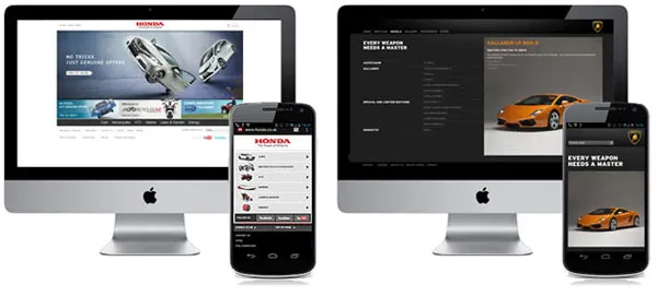
On the left, we see an example of AWD from Honda UK where there is a separate mobile website with a link to the desktop website. On the right, an example of RWD from Lamborghini where the desktop, tablet, and smartphone use the same ‘responsive’ code base.
Responsive Web Design ( RWD )
Many Designers prefer RWD mainly because there seems no need to change or “adapt” for different versions of the website. In short, Content remains the same. This also means that your CMS (Content Management System) stays the same and you don’t have to duplicate content entry for different screen types. The development role is also minimal as the RWD content could either stacked or adjusted to fit the space available automatically using CSS, media queries, and HTML5. Time of implementing RWD is cheaper than Adaptive Web Design (AWD) .
This approach can have significant limitations, however, as it is only the layout that changes and not the content or graphical elements. This can mean:
● Optimized Experience Compromised : The user does not get a fully optimized experience for the device they are using. Instead, what they get is the Generic experience.
● Same behavior across different mediums: There always is an experience difference when the users behave very differently while using smartphones and desktops, so ideally a mobile website should be adapted to these behavioural changes. In short there is no accounting for users’ behavioral differences.
● Loading Time : As the content doesn’t change between environments, with responsive websites, mobile users are kept waiting. Websites with lots of HTMl code and/or multimedia contents would take far longer time, yes , even with 3G connection.
Adaptive Web Design ( AWD )
Some designers believe Adaptive Web design is an preferable design solution mainly because the use of HTML and CSS can be stripped down to minimal level so that loading and processing time compared to RWD will be minimal. When producing an AWD website, designers are forced to focus on something for people’s sense within a mobile context by incorporating mobile-friendly gestures. Using AWD you can
radically change interfaces to avoid ‘fat finger syndrome’ so that users enjoy a more targeted UI. You can also decide to minimize content, change the hierarchy of information and transform widget and input methods. Speaking about the Native App portability, with AWD it can be easier to transpose the code over to create native app that you can submit to app stored.
AWD also has some limitations :
● Version Controls : It is important for AWD designer to plan the strategy of design properly or else they have to tackle the optimized solution for each existing device in loop.
● Native App ‘Transformation’ : You would try to compromise the performance of the native app if you adapt your AWD website into a native app. Even though, designers should focus on standard Apple/Android UI official guidelines (see the Android UI overview - http://developer.android.com/design/get-started/principles.html) and developers should focus on native programming language.
● The content nightmare : First thing that you will follow is naturally to optimize the layout, the amount/type of content, interfaces, and potentially the hierarchy. You are just not involving developers and designers in to this loop, but even marketers who would have to double their inputs for content marketing. Your focus would now cater to various environment. It’s tedious and time consuming if not followed with right planning and execution.
How about RWD-AWD approach ?
No matter which approach you follow, under priority of cost and quality delivery, you got to deliver great work that functions well on desktops, smartphones, and tablets. We could possibly follow the RWD-AWD approach, so that you enjoy the cost and time efficiencies of RWD while offering the better user mobile experience that AWD offers in prioritized content areas.
You can make AWD to blend with RWD by including some elements of AWD,changing some assets, content, or interfaces depending on, from where the site is visited from - this making a responsive website appear ‘adaptive’. Similarly, if you go with the AWD approach you can embrace RWD’s responsiveness so the content and interfaces degrade gracefully on different size screens (RWD) until the ‘break point’ where a different version is applied (AWD).
The major concern in this approach is the fact that,the interaction design/information architecture needs to be designed for both the desktop and mobile at the same time while considering the resizing, spacial distribution, and animation (if required) of elements on desktops, tablets, and mobile screens. Once this hurdle is cleared the developers need to rely on all available technologies to detect the multitude of resolutions and device capabilities while tailoring end-user experience to each particular device. Yes, this approach, even though slightly complex , had a bleeding edge and is quite experimental.
Don’t Fight The Future
The web is changing to meet the changing needs of its users. We trended using crazy flash intros and now we see HTML5 in ecosystem. We’re starting to see the importance of accessibility and developing sites to meet different use cases. If you think this is just a trend, you will get left behind.
If you’ve got so far, it’s time to get rolling to test your own site on your phone. Here are some online tools to help with testing:
Author:
Mr.Prajyot Mainkar is leading Product based organization, SPM Softwares & Designers based in India. SPM primarily innovates products on Android and Content Management Systems. He is also an Android developer advocate who expertise in android based commercial apps. He has been mentor for various mobile app building strategy and initiatives across India. He is an alumni from BITS Pilani and a Project Management Professional from IIT Delhi. T: @prajyotm