

Top 3 branding mistakes every startup should avoid
Think your logo is enough? Most startups get branding wrong without realising it. Learn the 3 common mistakes that make your brand forgettable and how to fix them fast.

First impressions last, and for startups, branding shapes them.
Branding is more than a logo. It is the personality, voice, and experience a company creates for its audience. Yet many startups stumble over the same mistakes, making their brand forgettable.
A strong brand clearly communicates who a company is, what it stands for, and why it matters. It builds trust, sparks recognition, and leaves a lasting impression. Want to know how to start?
Let's uncover 3 pitfalls you should avoid to make your brand start turning heads for all the right reasons!
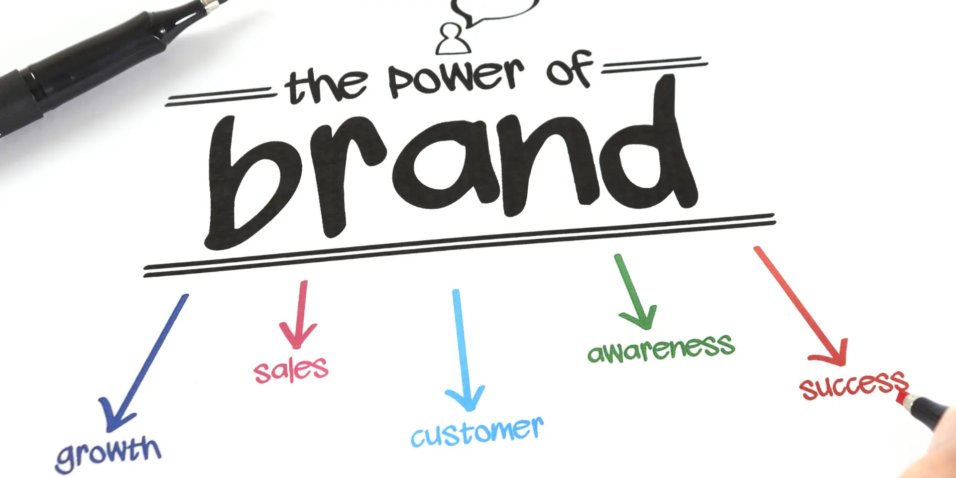
3 Startup branding mistakes you should avoid

Mistake 1: Thinking the logo is the brand
Designing a sleek logo feels like the ultimate stage of branding. But a logo is only a single puzzle piece. Your brand is the entire puzzle, from the way you communicate to the emotions you evoke, to the principles you stand for.
Too many founders pour hours into creating the “perfect” logo and then pat themselves on the back. Meanwhile, their messaging is inconsistent, their website feels cold, and their social media doesn’t reflect their values.
This results in people remembering a pretty icon but forgetting everything else.
How to fix it: Start by asking the big questions: Who are you? What do you care about? Who are you helping? Your answers aren’t for your designer, they’re for you. They define your tone, your messaging, and your purpose. Once you know these, your logo becomes meaningful.
Mistake 2: Inconsistent visual identity
Have you ever scrolled through a startup’s Instagram and thought, “Wait, is this the same company I saw on their website?” Fonts switching, colours clashing, graphics looking completely different, it’s messy and forgettable.
Humans crave consistency. It’s how we recognise brands without even thinking.
When your visual identity jumps all over the place, your audience struggles to form a mental image of your startup. And if people can’t picture you clearly, they won’t remember you.
The easy fix: Choose 2 fonts, around 2-3 primary colours, and stick to them. Build a simple style guide, even a Google Doc works. Outline your logo usage, colour palette, font choices, and any visual quirks. When everything aligns, your brand looks polished, professional, and memorable without breaking the bank.
Mistake 3: Trying to be everything to everyone
This one’s a classic trap. Many startups think they have to appeal to everyone, be fun, serious, smart, witty, and cool all at once. This leads to your brand voice being diluted and utterly forgettable.
However, clarity beats cleverness. When you focus on a specific audience and communicate authentically, your brand sticks. You don’t need to be everything. You just need to be yourself, consistently, and in a way that resonates with the people who actually matter.
A better approach: Pick your tone, focus on your real audience, and stick to it. Talk like a human. Be relatable. Let your brand personality shine in a way that feels natural. The goal isn’t to appeal to the masses, it’s to be memorable to the right people.

Branding doesn’t have to be complicated
Creating a strong brand doesn’t require a huge budget or a team of designers. It’s about being thoughtful, consistent, and clear. Avoid these 3 mistakes, and your startup’s branding will stop being forgettable and start becoming magnetic.
Remember, your brand isn’t just a logo. It’s the experience, the personality, and the story you tell. Nail that, and everything else, colours, fonts, designs, will naturally fall into place.