How To Build a Killer Pitch Deck, and Get Funded
Like many startup founders, at least the ones that are in it for the long haul, I've been presenting and advising startups about pitch decks for a while. And you learn very quickly that although you evolve as an entrepreneur over time; the pitching and story telling never stops.

So here's what I've learnt about building the right pitch deck, after being declined more times that I can count, and occasionally winning those VCs over and getting funded.
*Note - just having the right deck is not enough, you have to be able to tell a stellar story and weave the info well. Like my startup NoteWagon did on the Dragon's Den (by the way, they have a killer deck). But more on story telling later, for now lets focus on the deck.
Dave McClure's How To Pitch a VC has the best description of what your pitch deck should contain and I've adopted it the most out of all frameworks I've read.
Your slides should be (in this order) -
1. Intro - Quick short liner of what you do (elevator pitch).
2. Problem you are trying to solve - how a problem exists, and how people find it painful
3. The solution with Demo - how cool is your product/solution is!
4. Market size and value - how big is the market in users and in spending value
5. Business / Revenue Model - how will you make money
6. Marketing and Distribution plan - how will you grow your user base
7. How are you special? - Technology or something else that makes you special
8. Competition - how you stack up against them
9. Your Team - how awesome you all are
10. Funding status - how much money you need and how will you spend it
11. Last Slide - leave them with something to remember you by positively
12. Appendix - Have answers to any potential questions and more details here
The details follows. Please note: I won't re invent the wheel here, check out Dave's pitch slides for an actual example of this format, and I have also added slides from various versions of our own TwoMangoes.com pitches -
1. Intro - Dave's slide #5
Quick short liner of what you do (elevator pitch). It should be clear and concise. Something even a 5th grader could understand. Something like "we deliver healthy food fast!"
2. Problem you are trying to solve - Dave's slide #7
Best to use pictures and a story to show how a problem exists, and how people find it painful. The more visual pictures you have in your slides the better!
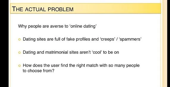
In TwoMangoes’s case I kept our initial slide about the problem with ‘online Indian Dating and Indian Matrimonials’ super simple
3. The solution with Demo - Dave's slide #10 and #11
Now show how you solve the problem, and take the time to demo how cool is your product/solution is!
In one version of the TwoMangoes pitch we just show our awesome Indian Dating vs. Indian Matrimonial video followed by a demo of the actual site.

4. Market size and value - Dave's slide #13
How big really is your market? And how much will your users spend on your solution, or are already spending on other potential/similar solutions?
5. Business / Revenue Model - Dave's slide #15
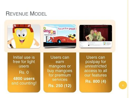
You don't have to have it right, but at least show that you have paths to make money. In fact, if you are already making money then highlight that aspect, and show the potential of making more. Otherwise just highlight the different ways you plan to generate revenue.
After our launch on Feb 14th this year, TwoMangoes was just two weeks old and already making money, so I highlighted that by showing how many users had paid for what service.
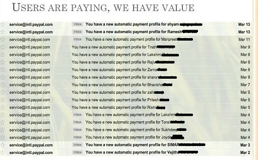
But what really got our investors is this slide where I showed how our payments were coming in by the day… as a founder, you have to love email notifications :)
6. Marketing and Distribution plan - Dave's slide #21
How will you grow your user base? How will you get word on your product out? Show some unique or thought out strategies that will get you out on the market and distributed amongst your potential users.
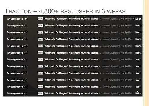
If you have a strategy that’s working, now is the time to show your traction in a way it can’t be ignored. So to show that online Indian Dating is in demand, instead of a growth graph, I sometimes opt to show show my inbox filling up with the email notifications I receive every time a user signs up for TwoMangoes (note: Gmail caps threaded conversations at 61)
7. How are you special? - Dave's slide #17Do you have IP, a new technology or a unique process? Any special advantage you have over your competition helps, and now is the time to showcase it!
8. Competition - Dave's slide #19
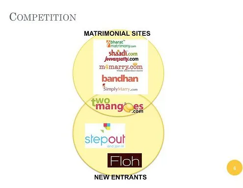
Best shown as a four quadrant Graph and where your competitors stack up in terms of attributes compared to you. The visual effect of the graph is very strong and the details you can pop in the Appendix.
In TwoMangoes’ case a simple venn diagram gets the point across initially of how we blend the best of two the Indian Matrimonial and Indian Dating worlds. And I followed this up with details ofcourse :)
9. Your Team - Dave's slide #22 done in Ninua's Slide #16 Team format
How awesome is your team? What kind of accomplishments, experience and specialties do you bring to the startup that makes you all a winning combo? If your idea and solution haven't done the job yet, this slide is your last chance at impressing any investor on why to invest in you - cause you are the right guys to get the job done!
10. Funding status - Dave's slide #24
How much have you already raised and has anyone important funded you? Followed by, how much money do you need and how will you spend it? And finally, what kind of milestones will you achieve with the funding / what position will it put you in in the end?
11. Last Slide - Dave's slide #26
DO NOT end with "Thank you for your time" and just your contact info on the last slide. After you finish your presentation and end up on the last slide, questions and answers begin and you don't want valuable visual space and time taken up by a blank 3 word slide.
So your last slide should something memorable you want to leave the viewers with - like a screenshot of your demo, a revenue graph showing how much money you've made already ... anything that packs a punch and shows your positive side.
The guys @Notewagon received a lot of press coverage, like being featured on Mashable, so their presentation last slide is always all the press coverage and user testimonials they have received. Which is a great way of showing investors how cool and awesome they are to the market.
One of the best last slides I've seen and use is a summary of everything presented. I can't find a slide to publicly show right now, but I sketched a rough version of it for a startup I'm advising - basically it shows all the key trends:
Your Users, Revenue and Expenses vs. time.

The table below the time axis identifies the numerical value of those trends at that time. So the values for 2011 and 2012 would be real but for 2013 they are projected numbers to show how far you will grow with the investment and how much of the market you will dominate.
The beauty of this summary graph is that you can add anything to the timeline to show visually its current status and how it will change over time with the funding you receive, as well as, how will it affect your revenue and expenses. For example: Team size, if you are raising to grow the team aggressively, which will obviously raise your expenses as well.
Or you can show product release milestones and how that will affect user growth and rev.
Always end on a strong slide, not a simple "Thank you for your time, call us!”.
12. Appendix -
Have answers to any potential questions and more details here - everything from screesnshots to scribbles. When an investor asks a question, there's nothing better than bringing up a slide that visually answers it for them.
In your entire deck you are attempting to convey the value of your startup to the potential investor - based on the slide sequence above, Product Value (slide #3), Market Value (slide #4), Business Value (slide #5), Tech Value (slide #7) and Founder Value (slide #9). Driving the high value of most or all these points pretty much puts you in the 'investment worthy' category.
Some more points to note -
- You don't have to have all the answers - but putting some content down for the slides identified above really shows you have given some thought to your entire startup's existence
- Have lots of graphs, stats and numbers to cement your position. Don't say "our market is big" or "we made a lot of money last month", put the numbers down in a graph and show the trend going to the top and right the cement the fact that you are poised for growth or growing. So less words and more metrics / numbers.
- Where numbers don't work, put pictures. The more visuals the better - less words and more visual cues to help the viewer see what you see and appreciate the true essence of your product / presentation.
More basic reading -
Dave's how to pitch slides and 500 Startups' Ninua's Pitch Deck
My friends at LegalReach wrote about how they raised 1MM in 2 weeks they detail how you perfect your story telling.
More on story telling / presenting well by Immad Akhund on How to Write a Killer Deck and get Funded
Sequoia's guide to Business Plan writing


