[App Fridays] NowFloats; India's Very Own Location Based Social Discovery Platform
In a recent listing of location-based apps that we put up on YourStory.in, we had mentioned today's app. It deserves a review. If not for anything else, today's app has set an example of sorts, by having an identity which users can relate to and will take note of. As the heading suggests, this is India's very own FourSquare. Only it
does what FourSquare does very differently.I interpret NowFloats as a location-based social discovery platform. Users can interact with other users who are near by via floats, which are basically thoughts (think status messages and photo uploads), offers and events. After having spent a couple of few weeks with the app, there are some really good things about the app and some things that need improvements.
Function
NowFloats is driven by to be a social interaction, but has safely chosen to niche itself with the use of a location-based service which only Smart Phone users can access. Users with the app can login via Facebook or create a user account within the app itself. Once you're done creating your account, you can choose an avatar for the app and you're in! You can now post your thoughts and photographs, list events and claim offers in your area.
Now the app presents compelling use cases to more than one kind of users; local businesses in particular, but this review is done from a normal smart phone user's point of view. This is done for a reason, because a social platform's success lies in its user base and the success of this app lies in how good or how bad the user experience is going to be, which will result in the number of users this app acquires.
Effectiveness
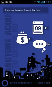
The features on this app work just fine; you can post your floats which people can “air” or “sink” (much like a upvote or a downvote on Quora), which helps you effectively customize your environment within the app. The app lets you communicate people within the app very well and yet keeps the extent of exposure of a user very minimal.The various categories are color coded, which lets users effectively identify the environment that they're in; Yellow for floats, Green for offers and blue for events. (Default settings). The main page changes color with time (yellow for day and blue for night), which is very thoughtful; it's easy on the eyes.
Based on your customization and if you have enough people in an area using the app, it really helps you stay on top of the your surroundings' happenings. I've seen the app used very effectively in events, where a user's float got many other people to the event. You can put up things like this on desktop based social networks as well, but the location-based use case has the potential to produce more conversions. The same holds true for offers and events; there lies a great monetization model where businesses can target potential local customers by using this app.
Innovation
Using a location-based service for a social network has been done by the likes of FourSquare, but the innovation lies in
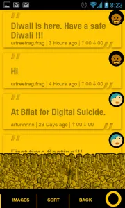
its providing the user with three things that would make them come back and use the app. They have also kept it simple enough for a user to understand and use.A lot of the innovation has been put into the UI and UX of the app. So as to not run of things to write about in the UI and UX section, I'll keep it short by saying it's visually appealing and it manages to keep the user engaged at all times.
Battery Report – By Little Eye Labs
NowFloat is a social app and hence it is quite internet data centric. As expected its power consumption is dependent mostly on its wifi usage and processing of images and location data of its user community. The power consumption can be considered average at best. The usage of CPU and network is fairly restrained but the amount of information it has to process (location, images, messages, deals, ratings, etc..) doesn’t allow it to be nimble as far as power consumption goes.
The use of this app will consume a fair amount of your phone's battery.
UI and UX
The UI is bright and vibrant. While this is good for catching the user's (or in my case, potential users) attention, the killer feature lies in the way it changes color based on the time of the day. Keeping the screen bright during day and making the screen darker at night, makes the app extremely view-able.
An important feature of the app is its transition animations. If you're running on a fairly decent internet connectivity, the app keeps you engaged at all times and the animations basically cover for the background work that the app is doing. This, however is one of the factors for its average battery performance.
While having a city like view at the bottom of the screen is very nice, it does use up a lot of usable screen real estate. This isn't a big deal on phones with large screen sizes, it can be an issue on smaller phones.
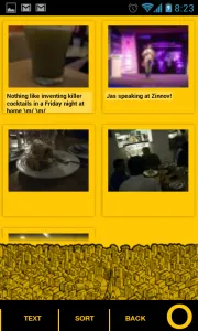
I think it's a beautiful UI and with a highly engaging UX. Some tweaks here and there, and the usability aspect of the app can be near to perfect.What We Liked
From a 2 week old user, here's what makes this app work for me -
- A great UI and UX. There is a very creative mind behind the design aspect of this app.
- Very good use cases; one of the first Indian apps to target the local market effectively
- Customizable environment; I get to choose the content that I want to see
- Very curated exposure of users; for those who are not ok with interacting with strangers, the app keeps information sharing at a very need to know basis
What we didn't like
There are some things that can be improved with this app
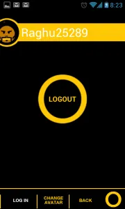
- Inconsistent typography; there are too many different kinds of fonts here. The font used in the floats environment is very pretty and the app could do with having the same font everywhere.
- A little more focus on user experience; simple things like a prompt before exiting the app can make a world of difference.
- The app needs to make it more clear to its users as to what its meant for. I've used this app and so I know what it is, but most users may not take the time to do so.
- Better use of screen real estate. The city like view uses up a lot of space which can be used for user interaction. A workaround could be hiding the city image while scrolling
Last Words
NowFloats is a great app, but only to those who know what it is. Some effort needs to be put into educating the user as to what the app can be used for and ideally it can be built into the tutorial that the app takes a first time user through.
Also, the app will really come alive if more people use it. I would really like more smart phone users start to use this and more businesses to adopt it as well and the app will give back the users a great utility to use.
Download NowFloats here.
Download the Little Eye Report here.


![[App Fridays] NowFloats; India's Very Own Location Based Social Discovery Platform](https://images.yourstory.com/cs/wordpress/2012/11/NF1.png?mode=crop&crop=faces&ar=16%3A9&format=auto&w=1920&q=75)

