6 things in a mobile app that will piss off users


6. Lookalike/wannabe user experience - No app that looks and feels like another good app in the same category is going to appeal to a new user. Users can smell a rat. Making an app that does exactly the same thing as another app is fine, but atleast the user experience should be different. Users identify apps with their user experiences and copying isn't a great idea. Another bad practice is using the same design for an app across platform. An Android and an iOS app have different design principles with user experience in mind. A good iOS UX doesn't necessarily mean that the same will work on android.
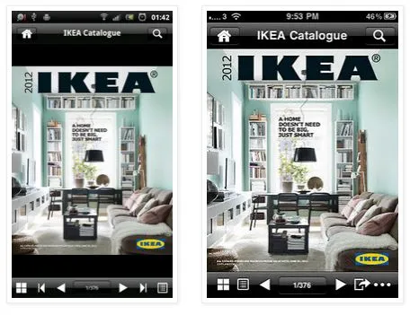
5. Apps that do too many things - Ok. Wanting your app to match your mother for utility is ambitious, and is certainly possible.

But given the size limitations of the smartphone, there are only those many functions that you can convey to your user. At a recent conference, an app maker voiced that user's don't use all of the app's features. And how will they if it takes an hour to figure out what your app can do!? Mobile apps are great at doing one or two fundamental things and these functions define them. If this isn't clear, no matter how many features you have, you are not going to retain your users. Don't make an app that feels like an OS.
4. Badly designed apps - Its called the ugly baby syndrome, where an app developer thinks that their app is the

best looking (and feeling) app. But if there are 100 users who don't like the look and feel of your app, there is a good chance you are wrong. Bad looking apps and the lag while using the app for the first time is huge turn off! This could be because of colours that don't go with each other or the app hanging and it requires some good design thinking to overcome. Even if your app is the sexiest looking app in the world, if it isn't light, it is still badly designed.
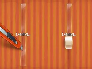
3. The infamous spinning loading wheel - Your app has to do some background work and there are ways to tell your users about

it. That annoying wheel isn't the best way. As a first time user, the last thing that you'd want to show them is that loading wheel. Its boring, and 10 seconds into watching the wheel, users are going to exit the app. There are more interactive ways to convey to your user that your app is working. Cut the rope is one of the best examples of an interactive loading screen. Be imaginative and make your app engage the user, even when its doing background work.
2. Badly placed ads - This is a touchy issue. But when a mobile app signs up for ad based monetization, it is going to be a compromise

on the app's user experience. Perhaps the best example of well placed ads in an app is Angry Birds, where the pause menu displays ads. At the same time, the retractable banner ad on the top left corner of the angry birds is just bad. There are those extreme cases where apps have more ads than the functions of the app itself and the app makers would tell you that they're getting great returns from it. These are invariably old ads when smartphone usage was new and the audience was more forgiving than what it is now. Forget clicking the ad; today's user will not even download your app if it has badly placed ads.
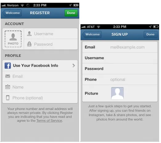
1. Entering login details and lengthy registration processes - The most annoying thing about an app for a first time user is entering login details. Users absolutely hate
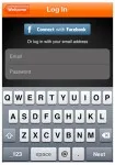
entering their login details to use the app. If you have a laborious registration process, you will most certainly lose a fair chunk of users halfway through the login process at best. Mobile phones aren't type friendly and you want to minimize making the user type as much as you can. Use the Facebook or Google SDKs to login and register, which will reduce it to a two- click process. If you must have your own login, make the process as easy as you can; two or three details at the most.
And that's a wrap! Feel free to use our comments section and share your annoying app experiences!