

This is a user generated content for MyStory, a YourStory initiative to enable its community to contribute and have their voices heard. The views and writings here reflect that of the author and not of YourStory.

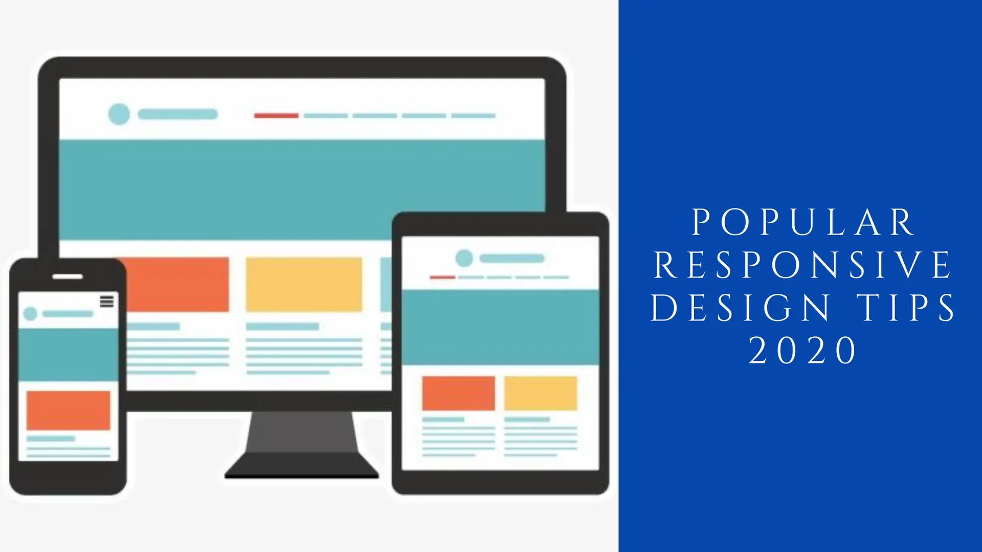
Popular Responsive Design Tips for 2020

This is a user generated content for MyStory, a YourStory initiative to enable its community to contribute and have their voices heard. The views and writings here reflect that of the author and not of YourStory.
There were the days when people used to browse the Internet only over PCs and websites were designed only for the PC views. But with the technology evolution, advancements came up in the entire digital world and the Internet could not only be accessed over a PC, but over tablets, smartphones, laptops, and all other sorts of mobile devices.
At that point, when users got access to browse the Internet at almost any device, this advancement accompanied numerous challenges for business owners. The websites which could be browsed only on PC earlier now must be compatible with all sorts of digital devices because you have no clue that your customers are using which device.
If you fail to do that and stick to the website that is only accessible on a PC, you lose all the potential customers and they might end up choosing one of your rivals.
The emergence of Responsive Web Design
Since it becomes necessary for a business owner to design a website which not only looks perfect on a PC view, you need to make your website look great across all screen sizes. This is where responsive web design comes into existence.
Having a responsive website i.e. a mobile-friendly website, will not only help you support all screen sizes i.e. a responsive website will offer a great user experience on a 4-inch smartphone screen and the same high-quality experience on a 40-inch cinema display as well.
Responsive design will not only offer a pleasing user experience but even helps getting ranked over search engines since, in today's time, Google gives higher ranking and priority to responsive websites as compared to the non mobile-friendly sites. At this point, having a responsive website not becomes a choice but a necessity in today's world for a business to resist the market competition.
Popular Responsive Design Tips
Once you are aware of the significance of responsive websites in today's time, business owners and designers must be aware of major responsive design tips so as to gain a competitive edge in the market and deliver a great experience that users are expecting from an ideal site.
So, in this post, let's explore the major responsive design tips that you must be aware of in 2020 and beyond that. Let's get started!
Emphasize on Navigation
Responsive web design has a direct impact on website navigation. As you are designing your website for all sorts of devices, you need to design in a way so that the user doesn't find it difficult to locate the web pages while they are using small screens.
So, you must focus on making easy navigation throughout the website and offer a hassle-free experience.
Effective CTA buttons
The CTA buttons must pop out from the page with respect to style and color as well. The color, shape, and size of the buttons are very crucial and it is preferred to go with the style that draws the customer's attention right away.
Don't experiment and go for some different shapes because rectangular and circular elements are considered as the most recognizable when we talk about buttons. Becoming too creative might take the customers away from your business, so there's no need to take the risk and trying something odd.
Content Organization
Content is an effective tool that can either grab the customer's attention to bank on your business or take them away from your business forever. So, you can't take content lightly and you must invest a great time while you plan the website content. And after that, organizing your content is another important factor that you must be aware of.
You need to arrange the content in a manner that the design and the content complement each other. You need to plan these things in advance because if the content is overflowing as per the design, it will be a terrible presentation that will not at all convince the website visitors.
Image Optimization
The images on your website are not only responsible for drawing customer's attention, but it even plays a direct role in affecting your website performance.
No matter how appealing visuals and images you have on your site, if these images aren't well optimized, you are eventually going to lose your potential customers. For this, you need to save the images in suitable formats and must reduce the image size.
Typography
Focusing on typography becomes even more important when we talk about small screens. Designers need to ensure that they scale font size, width, line-height to best fit varying screen sizes.
So, you'll have to spend a great time on improving the readability and spacing as well so that the website visitors experience a great website journey and love using your website.
The Verdict
Having a responsive website is eventually becoming mainstream in recent times as it is not at all possible to expect customer engagement if you are unable to deliver a great website journey to the customers.
If the website visitors find it difficult to browse your website on their device, you are simply out of the race. So, go for a responsive website today itself and keep the above things in mind while you get started with your responsive website.