[App Fridays] App Gazing with 'Hubbl'
Today's App Friday is a bit out of line (And a little late). It is not about an app made in India (The developers are all Indians) and it is not coming from a place that needs recognition. From the creators of Hmmm apps, which was TechCrunch disrupt finalist for the year 2010, comes an app which is aiming to solve a problem for the masses in the app space

(pun intended).Hubbl is a platform for app discovery which provides the user with a game like experience in finding new apps. It uses social features such as Hash Tags and Friend Feeds enabling users to discover apps on the iOS and Android platform.
Having made India proud at the world stage, it is our distinct pleasure to review Hubbl. Here is the App Friday review:
Function
The app performs one function; it helps you discover apps. Every feature on it helps in app discovery. The features are as follows -
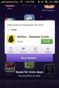
1) Sky View – A “sky view” on which a scrollable array of apps are laid out. These apps change between a set time interval. The app icons can be clicked with download links to the app market places. Stream of apps suggested by friends and everyone on Hubbl can be viewed on Sky View.
2) Stream – Stream is a news feed of your friends and everyone on Hubbl suggesting apps using Hash Tags. Upon clicking a news piece from the feed,
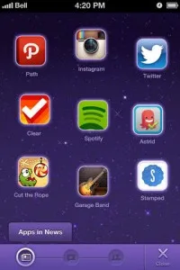
details of the app is given, including all the Hash Tags that have been used to suggest it.3) Explore – This is an option that allows more filters, categories and Hash Tags under which apps are filed. Again, the apps are linked to the marketplace from where they can be downloaded.
4) A social profile – A profile relevant to the app that provides statistics of your activities on Hubbl.
Effectiveness
With the main function in perspective, we have gauged the effectiveness of each of the features performing this function of app discovery. Here goes -
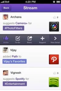
1) Sky View – We loved the experience of using this feature and the feedback from most of the Hubbl users is the same. A few months before the release of the smartphone app, Hubbl released a web app which was essentially this view with the Hash Tag functionality. And yes, we discovered some awesome apps which we had hardly heard about before.2) Stream – Makes a lot of sense if you have a sizable number of friends using Hubbl. The other stream option might help you connect with other “appstranauts” (Hubbl users).
3) Explore – If you're a Hash Tag person, then this is for you. Also, the other filters and categories are quite useful.
4) A social Profile – Again, very relevant if you have a lot of friends using Hubbl. Also, the social aspect of app discovery is very useful. Most users today ask their friends for advice on which app to download, and the suggestion functionality does this very well.
Battery Performace – By Little Eye Labs
The app was tested using multiple user profiles, with each test lasting about 10-20 minutes. We tested as an user who does not connect to this facebook account, and as another user who connects to his facebook account, and even as a user who just launches the app and just keeps it up without doing anything.
Hubbl, as is expected out of related syndication and news (done using social) apps, consumes a lot of network data and associated power. But surprisingly also consumed more CPU than we would expect.
As we tried the category list view and went into the categories, we find the list of categories and the content for the category is continuously queried from its servers. We would have preferred it caching the content and doing the refresh only after some elapsed time. That would have been ideal from a battery and data consumption perspective.
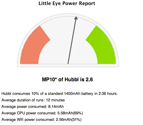
The average MP10 value for the app, considering all the cases tested is around 2.6, which means the app can run for about 2 hours and 36 minutes and consumes only 10% of the total battery. Note that this data is based only on its CPU and Wifi usage only.
This is a decent score for an app in its category, but could have been better if not for the animated background and the lack of caching of content.
UI and UX
Compromising on the battery has paid off very well for Hubbl. If not for the features that it provides, this is an app which you can have on your phone just for it looks. The deep purple is really attractive and it give a rich look and feel to the app.
The experience of using the app is brilliant as well. There is a small augmented reality tutorial when you first use the App, which is very useful. Many highly downloaded apps use this feature to good effect. Furthermore, we feel that the app is intuitive enough for the average app user to figure out without much difficulty.
The transitions between screens is smooth and we cannot get enough of the sky view. It is very pretty and that's what we fell for in terms of look and feel.
What we liked
The app is still in beta and we have had enough time with it. Here's what we like about Hubbl -
1) Great UI – Use it, you'll know what we're talking about. Large screen devices? Even better!
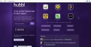
2) Discovering apps on established market places is difficult these days and Hubbl is really addressing a buring issue here.
3)The social aspect is very useful. Besides, this is something that app users do in real life. Very Practical. Furthermore, as an extension of this, the app has Facebook and Twitter integration as well. All your friends will be there, and users can receive suggestions from them without having to meet them.
What we didn't like
Here are a few things that we didn't like about the app
1) Buggy - We know this is a beta, but the iOS version crashes a lot. No such problem with the Android app. Something that needs looking into.
2) Lengthy Registration Processes – There has to be a less lengthy way of creating your Hubbl profile and linking social media to the app. It isn't that big a deal as it is a one time process, but can definitely enhance the user experience if these processes took lesser time.
Last Words
Hubbl is doing something the App store should do. This will help the developer ecosystem a lot and good apps will become more discoverable. Hubbl is
like an alternative app store; more social, more intuitive to use and a so much more good looking than the app stores. Apple's app store has tried to address this by suggesting a starter pack of apps for first time iOS users, but Hubbl has taken it to a whole new level.Hubbl has is a the benchmark for what an app store should be without even being one. So much win!
Visit Hubbl here.
Click here to view the detailed Little Eye Battery Report (Will be updated shortly)


![[App Fridays] App Gazing with 'Hubbl'](https://images.yourstory.com/cs/wordpress/2012/10/Hubbl-High-Res.jpg?mode=crop&crop=faces&ar=16%3A9&format=auto&w=1920&q=75)
