If you haven’t already noticed, Twitter has just revamped its desktop web interface. They didn't add new features or take down anything, but the overall look and feel of its desktop version is now similar to that of its mobile applications.

This cosmetic change does make it swanky. The slot for profile picture moved to the top left corner. And now it has space for the cover picture, increasing the overall aesthetic appeal of this very popular social network. It's reported that Twitter has been testing this new look since November, 2013. The major aspects of this updated look relates to the removal of pop-up 'compose tweet'. In its place, it now features an inline box which in sync with the iOS and Android application of Twitter. You can still access the older way of composing tweets by clicking on the top right corner button.

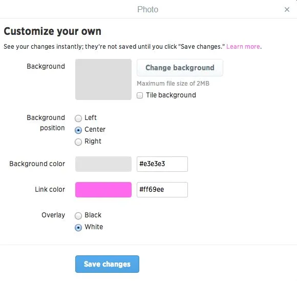
Twitter tweeted about this feature from their twitter handle saying that users can now personalize their twitter profile with accent color. For example, you can now have bright pink as your link color, as shown in the picture.

Twitter experimented with these changes in the user interface by giving access to one percent of the users and gathering feedback and user behavior before its worldwide release today.
Now we are waiting for more updates on user interface from Facebook and Google Plus as well. Let us know if you see any more interesting changes in the social network.


