This is the second part of the 3 part article on relevance of UX to startups. We explored the need to understand the audience and explore the problem space ahead of building your product in our first article. If you haven’t read the article, check it out here.
There’s nothing like observed data to throw the doors open to identifying new problems. They help you think big, look for problems rooted in reality and help you understand your users better. But then there’s the question of what aspect of the problem to solve for and how to solve them. While asking the right questions at the time of inquiry is critical, it’s even more important to understand which aspect of the problem space you’re going to go after once you’ve collected your data. In the travel space for example, there are a ton of problems that can be sourced from observing and talking to your users. Chances are they’re all going to end up in your notes. Users want the best price for their tickets, but they also want different kinds of experiences depending on the nature of travel and are often willing to spend more for specific kinds of activities. Many travelers want all the help they can get when putting together an itinerary, hunting across several sites for reviews and while they want the process to be hassle free and quick, they’re willing to go the extra mile to know that they’re not missing out on something really cool that matches their interests or that their friends have done.
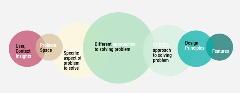
Knowing which need or gap to pick from your problem space, it’s characteristics and the approach to take towards solving that problem is what the Design Strategy process provides.
How can Design Strategy help?
The Tools
Whether it’s simple conceptual modeling, affinity diagrams, drawing up consumer experience journeys and flows or simply laying out different scenarios — Experience Design provides a range of tools that quickly take you from wading in a pool of data and suffering from analysis paralysis, to quickly zoning in on helping you frame the right problems.
An activity flow simply maps out the flow of activities required by your target to perform a task. Now add a handful of contexts where you know the user will be performing these activities. Assign each team member of your brainstorming group one context and have them each build out a different scenario of use. Imagine how your product gets used in each setting, identify the points where there are gaps or where the flow breaks down. And make sure you’ve either done your bit studying people experiencing this before or take your assumptions into the real life outside your room and test it out in context.
Similarly, affinity diagrams simply help you group and classify different needs or types of user segments or the kinds of features you want to offer. Consider it as a more visual representation of a table, but in free form, allowing you to build out a diagram mapping other values to it, showing you both the micro and macro map of all involved vectors. Affinity diagrams are great because they typically reveal relationships, connections, causality between a consumer’s needs, the contextual elements they operate in, the gaps etc. You’ll be surprised at how many aha moments you can discover by sketching out consumer journey and affinities.
What this does, is help you get creative before you get too focused down one path. For eg: there are several ways to approach solving problems people have while traveling. Some companies like Kayak, Priceline and their predecessors have tried to solve the problem by providing price comparisons, other entities like the hotels and restaurants have provided wifi and nurtured ‘working spaces’ to create new meaningful ‘spaces’ for people on business trips. AirBnB decided to solve the problem by building on resources people already had, inspired largely by the situation in the US at that time during the recession. And what resulted was the model of travel inspired by the ability to share and connect with other people and enjoy the true meaning of being a ‘local’ in the short period that you stay in a place.
Design Principles
Next, define a set of principles for how your solution should be. Look for qualities that define that experience or the activities at hand, and come up with solutions that reflect that quality. Defining qualities or principles ahead of time can make sure you never deviate (unless consciously done) from the core goals of your startup or your offering. For eg: if you are building a travel app that helps you plan your trips and has a price search engine, what are the main qualities of your offering that will define you? An app that focuses on offering the cheapest trips made to standard destinations on business or with simple straightforward itineraries needs to be super simple, quick ‘n easy, getting the user in and out of the app as soon as they can. This is a utility app — where wasting your user’s time can make them mad enough to go find another app. If your app is about showing people all the options available to them to vacation in style, curated destinations and vacations — then it’s a luxury and lifestyle app — where users want good research on options available to them and to make sure the money they’re spending is totally worth it. As a result they’re willing to put in more time to find destinations of choice at the best value. Your app needs to simulate different themed experiences, indulge and invite users with brilliant photos and videos, curated vacations and convey qualities of different lifestyle vacations, be it, animal activism, nature tourism, pilgrimages or yoga / health retreats.
The beautiful thing about Design Strategy is that, if done right, it can provide you with the ultimate map of a system with Design guidelines relevant to your startup, with your consumers, their contexts, other objects and products relevant to those contexts etc. Then every time you have a problem to solve or a feature to add, you can go back to your map & look at what happens when you add or remove a feature, design it one particular way as opposed to another. And all within the operating principles or guidelines you’ve developed.
A well thought out Design Strategy, early in the product development can heavily reduce time in troubleshooting problems along the way or expanding your product’s offerings, while allowing you to be creative at the same time. It can show you the factors most influencing the way your product is evolving, consumer needs and how they’re changing with time, factors influencing their change and how your product has adapted. It reveals the ‘what is, what if, what wows and what works’. And then suddenly, you have a tool that helps you anticipate changes and preemptively design for evolving needs and contexts.
Design Driven Strategy: A cheat sheet

So what is innovative here: The ability to explore several paths / stories and pain points, not just one, opens up a larger space within which you can create. Creating alternate paths to solutions is always helpful in breaking the typecast options out there. Next, it gives you the opportunity to disrupt existing players either in several ways: one, by completely changing the way the game is played which often involves creating a new vector for competing and changing user behavior (as in the case of AirBnB or Uber, where the vector was derived from the larger context of the society at that time) or two, by creating radically cheaper solutions to existing options (disrupting from the bottom, as in the case of Instagram, which opened up otherwise expensive Photoshop tools usable only by creative professionals, to the rest of the world) or three, creating new value for objects / services / experiences that weren’t consciously realized as valuable but were needs and behaviors waiting to be tapped into (eg: digital boarding pass, the touch screen).

Most folks I’ve met consider Design Strategy as something exclusive to people that are just thinking about ideas and don’t have it in action yet. In other words, people that have the leisure of time. This is not true. In fact, as an early — mid stage startup, we’ll find our strategy constantly evolving based on input from several sources, whether that’s customers, end users, competition etc. The tools mentioned above will keep us constantly thinking, pushing the boundaries on creativity while allowing our daily role in the startup to keep us firmly rooted in the reality of the market.

Finally, it’s important to understand that you’re designing for the journey, not just for touch points. A great user experience is not made up of a bunch of cool new features, it’s a feeling, a set of emotions, the total sum of all that you feel, which results from the entire journey you’ve had with a product.


