How startups can use design thinking to ‘Draw and Wow’ people
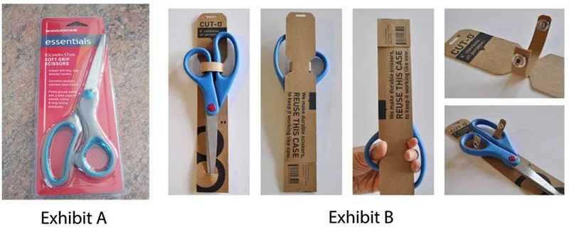
Say you need a new pair of scissors. Which would you choose? A or B?

If you picked A, then good luck dealing with Wrap Rage!
Wrap Rage - (n)
The anger and frustration arising from trying to open clamshell packaging, leading to cuts and blisters on one’s fingers.
But I’m sure you made the smart choice and picked B.
There is literally no difference between those two products. Both are your standard pairs.
So why B?
The choice is obvious. The relief from the nightmarish finger cuts of the former is only part of the answer. The main reason is the easy-to-use packaging style of the latter. Also, in the case of exhibit A, you know instantly that you need another pair of scissors to open up the packaging to your new one. Who wants that, right?
This is pretty much an everyday occurrence, I would say - having to choose between products that serve the same purpose, but are miles apart in terms of presentation and packaging.
Startups are finding it hard to make products that people will unquestionably choose over similar products from their competitors. Or in other words, products that sustain in the market. How many times have we witnessed great products not making the cut just because of their shabby design? Products face a sustenance-crisis because of bad design. So we now face the obvious question, “What can startups do to actually create products that are not just great, but great and appealing to users?”
The way I see it, design is much, much more than simple aesthetics. It is a language that speaks directly to consumers.
Design has the power to create images - either positive or negative - in people’s minds. This is what we call ‘first impressions’ and these are formed even before people begin using your product. By creating well-designed products you send a strong message to your customers, saying ‘trustworthy’. In general, you make them feel good about your product.
You can use design-thinking everywhere - websites, logos, product packaging, taglines, events - and I’m just naming the bare minimum. Rome wasn’t built in a day. You can’t jump headfirst into elaborate design lessons. However, there are a couple of things that you could do to adopt design-thinking.
I’m always pro-minimalist. If there is anything that I find ‘extra’, I remove it.
Strip down to the basics:
I know it sounds counter-intuitive. But all those extra features will only confuse your users. Don’t bog down your awesome product with unnecessary details.
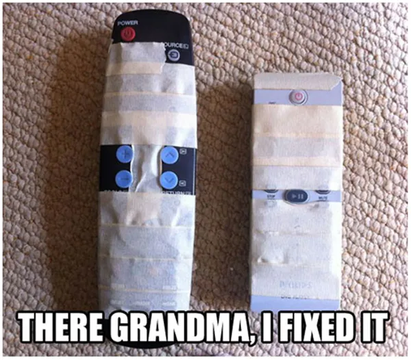
Keep it simple and keep it focused, a.k.a make it grandma-friendly. This picture right here shows you how many buttons we don’t use on a remote.

Another example is Instagram. Instagram had a precursor named Burbn, which was a terrible mess - it had check-ins, events, a points system, and lastly, photo posts. The guys who developed Instagram, Kevin Systrom and Mike Krieger, decided to kill some of the ‘extra’ features of the app, after consulting some heavy-duty analytics. They focused on the most important feature, photo-sharing, and released Instagram. The rest is history.
Yes, you might have to throw out some great idea for the sake of the product, and NO, it is not a bad thing to do so. If you strip away all that’s unnecessary, what you are left with is pure design.
And that makes a killer product.
Speaking of Instagram, the design process isn’t equivalent to applying filters to make the blemishes on your products just vanish.
Design doesn’t work like filters. It can’t be postponed till the end. On the contrary, it has to form the core.
Until a decade ago, kajal, common eye makeup for the average Indian woman, was available only in clunky and roughly shaped cones. This led to a lot of waste of product, and uneven application. Women didn’t like carrying it around, because it wasn’t easy to use.
But now it is available in pen/pencil format. This simple redesigning literally transformed the product. Needless to say, sales spiked, mainly through word of mouth. Women everywhere raved about it. Soon the kajal pen became one of the staples of ladies’ handbags.
I cannot stress this enough - simplicity and ease of use make for good designs. It is nearly impossible to achieve simplicity in the last stage of product creation. So stop treating it like the final decoration, a mere embellishment. Instead, begin with design.
Design is an unstoppable force. Convincing yourself that designing happens only once is a common mistake. You don’t stop using design after just one kickass product. No matter how well you think you have modeled your product, there is always a better way, a simpler way, to do things.
In fact, Tim Brown, CEO of IDEO, says that design-thinking doesn’t just make him a better designer - it makes him better at anything. In an interview, he spoke of applying ‘design-thinking’ to his life, like say, planning a dinner party.
Here’s what he says,
“I design that experience. I start thinking about how the food and the space work together, all the things that I naturally think about as a designer. That’s what design-thinking does for you. It’s a set of tools that allows you to approach life - particularly where it might be advantageous to solve a problem - differently.”
I think this is exactly what we startups need today. A paradigm shift that puts design-thinking in the core of our business. Figuring out the purpose for your company can be tricky and challenging. Often that purpose is lost in a myriad of distractions. In my humble opinion, design-thinking can take you there like a horse with blinders on.
So to summarize,
- Go minimalist.
- Don’t just decorate, design your product.
- Think, do, repeat.
I would urge startups in India to make design-thinking a part of their work culture, and believe in the design movement.
(Disclaimer: The views and opinions expressed in this article are those of the author and do not necessarily reflect the views of YourStory.)


