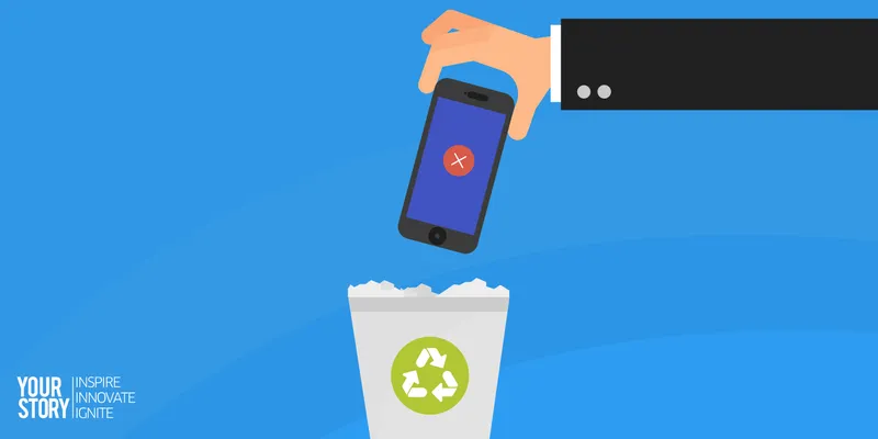
Here are 9 ways to ensure your mobile app doesn't end up in the trash in the first 3 days
Let’s cut to the chase and throw you into the deep end of the dilemma of app-penetration in India, beyond mere download numbers. Actually analysing how apps are faring in providing actual value and engagement, it does not look good — 25 percent of the apps downloaded are never even opened, and three out of four users uninstall an app in the first month itself. The app retention rates in the first 90 days are 20 percent, globally. It differs industry to industry — for example, you don’t book a flight ticket every day, so, the retention rate for travel apps is even lower. A content app, on the contrary, is slightly higher, but is it high enough?
These percentages are weak; so, even if you spend millions on marketing campaigns to acquire a million more users, your bucket remains leaky as you will still lose a large percentage of them. The simple and perhaps the only solution to this problem is, you have to try and engage with the users in the first couple of days in order to drive habitual users. At the Branch meetup in Mumbai, Yashwanth Reddy, VP Sales, MoEngage, talks about how to look beyond installs, and adopt the best practices to drive app retention among your users.

Construct the perfect aha! moment for the downloader
Have an excellent on-boarding process. Many apps have five to six screens explaining what the app does, etc., which is a faux pas. The discovery has already happened. So, ideally, one mustn’t bore users with information they already have. Do a benefits-based on-boarding process, and explain how the app adds value to the user. Explain your value proposition very clearly. You need to have one ‘aha’ moment — marking a ‘first’ for the consumer, like them making their first post, booking their first ride, etc., — and attach a sense of accomplishment to it, for the user. It even depends on where the users came from. If they come through a Facebook ad, you greet them with a thought bubble saying ‘Hi Kat!’ and then offer them a coupon exclusively meant for everyone who came through that particular Facebook campaign. Collect your data and bucket your installs to see which ones need to be incentivised. Another trick would be to ensure the landing page for the user is accurate. If the consumer sees a design on a Facebook ad, he does not want to be taken to the homepage, but the listing of that product directly.
Chat them up
Slack is a great example for apps that welcome the user in the cheekiest possible way — the slackbot, after all, seems nicer than a human being. The news portal Quartz’ iOS app also has a format, where it sends the user a series of messages in the messenger chat format to enlist its features, note down your preferences, and then goes on to prompt you with notifications to read its hot stories in the same chat format, making it very interactive and personal.
Don’t rain down on them with permissions
For iOS especially, there is a bunch of intrusive pop-ups right when the user downloads the app asking for several permissions — even before they get to use it. What works well instead is asking for permissions that are context relevant, as and when the user uses the feature. For example, show the dialog box seeking permission to access your contacts and calling application when your user wants to make a phone call from your food delivery app.
Have an activation goal set for your users
Give them a task or challenge that they must accomplish within the first few days of installation. What has been observed is that if the user ends up staying on at the end of a 14-day or 21-day period, it means, in all likelihood, that the user has developed a habit to use the app, and is much more likely to retain the app for the long haul. So, try and nudge them to use the app in the first few days — through push notifications, in-app prompts, etc. Be creative.
Don't T.M.I. them
If you are a news app, for example, your users do not want an information overload as soon as they install the app. So, ask them for their preferences at the very beginning — for example, the beats they track like sports, city, etc. —and then customise it for them.
Pick the right channel
Once the user has your app, pick the appropriate channel to nudge them and engage them. It’s all about engaging the user in your app — that’s the difference between in-app and push notifications. If you want to send an urgent message, a push notification is the way to go. If you want to send a content rich message, use email as the real estate on a push notification is limited. Opening and checking rates are much higher for push notifications compared to emails, though. To urge them to explore the entire property within your app, you may even use in-app recommendations — like banners and popups, but more native looking — which make for a good alternative to intrusive push notifications. Image-based push notifications have fared especially well in India, with 16-17 percent click-through rates. Android even allows sliders and action-based buttons on the notification, with deeplinks. For categories like travel and flight booking, the use-cases aren’t intent-led. So what the apps in the said category do is embed the share button on to the notification, enabling the user to just pass the message on without really opening the app. It’s like a referral in the notification itself.
Get the timing right
When is everyone in India most active? Obviously, festive season, because that also translates to the sale season. So, timing your awareness generating campaigns and coupling it with your best offers would reap the best results around these clusters of weeks that come by every two months. As far as daily communication with users is concerned, Flipkart would send push notifications in the morning first, assuming that people would use the app on their commutes to work. However, probing 60-65 million users for conversions revealed that people were way more active between 12pm and 4pm, as a lot of browsing also happens on the desktop once people get to work and are settling in. 6pm to 8pm is also when you notice a spike in the number of notifications on your phone, for the same reason.
Don’t paint them all with the same brush
Your users and their opinions of you aren’t homogeneous. One thing which is common across channels is that when you start segmenting your users — like your loyal users, new ones, recurring ones, and erratic ones — your conversions are bound to improve, rather than when you do broadcast mass bursts of messages to all your users at once. At this stage, the flip through rates for broadcast notifications for e-commerce sites are six to seven percent, content sites are three to four percent, and those for video or movie streaming sites are even lower, because the use cases are such. Segmentation is key here — taking the preferences checked by your users, personalising the messages as per location and timings, using their names, etc., help. For example, while targeting a customer who left a checkout halfway, sending a push notification with the product and leading them to exactly the point they left off at, is a good personalising strategy. Similarly, if you send them an email, make the subject line informal and personal.
Cross-channel targeting
You should device a cross-channel targeting strategy. Capture your data from every possible source — be it your app, mobile site or desktop. Having said that, never target a device, target a user. Frame your communication not just in a way that suits the medium; always keep the user and his demographics at the centre of your strategies. Understand their behaviours across devices, and understand their user journey. Conversions are 2x or more when you take a cross-channel approach. Send a push on day one, email reminder three days later, retarget through an ad five days further ahead. These are essentially low-hanging fruits — try and get them back.


