Learn in bites with Gurugram edtech startup Yoda's app, one smartphone screen at a time
Social learning startup Yoda's app employs ‘infobites’, in which text and images are woven together to explain anything within 20 seconds.
In the age of information overload and shrinking attention spans, a social learning platform aims to educate users about anything in the world within 20 seconds, one smartphone screen at a time.
Named after the legendary, diminutive Jedi Master in the Star Wars saga, the Yoda App employs what its founders call “infobites” — bite-sized information in which text and images are woven together to fit one app screen.
“Yoda App has created a new model of learning, which we dearly refer to as ‘infobites’,” says Amit Mishra, one of the four founders of the social learning startup.

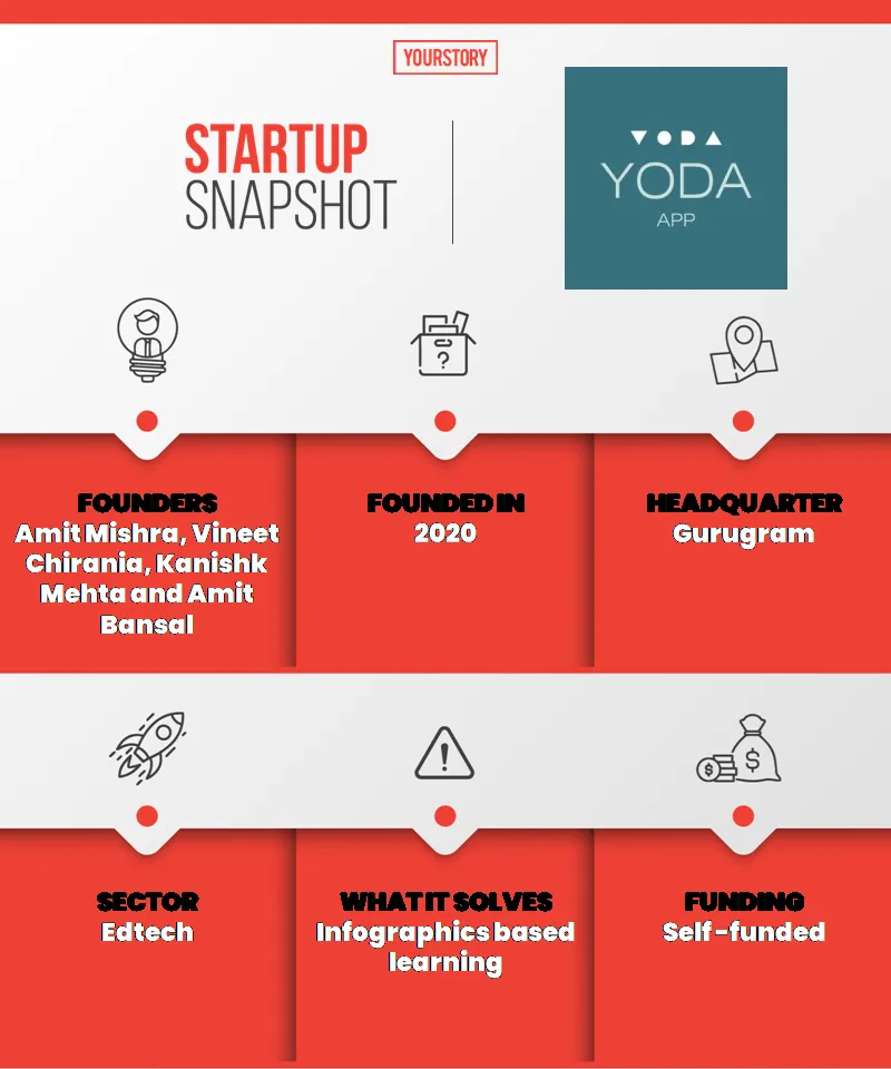
snapshot
The mix of text and images in an “infobite”, Amit says, helps a reader grasp the information quickly and easily.
“On the surface, the app works like an Instagram or TikTok,” he says. “However, we believe that an ‘infobite’ is a piece of art. In order to fully grasp it, one needs to immerse in it. That has been the thought driving our product philosophy.”
The Gurugram-based startup was founded last year by Amit Mishra, along with Vineet Chirania, Kanishk Mehta, and Amit Bansal.
On the app, students, working professionals, or anyone with a curious bent of mind can learn about topics as diverse as a sector-wise study of the world economy, funding stages of a startup, BCG’s magic quadrant correlating market share of companies with market growth, Sigmund Freud’s theory of the human psyche, and what it means to have been born in 1900. Many of the “infobites” also employ GIFs and animation.
Yoda has been downloaded 50,000 times since its beta release on August 16 last year, with an estimated 5,000 users logging on to the app every day to read a total of 135,000 “infobites”. Its community of 1,050 creators spread across five countries upload upwards of 120 “infobites” daily, say the founders.
The road to the app
Yoda’s founders set out to build the app with an aim of “de-institutionalising education”, says Amit Mishra.
But learning anything new is often time-consuming and boring. “We wanted to change that by building a social platform, where one can learn anything new in a crisp manner on their smartphones,” says Amit Mishra, a mechanical engineering graduate of IIT Roorkee, who did his MBA from NITIE Mumbai.
Amit Bansal graduated from NIT Kurukshetra and completed his MBA from NITIE Mumbai. Vineet is a graduate of IIT Roorkee and Kanishk an alumnus of IIM Ahmedabad.
Early on, the founders gained two key insights: Limited space leads to better content formation and visuals improve the speed of comprehension, making information more relevant to learners.
This led them to develop “infobites”, in which a creator presents information in visual form limited to one mobile screen of space. “That’s how the idea of visual learning evolved,” says Amit Mishra.
“This kind of content seems to be appealing to the natural behavioural tendencies of users,” says Vineet. “By the time they begin to get bored with the content they are seeing, they have almost consumed it and are on to the next exciting creative, curated to their liking.”
There are several successful informational social network platforms such as Quora, Reddit, and YouTube, but Yoda's founders claim these platforms do not combine bite-sized information with visuals effectively.
In relation, they cite the average user’s consumption of 35 “infobites” a session on the Yoda app, compared to 2.2 questions a session on Quora.
Getting the visuals right
Prior to launching the app, Yoda’s founders sought to find out whether anyone could create world-class visually rich content.
They did not want to create content in-house as it would be difficult to scale. The intention was to democratise the process so that anyone could upload content on Yoda.
To test if this would work, the founders floated a competition on the global platform and received more than 100 submissions, with many of the participants coming from non-design backgrounds.
“They were creating mind-blowing ‘infobites’,” says Amit Bansal.
He cites the entry of a girl from Lucknow who explained the concept of golden ratio — its origin, utility, along with visual examples — within the space of a mobile screen.
“Basically, she made it possible for anyone to understand an advanced mathematical concept in 30 seconds,” he says. “These early trials were a big morale booster.”
Since the app’s launch, the founders continue to focus on the quality of “infobites” through well-designed visuals.
“The trickiest part is to bring the right kind of content on the platform,” says Amit Bansal. “Users come to Yoda to gain some information in an interesting way. For them to be satisfied, the ‘infobites’ have to be well- designed.”
To improve the quality of content, weekly workshops are held for Yoda’s creator community, covering topics such as information designing, Canva crash course, and “infobite” basics, he says.
In fact, due to platforms such as Canva that have democratised designing to a reasonable degree, it was easy for Yoda’s founders to get creators on board.
How the app works
On the app, users can select their preferred category to see fully personalised content. The artificial intelligence-driven feed creates preferences based on users’ category preferences.
Users can like, share, or bookmark posts they find interesting. The feed keeps track of all activities on the app to ensure users are served relevant and personalised content.
Since the beta launch, the app has acquired more than 60,000 users and the founders are now targeting 5-10 million users in the next 18 months.
The app has garnered seven million lesson views so far, with about 70 percent of these coming in the last 28 days, say the founders. Another encouraging sign is that the app has been rated 4.6 out of 5 in 700-plus reviews on Google Play.
Growth strategies
Yoda’s founders, who invested a total of Rs 50 lakh in the venture, are currently focused on achieving critical mass on the app, after which they plan to allow ads on the platform.
“We are not monetising at the moment,” says Amit Mishra. “For the next 12 months, our focus is on creating a habit-forming product.”
The app’s user base is currently growing at 33 percent week-on-week.
Among the monetisation options the founders say they would consider in the future are launching premium content and contextual commerce.
On the product side, they are planning to invest in an advanced AI-driven personalisation engine, image meta-search, and features that would help users socialise with each other. They are also keen on investing in new formats that they can bring to the app.

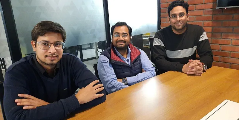
Yoda App founders
Yoda is also looking to expand its content range and network of creators. The startup plans to increase its creator community from the current 1,050 to 200,000 in two years.
“Eventually, we would like to organise all of the information of our world in visual form on Yoda,” says Vineet. “That is our long-term goal.”
Edited by Lena Saha


