

This is a user generated content for MyStory, a YourStory initiative to enable its community to contribute and have their voices heard. The views and writings here reflect that of the author and not of YourStory.
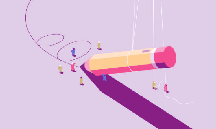
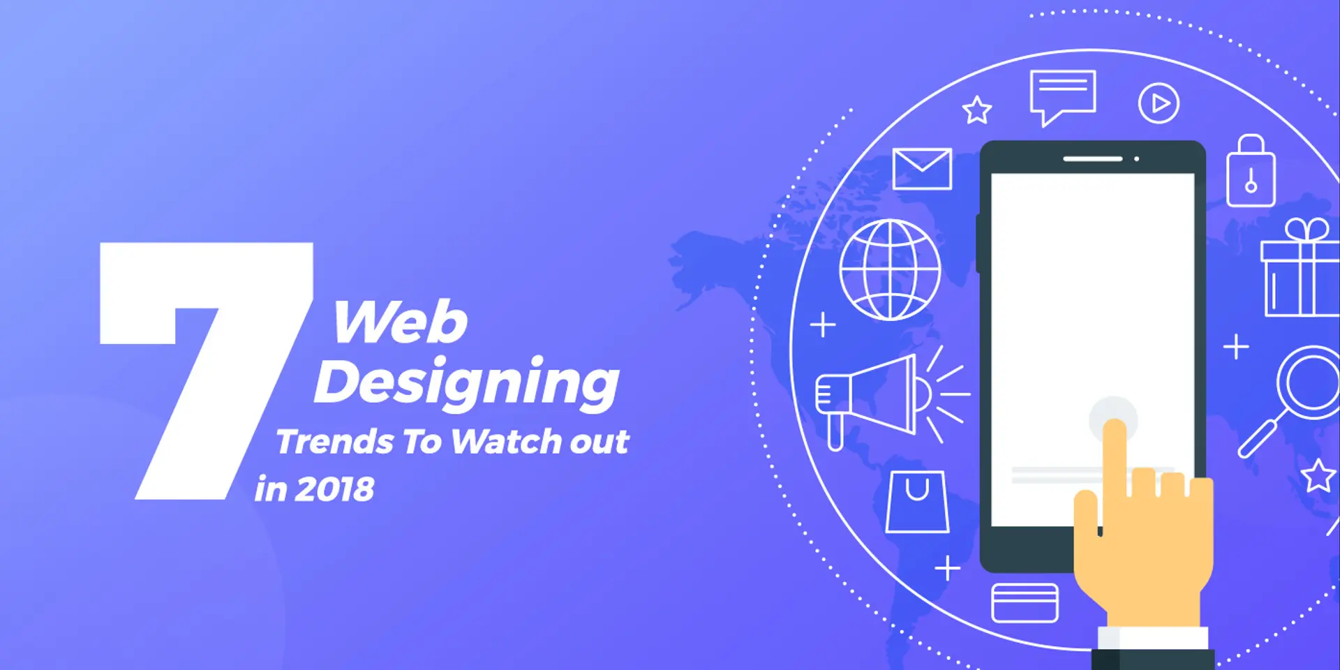
7 web designing trends to watch out in 2018
The web design trends are continually developing and changing so, to help you get ready for your 2018 strategy.

This is a user generated content for MyStory, a YourStory initiative to enable its community to contribute and have their voices heard. The views and writings here reflect that of the author and not of YourStory.

Web designing is something which is continuously changing its pattern from time to time. It follows a particular evolution cycle which requires some inspiration. Anything which is new today can become old-fashioned and outdated overnight. The world of web designing is changing so fast and also, the trends that this industry follows is frequently changing.
To remain updated with the latest trends in the web designing we need to keep an eye on others works. This is not a path which we can travel on our own. We have to look other's work to get inspired and design better web pages.
Unlike a few years ago today's website is fancier and includes lots and lots of plugins. Such plugins not only make the website a lot heavier but also makes it dependent in some cases. Unless the plug-ins are developed by the designer itself, it recommended not to use third-party plug-ins a lot. The reason behind such a trend is the demand of the customer. The designer has no choice but to fulfill the customers need and design website as they demand.
Below mentioned 7 trends that are trending in 2018-19:
1. Brutalism

Image Source: Envato
Brutalism in website designing means using Bold fonts and harsh colors on the website. This is not necessarily true for every Brutalist website but, most of the time it holds true.
For example, Instagram's new logo features the neon colors used in the early 90s which can be classified as brutalist. In short, Brutalist is a design which directly attacks our eyes. The websites with bright and halogen colors followed by a Bold and sharp typography can be considered as a Brutalist design.
2. Responsive Components

The concept of responsive web design was first brought by Ethan Marcotte eight years ago. Today it is such a huge business that people have started hiring the companies or freelancers who can particularly design responsive websites.
There are various technologies and techniques available through which anyone can design responsive websites. Default CSS plugins and Element queries have made this task quite convenient.
3. Device Specific Micro-interactions
With the increase in the use of mobile devices like smartphones and tablets the need to design mobile-specific websites can get into the picture. Earlier when tools were insufficient, it was a huge task for web designers to design mobile site.
Today, because of various supporting tools developer can simultaneously design Desktop and mobile sites. Also because of default JavaScript plug-ins, we can add mobile-specific gestures to the website.
4. Split-Screen Design

Image Source – UX Planet
The split-screen design is one of the latest concepts of designing responsive websites. Split-screen is used in websites where the customer needs to see the variety of products the seller sells or to compare two products on a single page.
Split-screen is majorly used to ease the task of visitor and provide them direct information on the things they want. Split-screen design should include Vibrant and contrasting colors. Typography should be clear, and the usage of white space should be appropriate. Overall the design should be bold and catchy.
5. Reactive Animations
Nowadays the majority of the websites include some animation or human interactions. Designing websites affecting humanly is one of the latest trends among all websites and mobile apps. The reason behind Apple's iOS's success is its interactive and humanly design.
The gestures, textures, and animations included in iOS make its user feel nearer to humans. This is something that attracts humans a lot.
6. Refreshing Card Based Interfaces

Image Source- TopCSSGallery
Cards are the best way to display more information in small pieces. Cards can provide all the necessary information to the user and that too in an interactive manner. Cards are also a good substitute for mobile sites.
This type of design has been trending for few months. Cards will make our website rich in micro-instructions. Cards are the majority of the websites which are information dominating.
7. Large Screen Design
Because of the increasing user base in mobile devices, people have forgotten to design websites which are also suitable for large screens. We cannot ignore the users who still prefer large screens to view websites.
Hence, our website should be scalable as far as screen size is concerned. It should look beautiful on both Large screen and small screens like Mobile phones and tablets.
Conclusion
From this, we can conclude that ideas don't come as easily as we expect. We have to continuously look around, Observe websites if needed also appreciate it. Do anything and everything that can keep designs in trend. If we are not well versed in the trends and changes that are occurring over time, it won't take too long for us to get out of trend. That is why it is always good to follow the designer who designs better than us and is following the trend in every website designed.
Following new trend is one thing, but a good designer never forgets what default in websites is. Every designer has to follow certain traditions, and in addition to that, they have to stay in trend. No trend or website should harm the regular functionality of the website.
Heavy images or graphics might add value to our website, but because of it, website loading problems should not occur. Sometimes problems occur when the user is not using the latest browser. Even in those cases, our website should open even though its design is in trend. The following trend should also not affect the readability of the content present on the website as well as the clarity of images.