
Creating the right value proposition, cementing the correct business model, putting together a driven team, securing funding, and perfecting the product or service are just some of the many challenges faced by startups.
Of course, the biggest challenge for startups is to attract and retain as many customers as they can, and that is where a startup’s visual identity plays a vital role. With the right and unique visual identity for your brand, you are able to make better your products easily recognisable.
But branding isn’t about investing a lot of money; it’s about creating a consistent visual identity for both print and offline promotions. When you are struggling to use every part of your startup’s funding efficiently, there is no need to hire big design and marketing teams just for branding because you can create a unique visual identity for free using simple online design tools.
From Raw Pressery to Frooti, here are five startups and established brands in India that are nailing their visual identity:
1- Frooti
Giving a new twist to everyone’s favourite mango drink, the brand decided to change their visual identity with the help of Sagmeister & Walsh, as they entered the social media space. While Frooti changed their logo, the packaging still resembles old 90’s bottles because of their signature yellow colour.

Source: https://www.underconsideration.com/brandnew/archives/new_logo_packaging_and_brand_campaign_for_frooti_by_pentagram_and_sagmeister_walsh.php
Frooti’s Instagram page follows a specific colour scheme which includes purple, orange, green, and of course, yellow.

The brand adds Frooti bottles as real-life objects in pictures, which is want makes their posts unique.

The retro brand which was rather late to arrive on social media platforms has been able to gain millions of followers because of their enticing and unique visual identity.
What startups can learn from Frooti: While you may feel inclined to stick with the same old formula that has worked for tens of years, giving a modern twist can take your brand several miles ahead.
2- Zomato
The restaurant review website which recently started offering food delivery services has been one of the very few well-known brands that boldly changes their logo regularly -- Even twice in three months sometimes.

To get maximum attraction from every social media platform, Zomato uses Facebook and Instagram very differently. While the brand uses Facebook to post illustrations and offers, Instagram is used to share pictures of scrumptious food.

In fact, the pictures on Instagram have the same filter, which leads to a more uniform feed.

Recently, Zomato put forward a series of billboards to advertise their food delivery services. The billboards are simple, straightforward, connect with the Indian audience and have Zomato’s unique branding with its signature brand colour.

What startups can learn from Zomato: Changing logos won’t alienate your customers, as long as you stick to the same colour scheme and brand identity.
3- Paperboat
The beverage brand with classic Indian flavours, Paperboat’s branding and visual identity, has always been about simplicity and nostalgia which is also in line with the brand’s slogan - “drinks and memories.” Their product packaging includes white coloured bottles with bright colours that reflect the flavours of every drink.

Incorporating the same bright coloured theme to their Instagram page, all posts either include the Paperboat logo or text in Paperboat’s signature typography. Instead of using their products in every post and making their feed repetitive, the brand uses actual paper boats in the most creative way possible, just like Frooti uses mangoes instead of actual Frooti bottles.

Paperboat uses Facebook a little differently by sharing fun and nostalgic Indian comic illustrations that drive engagement and also fall entirely in line with the brand’s overall visual identity.

What startups can learn from Paperboat: Instead of posting the same pictures on every social media platform, approach each one of them differently.
4. Raw Pressery
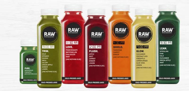
Another beverage brand, Raw Pressery offers healthy fresh cold juices, smoothies, and soups with no preservatives or added sugar. Their target audience includes health conscious people or the ones hoping to change their lifestyle for good.
Raw Pressery’s visual identity focuses on honesty and candidness, and that is quite visible in their product packaging clear bottles and a simple brand logo. To reinforce brand’s idea of honesty, all their ingredients are also mentioned right below the logo.

The brand supports healthy lifestyle on their Instagram page by posting pictures filled with vegetables, fruits, and of course, the Raw Pressery products.

Instead of following a specific colour scheme, Raw Pressery follows the colour scheme of their products for Facebook posts. The taglines for these posts start the same to maintain uniformity.

What startups can learn from Raw Pressery: Your brand doesn’t always need a specific colour scheme, make your products the focus and change your colour scheme according to them.
5- Ustraa
One of the first brands to offer men’s beard grooming products in India, Ustraa’s strategy has always been to embrace masculinity. The first step towards that was choosing the brand name and logo as an ‘ustraa’ -- An age-old grooming product used by men.
When it came to their product packaging, the brand decided to forgo flashy graphics and put the focus on the font instead.

Ustraa’s Instagram page is a combination of customer-generated content and relatable posts with pictures of their products. By urging customers to share their beard pictures along with Ustraa products and a specific hashtag, the brand is able to gain more popularity and drive engagement as well.

What startups can learn from Ustraa: When you put font as the focus of your products, the same visual strategy can be carried on to your social media platforms, and it can be just as successful.
Are you ready to take your startup to the next level by creating a unique visual identity?


