
Role of Branding Color: The color Psychology
When the brand color thing comes, You should always choose the attractive and effective color combination because this impacts on how your customers perceive your business. Branding and advertising through logos have experienced a enormous transformation-a look at some renowned brands ancient and existing logos is enough to give one an idea of the magnitude of this transition. Graphic design businesses are now capitalizing on many significant variables that impact buyers decision-making processes. These variables include the colors used together with the smart design of the logo.

Why we focus on the brand color?
The reason behind the brand color, the color psychology work here. Every color has its own meaning and we should always take care of this, chose the right color of your brand. Color psychology play main role in branding, because of this every color put impact differently on customers, so branding colors matter how to build strong emotional connection with your customers. You can't not tell your company story in your logo but with the help of colors you can reach straight to your client's hearts.
The colors used in a brand logo play a major part in how that specific brand is projected on the market and how it accepted by the target audience.
Business employ graphic designer's services to design their logos- these logos should be an appropriate expansion of the identity and philosophy of their brand.
Emotional connection of each color
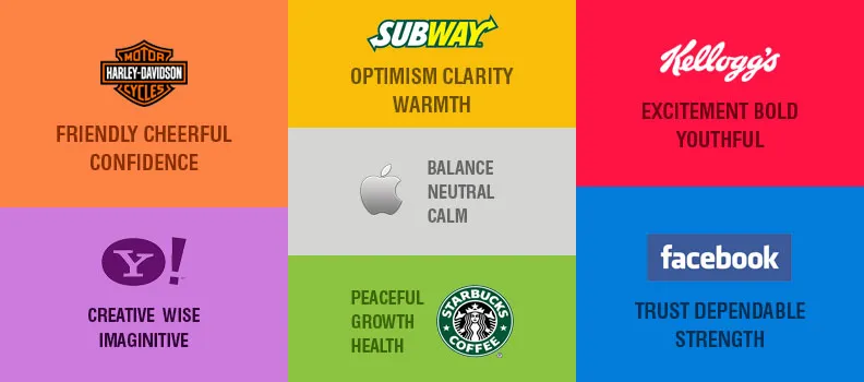
Let's come on color's meaning and emotional connection then here some color's meaning with their significance.
Branding a product or service through creative graphics is an efficient way to affect purchasing decisions; a survey carried out to study the impact of colors on clients when purchasing a product disclosed that 93 percent of clients concentrated on the product's visual appearance.
Businesses use different colors and color schemes in their logos to create targeting extremely specific; below are some examples of the same-Red-often used by fast food chains and during sales as it impacts human appetite and stimulates focus and energy.
Blue-Creates a feeling of tranquility, safety and confidence; predominantly used in conservative offices and corporate brands.
Green-often associated with nature, health, money and peace; used to produce a feeling of tranquility and environmental causes.
Purple-It is an imaginative and respectful brand; often used for products of beauty.
Orange / Yellow-Used to attract both impulsive buyers and window shoppers as these colors generate a feeling of joy and optimism.
Black-Used as a power and intelligence symbol; used by IT businesses.
Grey-Neutral color, creating a feeling of timelessness and practicality.
White-Generates a feeling of purity, safety and creativity as it acts as a clean slate.
Red -The meaning of red It evokes feelings of warmth, excitement, passion, love.

Designers at graphic design firms change the contrast and color scheme to better engage consumers and clients. They use:
Contrast to attract the attention of customers as well as to decrease the eye strain, complementary color to concentrate on fields that have data for user to read.Vibrancy to project the emotion of any graphic design. Bright hues to evoke a reaction from users,Neutral colors to assist consumers better process data in the event of data-heavy products.
With the proper use of colors, Designer can achieve a lot for business. To find out more about Graphic designing tactics best institute for graphic designing course in delhi.


