


Interesting Logo Design Tips that You Won’t Find Elsewhere
Practical Logo Design Tips Guide

Logo designing demands sheer creativity and originality with a pumping desire to develop beguiling and insightful logos. Creativity is an attitude that requires inspiration from within and around. Designers comprehend patterns and sequences around them and add their individualistic style to the design. Sometimes, however, even the most creative people lack ideas.
This article provides practical yet exciting tips to help designers develop the most creative logos in the world!
Study the Brand
Every brand has a vision and represents an ideology. For example, Coca-Cola advertisements are fun-filled and energetic. Its logo must have a tinge of excitement to resonate with the brand.
Tip: Write down the first three things that come to your mind when you think of the brand. It will develop a practical approach to the designing process.
For example, when I hear McDonald’s, I think of a Happy Meal. When I hear Baskin Robins, I am unconsciously choosing a flavor from their extensive range.
Visit Popular Design Websites
Every designer has a specific designing style, such as using bright colors or avoiding text. An analysis of your portfolio will identify the repetitive patterns in your designs.
Visiting different design websites will widen your horizons. It will stimulate creativity and expose you to different unique ideas that you had not thought of otherwise.
Tip: 99 designs, Logojoy, Logo Design Genius and Logaster are your key to creativity.
Start with a Sketch
Finalizing the font, color and other aspects take time. Instead of looking for closure to each element before moving to another, work simultaneously.
Draw the logo on a paper or write down the elements. It will help you move forward with the designing process.
Tip: Sketch on a paper and doodle around. A simple logo will transform into an artistic one without any conscious effort at creativity.
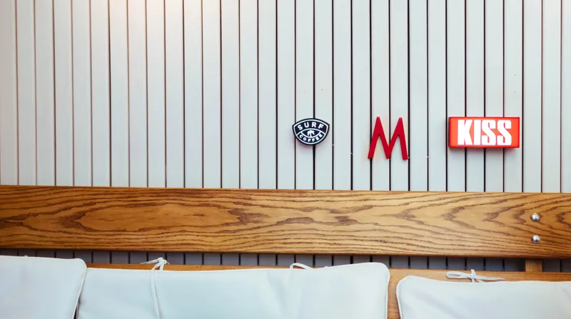
Befriend Simplicity
Simplicity is often beneficial. For example, multinational brands like Hp, Dell, Gap, Nike, Apple, and others have simple logos. Basic shapes and simple designs communicate the message clearly and efficiently.
It’s okay to have a definite shape, simple text, or a monochrome logo like to Adidas, Samsung or Facebook.
Tip: Don’t add extra items to garnish the logo. The logo shrinks when used on products, and the details will go unnoticed anyway.
Get Familiar with Designing Software
Every software has a different strength. Some are better for text-based logos with extensive font styles, and some are better for making different shapes and icons.
Tip: Make a logo that includes text and shapes in different software. It will help you in understanding which software works well for which element.
Avoid Templates
Logos are graphical identities of brands and must be different and unique. A logo must remind people of another brand or another logo. Instead, it should be unconscious and a quick reminder of the brand it represents.
Tip: Avoid using templates. Thousands have access to the sample templates which increases chances of resemblance.
Develop a Black and White Logo
Deciding on the color is time-consuming. The chances are that you would like the logo in more than one color which is distracting. Instead, develop the logo in black and white, and add the colors later.
Tip: Once the logo completes, think if you need to add colors. Some exceptional logos are in black like that of Chanel, Gucci, Uber, and others.
Choose the Font Carefully
Like colors, fonts are also difficult to choose. An initial study of the brand will help in selecting an effective font.
For example, Coca-Cola has a stylish font reflecting its exhilarating brand aura while Mastercard’s logo is a plain font highlighting the simplicity of the brand.
Tip: Shortlist and categorize popular fonts for yourself. It will make it easier to choose and save your time and efforts.
Do Not Limit the Logo
A company is likely to diversify its business in the future. Therefore, logos must not be product-specific. For example, using a burger for a food chain will hinder the inclusion of deserts.
Tip: Never include products in the logo, like doughnuts, mobile phones, or watches.
Take a Break When Needed
Often the workload and pressure lead to a lack of creativity. Usually, we try hard to be innovative but struggle with creative ideas. If you are stuck and your mind is revolving around the same concepts, take a break!
Tip: Go to your favorite café and grab a cup of coffee or take a day off and stay in bed. Remember, creativity is not enforceable!
Choose the Spaces Carefully
Too much of negative space or no negative space at all are both terrible ideas. Look for appropriating and meaningful spacing between the letters and shapes.
Tip: Take inspiration from FedEx and NBC.
These tips will take your designing to a whole new level. It’s time to design differently!


![[Covid Alert] : How Rentals And PG Have Been Impacted By Pandemic](https://images.yourstory.com/cs/1/b3c1ad06ab5e11e88691f70342131e20/renthouse73089751-5bfc333346e0fb002602ddbe-1595396631816.jpg?mode=crop&crop=faces&ar=1%3A1&format=auto&w=3840&q=75)