Product Ka Movie Script Kaun? The Design Document!
Founders of startups are like film directors.
They come up with a great idea and story line (vision and product roadmap). They convinced a good producer (VC) to invest in the film. They put together a great cast and crew (your team). They know that ‘yeh picture toh multiplex me hi chalegi’ (target audience).
Diwali release plan kiya hai, bumper opening weekend hogi - all across India! (launch and distribution).
All’s ready. Everyone’s primed for action to start shooting.
But where’s the damn script?
Oh, it’s still getting finalized, let’s start making the movie and we’ll develop it along the way.
For technology products, the design document is the movie script. When done right, it has enough information for your product architecture to be designed well, development teams to get a sense of what they are working towards, marketing to feature in their collateral and business guys to include in

their pitches to partners, clients and investors.Unfortunately, many products are planned like a typical Bollywood movie. Work starts off much before the script is ready. Everyone ideates around the script and story line so much that the first product version looks nothing like the idea it started with.
To add spice, the director asks for an item number (animations, fancy graphics).
The 1.0 product is launched with a lot of marketing fanfare to grab the audience attention (user base). Good ideas are pushed back to a 2.0 release due to bad planning. (movie sequel, if the first one is a hit)
In India, there is much confusion about how to work with designers. People see design as something magical and awesome (everyone wants to believe they have Steve Jobs’ taste, right?). But how do you get there?
Now, design is a huge space. There are multiple elements that need to come together to make good design.
I am not a UX designer. I am not going to talk about what good design is.
I want to focus on what development team/product managers should know while working with designers.
This is a two part series.
In the first part, I’ll discuss some common issues we have while working with design.
In the second, I’ll illustrate some phases that a typical development and design process goes through, and special aspects of mobile design.
Common issues when working with design - ‘Iske jaisa banao’ specification
Bollywood is full of movies that are rehashes of others. You get the feeling that the director’s formula was just ‘inspired’ by previous super hit movies.
Many products are made in a similar vein. The founder/product manager picks a template, researches a few successful product and tells the designer – build a similar one for me.
Looking through other design sites for reference is an excellent idea, but not when the specification stops there.
That’s one reason we have so many me-too products. Founders are unable to articulate what’s unique in their product or vision that should make the product stand out. If they are schooled only in engineering, design seems best left to an expert. But even the most talented designer will need a good product brief to design a great experience.
One tip here: Work on your marketing story or headline before you speak to the designer. Talk about what the product has to achieve, and give him/her leeway to think through how it should work. Design takes time and effort, yours included.
The better, and earlier, you articulate the idea, the more time the designer has to understand the scope, utility and come up with design ideas you can iterate with.
‘Arre, usko pasand kyun nahi aayega?’ bias
You believe you know the consumer, right? If the product looks right to you, it should be ok for your consumers.
Maybe not.
You view the product with a lens based your knowledge base and personal history. But consumers look at your product very differently.
I remember when I first experienced a shock to realize that people were confused about something that I always assumed as being ‘obvious’.
In an earlier market-facing role, I was helping close a sale of a navigation device at a stall in an auto exhibition. We had convinced the user to purchase the product, but unfortunately, the swipe machine was out of order.
Well, we thought, we have a data card. Why not ask him to pay online through the website. We pulled a laptop and data card and sat him down to enter his details.
The consumer had received his credit card not very long before that, and had not conducted any online transactions.
He entered his details in the site, and finally came to the part where he had to enter his credit card information. Due to this being the first online transaction, he had to set up his verification password.
We stepped away from the screen, as it seemed a trivial enough task. He could have his privacy in choosing a password and then just complete the transaction (that would also leave us free to focus on new customers once the sale was closed!)

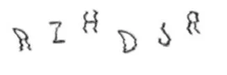
He struggled for a while and then finally called me to help. “What do I type here?” he said, pointing to a captcha. “I trying typing it twice but it said I entered it wrong.”Turns out that he kept entering the characters displayed along with the spaces between them!
Was it obvious that he just had to type the characters? Not to him.
One way of trying to mitigate this is to build user persona.
A user persona is a fictional representative of a key user, his likes, and lifestyle and how he would use the product. You could start with defining these details:
* Who will be using the product? - Age, sex, profile, etc.
* What are they using it for? Key need for this user
* Where are they using it? - On a mobile, on the desktop or tablet, etc.
* When will they use your product? - In office before a deadline, at home when they are relaxed, etc.
You can have one or many persona who interact with your product.Say you’re building a marketing analysis tool. Your user persona could be:
Satish, 32, is a brand manager with a multi-national FMCG. He looks after a leading hair care brand - currently the no. 2 player in urban India - and is constantly looking to be the number 1 in his market. Satish is an extrovert: gregarious and loves spending time with people. As part of his job, he regularly needs to present updates on marketing campaigns to his boss when a new web campaign is launched. He also sends a monthly report on web marketing effectiveness to his sales team. His company has a BYOD policy, and he reads and responds to email on his laptop, and often on his smartphone.
This is a rough sketch, but this helps your design team visualize an end user and plan their design accordingly. (Hey, marketing folks: this is similar to your marketing profile. We’re talking about the same target audience after all!)
It also gives you a fresh viewpoint when you analyze the design –‘would Satish find your design good’ instead of ‘do you find the product good’?
You can also specify the why part of your product to give more detail to the UX designer.
* Why will Satish use your product? - Your secret sauce that he will see value in!
This will help them focus on key attributes and presentation.
For example, you may find that Satish loves a design where he can pull a good chart from the web and include it into a presentation that he sends to his boss.
Better still might be a solution that automatically creates a pdf with charts that he can send his boss.
Later in the process, you can verify your assumptions through usability testing.
The ‘parampara’ bias
This one starts with - but this is not how we do things here…..in my opinion, we should …
Sounds a lot like ‘hamare khandaan me aisa nahi hota…’, right? J
Leave your khandaani mindset out if you want a radically new design.
We’ve gotten so far with a filmimetaphor (ok, it’s actually a simile). Good user experience and design deals with visual metaphors, existing behaviors and customer psychology. (In fact, skeuomorphism is also based on visual metaphors. Will Apple finally move away from it? I hope so!) Here’s an interesting take on metaphors and user design.
It’s vastly removed from the analytical left-brained thinking we are used to as engineers or business folks. It also evokes strong emotions that ultimately help sell your product.
Spend time on thinking through what you want your design to do. It’s what your users spend most time with.
Let me know your opinions and thoughts in comments below or at @shrinathv.
Note: all views are personal.


