Best Mobile UI Practices for developers
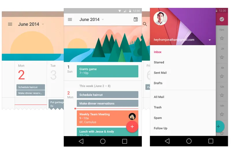
In the new world where there is an app for everything, design can make or break your app. No matter how sophisticated your app is, the ability to respond intuitively to user actions and needs is what truly sets it apart. A great Mobile UI design is one in which users rarely need to look at help files to figure out how the app works. This has been a recurring theme of Google I/O 2014 as well - building apps that respond to the natural human thought process. Hence, here arises a big challenge for developers - to develop an app that not only has brilliant functionalities but most importantly looks and feels beautiful to work with. At I/O 2014, Google gave Android design a major overhaul. Android has lagged behind iOS in design but is catching up really fast and can deliver much superior experience to its users over time.
Android developers and enthusiasts met up on a bright Saturday morning to discuss UI design and best practices. With all the buzz surrounding Google I/O, vibrant discussions on material design and the new Android L further livened up the atmosphere.
Rohit Bhat, designer at Moengage, a mobile engagement platform and also one of the designers of Savezippy, a Google play store featured app with more than 100,000 downloads, shared “Good design is something that is intuitive and easy to use”, in his opening statement. Keeping up with the recently released Material Design and Android L during Google I/O 2014, emphasis was placed on key design functionalities an Android developer should include in the app. According to Rohit, various UI features in the app could decide whether or not it gets featured on the Play Store.

Rohit also touched upon the importance of scaling the UI elements of your design and understanding how to scale assets from one density to another.
"Android devices have progressed from low density, LDPI, all the way to extra high density, XHDPI. Hence, it is crucial to design UI elements according to the mobile device density you are dealing with. This has changed how we interact with software. Mobile has made people interact with software physically and thus the design approach should change too. That is why Google has adopted material design approach which will give one unified experience across devices and forms."

The material design follows the paper and ink principal. Transitions and physics of user experience simulates paper and ink. The way ink flows on paper and how a stack of paper behaves, has been the fundamental starting point for the new design. The use of the newly introduced floating action buttons and intuitive, natural surfaces was also extensively discussed. Finally, a brief explanation of critical do's and don'ts with regards to UI designs summarized the talk.
Amol Gupta, an Android Developer at Redbus with over 10 apps to his credit, shared about how UI design can affect your conversions. Amol started with explaining the importance of identifying your user before designing the UI for your app. He then proceeded to talk about tweaking several UI features within your app to improve conversions. This included various action and navigation functionalities as well as the launch mode used for the app. He stressed heavily on the importance of continuously analyzing data on how users are using your app. Redbus being the leader, has constantly shown the way to other startups and companies the importance of simple and minimalistic design. Redbus continuously tracks each and every interaction of users and determines relevance of each UI element. Everything is data driven and intense A/B tests drive decisions at redbus.
"Since developing on Android is an arduous task where you have to take care of several form factors, it is crucial to use the right analytics tool to gauge user satisfaction. This could include either a system of direct feedback from users or the utilization of tools like heat maps and screen shots", he concluded.
Gone are the days when apps were developed without user experience at the forefront. A bad UI design can lead to user frustration, as the UI does not provide the information they need or react as expected. So if you have developed a wonderful app that has the possibility of catering to a large user base, just take that essential step and perk up your UI.
Which Indian apps do you think have the best UI? Share in the comments below.


