How to create the perfect pricing page that converts
There are three stages in a buyer's journey -- awareness, consideration, and decision. The pricing page falls under the third category, that is, a potential customer lands on it when they've realised that your product or service offers a solution to their problem and they're ready to buy it. Most marketers think that at this stage, leads have already made the decision to buy and no effort is required to convert them to customers. But this is a false assumption. If the pricing page doesn't effectively convince prospective customers to make a purchase, they won't hesitate from going with another option; there is no shortage of competitors after all. Designing a pricing page that converts, therefore, is vital for converting a lead into a paying customer, and here's how you should go about creating one:

Image : shutterstock
Keep it simple
Simplicity is key while designing a pricing page. A page that overloads customers with information will only dissuade them from reading it and taking the desired action. The design should be pleasing to look at and the copy should get the message across in as few words as possible. Also, restrict the number of options you present to the customer (say a maximum of four). Customers should find a pricing page easy to skim through and make a decision in as little time as possible.
Make comparing easy
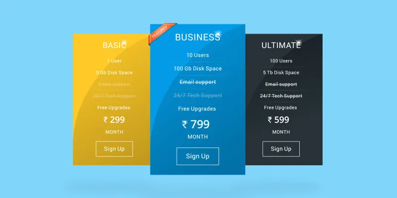
When you present customers with the different pricing plans, the benefits each plan offers should be clear. Use icons or short bullet points that illustrate the difference between each plan so that customers know why they should, or shouldn't, select a particular option. People don't always know what they want unless they see it. Keep that in mind while writing the benefits of each plan.
Help them choose
A good pricing page makes it as easy as possible for a customer to choose a plan. Highlighting the most popular plan is a must as people will use that for reference while comparing the other plans. It's also a good idea to offer a free trial period for all plans as customers can gain a first-hand experience of using them and decide which one best serves their purpose.
Use the psychology of pricing
Ever wondered why some products are priced Rs 1000 while others are Rs 999? This is an age-old trick used by retailers and businesses to entice customers into making a purchase. The best way to sell a product that costs say Rs 500 is to place it next to one that costs Rs 10000 as it makes the customer think they're selecting the more budget-friendly option. The psychology of pricing, as this practice is called, is essential to maximise conversions on a pricing page. But its implementation is different for each business and it requires thorough research to zero in on the perfect strategy.
Clear and enticing call-to-action
A simple ‘buy now’ rarely suffices when it comes to calls-to-action. A CTA should entice the customer into making a purchase without seeming too pushy. Also, each plan should clearly display its own CTA to make it easier for customers to buy a plan once they've made their choice. If a visitor has to search for the purchase option on a pricing page, it gives them more time to change their mind and leave the page.
Allay the customer's fears
Making people spend money is never an easy task. They'll always look for an excuse to not part with their hard-earned money which makes it important to reassure them that they are making the right choice. Displaying a clear money-back guarantee, customer/client testimonials, and FAQs instil confidence in potential customers who will then be more likely to make a purchase on your site.
The type of pricing page you create will depend on the product or service your business offers. If you need some inspiration, go through these excellent examples curated by HubSpot to see what a good pricing page looks like.


