

This is a user generated content for MyStory, a YourStory initiative to enable its community to contribute and have their voices heard. The views and writings here reflect that of the author and not of YourStory.

How To Create Good Web Design With Example 2020
Win business, and audiences with good web design.

This is a user generated content for MyStory, a YourStory initiative to enable its community to contribute and have their voices heard. The views and writings here reflect that of the author and not of YourStory.
Web Design is one of the most important skills to have in 2020. After the huge number of offline businesses getting annihilated, Due to the outbreak of Covid-19.
The opportunities for web designers are now flourishing. If you are new to this industry and want to learn this art. Stick with me and I'll share with you How To Create Good Web Design With Example.
Even 40,000 years ago hunter-gatherers put more effort into making their cave painting look good; Rather than putting out more meaningful information. Human tendencies to create beauty withstand logic.
A study suggests that recruiters have a tendency to favor those portfolios that look good with the UI. Their assumption is if the website looks good from the outside then the code also must be very solid.
I know this may sound ludicrous. But this is how we make choices. When you go for groceries what items do you pick, the one with good packing or the bad one?
Even though bad packaging may have good taste. Our neurological system does not allow us to choose something that is unpleasant for our brain.
In this article, I have shared with you how to win your audience with good web design. The article is constructed in a checklist manner; So you could take action accordingly. This is not a psychology blog, But I have shared with you many secrets that psychologist uses to manipulate even the toughest of mental disturbance case.
I know the opening of the article may sound a bit off-topic. And if I am being honest it is. The hardest thing for a painter is to stare at a blank canvas. For writer onto a blank screen with cursor blinking. But this is the hardest part of any task. That is to start work and introduce your attention.
The same is with learning any new thing. We have to know the background. That's why I'm bringing all the topics in this article. I think the introduction is big enough and we can now move forward to the main content of the blog. How To Create Good Web Design With Example
Qualities of Good Web Design With Example
1) Aesthetic

Credit: MontageHotel
Aesthetic designs in a nutshell bring peace of mind. Even though they are not super decorated they are impactful.
Many designers focus too much on what they like and ignore the opinion of the customer. Of course, you have the authority to judge a Web Design better than a hotel owner.
But your theory lessons about UI ends where human psychology behavior kicks off. When we visit the website our emotional states change according to the content of the website.
If you visit a DJ concert website and if it has cool effects and many colors that's absolutely fine. But when you visit a website about nature parks and hotels.
You should make your website aesthetic and playful. The first good experience of your customer should not have to be the resort or hotel it should be your website.
One-Line Lesson: Use Aesthetic Design Wherever Possible
2) Content Hierarchy

Credits: Freshbooks
Have you ever visited a website that felt total chaos? Even though you felt bad about the web design you don't know why you felt this way.
The probable answer would be Content Hierarchy. This is one of the most important aspects of good web designs. Freshbooks is a great example of using content hierarchy to bring in more sales.
They have smartly added only that information which will either trigger the customer to buy or go back. On the left-side, they have the interface of their software. And on the right some generic good stuff about their software.
Here they have not tried to put in every feature of the software. Because people that came on the website have either come from advertisements or through referrals. In either case, they already know about the software.
In the header navbar, they have offered users blogs to help the users get started, The lessons that we can take away is to cut down on useless information.
One-Line Lesson: Organize useful information and cut down useless.
3) Clear Message
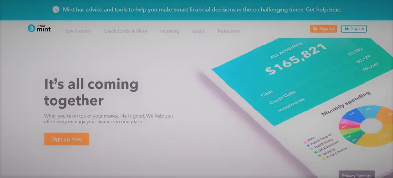
Credit: Mint
This one is related to my previous point of Content Hierarchy. But there is some difference. My earlier point defines which content should be given priority and to which we should not.
But a Clear Message is something else. When you visit the mint website you'll be greeted with two main forms of content type sign up button and their app image.
From both of them, you'll have a clear message that this is a budget tracker app. That's all. They are not trying to sell you insurance, suggest banks or credit card.
Just a simple budget planner for you. Of course on the navbar, they have pages for a loan, investment. But they only hold less than 5% of the whole webpage.
The majority of the landing page is screaming a single clear message A BUDGET TRACKER AND PLANNER. If you want to learn How To Create Good Web Design. Then you must master the art of speaking clear messages.
One-Line Lesson: Know your story and tell exactly how you want.
4) CTA (CALL TO ACTION)
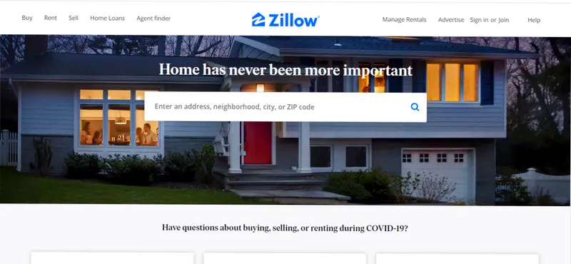
Credit: Zillow
The Clear Message is telling the user about the website. CTA (CALL TO ACTION) is about convincing the user to take immediate action. Like, inquire now, sign up, buy now.
These are some of the examples of CTA. When you visit the website of Zillow they are not showing you what their product is about or who they are.
Zillow is a big brand and if you are visiting them then you already know who they are. On their front page, they have a big input bar for searching homes.
Their website is simple yet effective in driving new sales; Because they use CTA very efficiently.
One-Line Lesson: If you don’t guide the user they’ll get lost.
5) Typography
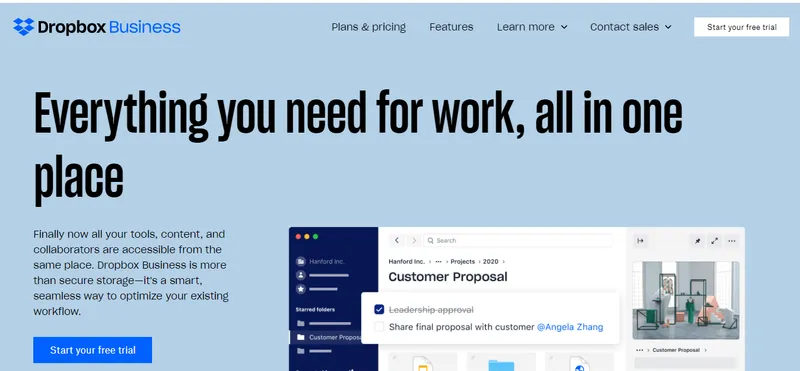
Credit: Dropbox
Typography is such an underrated aspect for web designers. I know many people don't give much thought on their fonts. But they should be. Fonts have evolved greatly through ages.
We may don't know the names of font but we can identify and differentiate. When you see some historic movie you see the writing style is very different.
And when we have to signify something futuristic we still make use of fonts. There are some fonts that fit in everywhere, But our goal should never have to get fitted but be perfected.
When we analyze the dropbox business page. We see all the previous qualities of good web design. Here we don't see flying animations, a zillion of graphics.
But just a huge heading and a little image accompanying it. Of course with a clear message and CTA.
One-Line Lesson: Get familiar with different font and use them.
6) Colors
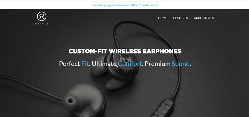
Credit: Revols
Playing with colors is fun. But using them in the real-world is not. When we are creating a web design for a larger audience our aim is not to create an intuitive website.
Of course, neon colors look great with a black background. But ask yourself does that look professional.
See there are many great designers who choose simple colors and designs not because their toolbox won't allow them. But for the great good of the client.
Revols is a great example of professionally using colors. Blue, White, Black the only there colors they have used. But still, the impact of the website is still high. Choose less and do professional.
One-Line Lesson: It’s always good to use less; In case of colors.
I hope you find this How to create good web design with example guide Useful. If you want more such content you can follow me on my social media handles below.