Dark Patterns in UX – is it ethical?
E-commerce, hotel bookings, and subscription-based companies are using dark patterns to make quick sales by creating a false sense of scarcity of a product or time limitation of a discount for many years now, is this ethical?
What drives us to some e-commerce shopping sites often? Firstly, due credits to access the plethora of products under one domain, and the presentability. Secondly, something we all can't deny is comfort and pricing. Thirdly, the site functionality and the loading time. The consumers are unaware of deep design elements and labyrinth of patterns that designers have created to offer easy and accessible designs. What happens in the backend is a sinkhole that traps consumers unawares.
The pattern of usability is the efficiency with which the user can access sites. However, in creating client experiences designers have gone way ahead creating patterns that are undisputedly efficient and result-oriented but a tangled web called dark patterns.
Most of the times you will not be aware of the farce the companies are creating to keep you coming back. User experience does bring the comfort of easy access, but stealthily extracts information or psychologically manipulates consumers to act even in unwanted situations.
www.darkpatterns.org very plainly explains dark patterns as tricks used in websites and apps that make you do things that you didn't mean to, like buying or signing up for something. This site is created to spread the awareness of dark patterns and how they come to influence consumers and shame companies.
Types of Dark Patterns
A dark pattern is a maze and is classified under various types. We all have experienced some of the other dark patterns while surfing online. However, the intensity and ethical pursuit of these dark patterns remain a huge question. There are numerous types of dark pattern, but we have listed a handful here:
Disguised Ads
Disguised ads are plentiful on e-commerce websites, tricking us with colours and patterns and unexpected buttons on the payments page, which till then did not just exist. Often these triggers are set sitting adjacent to the action button, like include insurance, donate for charity etc. Often in the maze of designs companies make you take decisions that you never wanted.
Scarcity
Human minds are programmed to act fast in scarcity mode and the action trigger is procuring the item before it is out of stock. Apparently, that might just not happen as this is a tactic crafted to sell, and you end up buying.
The utter disgrace could be, the companies have so well accepted and adopted to the dark patterns that in critical conditions to they keep playing their usual marketing gimmick.
While e-commerce sites are listing their service unavailability during the COVID-19 worldwide lockdowns, a well-known hotel booking site, continues to lure us with the scarcity pattern.
When I ran a search for hotels in Mumbai during lockdown ending on 3rd May, the result still went ahead to convince me that I might lose out on an offer if I do not book NOW!! Here NOW is a situation when all the commercial units are closed in Mumbai.
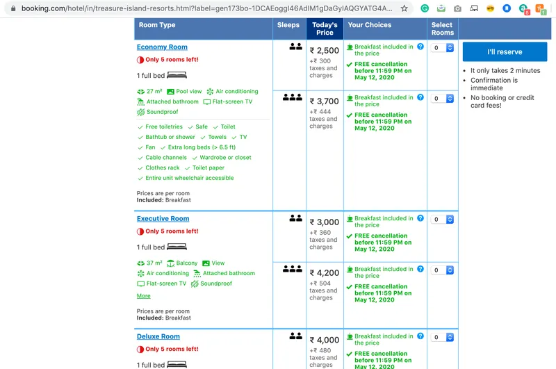
An actual screenshot of booking showing "Only 5 rooms left" while checking on a date during lockdown and nobody is travelling.
Forced Continuity
Netflix has undoubtedly hooked consumers to a visually delightful experience. Web series is the trending entertainment for which Netflix comes to rule the market. Netflix offers you a 1-month free subscription and the process is marked by filling a form that not only captures your personal data but also credit/debit card details. It takes consent from you in fine letters that as soon as the free subscription ends, the next month's subscription fee will be auto-deducted from your account. However, the pattern here is after 1 month you might forget above the auto-debit and one fine day without intimation the fee is debited, even
when you didn't want it to. Undoubtedly they have the best contents, but that is not the only reason behind their claims – Sleep is their only competition!
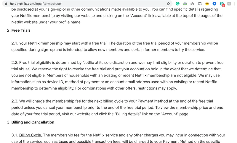
In the terms of use page, Under Free trials, point 2.3 Netflix says about the continuity process but who reads it
I recently faced forced continuity under no intimation with Audible App, an audiobooks subscription app.
Roach Motel
The clock is ticking by the second and you are biting your nails as your internet is down and you might just lose out on a dress offer that is about to end in an hour. Are you familiar to such a situation or near around? This is the pattern that misguides consumers by creating an emergency and triggering to buy, even if there was no intention to buy.

In above example, India's top e-commerce Myntra.com shows “Only Few Left!” to make you buy it quicker
You are in a Roach Motel pattern that has lured you with ease towards great products and exclusive offers and now you are finding it hard to get out of the situation without buying.
Dark Patterns and Trends
www.europeandatajournalism.eu offers an interesting statistic of how the different dark patterns play psychologically on consumer behaviour with scarcity topping the charts followed by urgency.
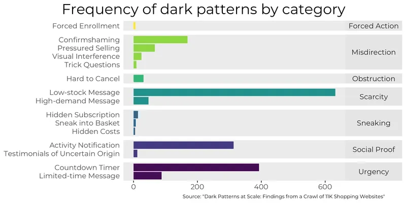
Credit: https://www.europeandatajournalism.eu/eng/News/Data-news/Dark-patterns-born-to-mislead
How Ethical are Dark Patterns?
Dark patterns are webs that are stealthily laid out to bring promising business to companies, but when questioned in the scope of right practices, it is a dilemma to call dark patterns ethical or unethical.
It is a loud and clear message that dark patterns are dominating us by tricking us in buying or extracting information. However, there are no governing laws or authority that can bring it under the scope of interrogation and bring lawful closures.
The dilemma supports different perspectives for the user and the companies.
User's perspective
For a user, the experience could be one-time or engaging. Companies in the context of comfortable design and accessibility are hooking users to the pattern for comebacks. Faster loading websites, captivating displays and ease of processing is every user's need and that is what these patterns guarantee.
What might concern a user, in the long run, is data extraction, spamming, paying extra under disguised sales or loss of reputation. Unless the dark patterns are transparent they are good, but as they get dense, the user behaviours might change the course of the equation, calling it unethical.
Company's perspective
The sales & marketing departments are interested in crunching sales numbers and with the support of the design teams that does a magical job of designing disguised-sales, the dark patterns are marketing gimmicks and very much ethical.
Companies can claim of sharing information, but has the user read it through? Do you remember the- Accept Terms and Conditions checkbox we have all at some time blindly checked? How does someone then go back and claim something that was clearly overlooked?
Dark patterns are technology-backed promotional gimmicks and could be termed as an ethical practice unless a user might begin an ugly charade causing a loss of reputation to the company. Under the immense scope of business Dark Patterns create, it is yet a fine line designing companies need to be wary about crossing.


