

This is a user generated content for MyStory, a YourStory initiative to enable its community to contribute and have their voices heard. The views and writings here reflect that of the author and not of YourStory.

How to design your contact us page in 10 possible ways?
The Contact Us page can be really helpful in generating leads and driving conversions. It should be designed with beautiful themes, CTAs, design layouts etc.

This is a user generated content for MyStory, a YourStory initiative to enable its community to contribute and have their voices heard. The views and writings here reflect that of the author and not of YourStory.
Are you of the view that consumers are mostly enticed by the landing pages of your website and do not give even two hoots to your ‘Contact Us’ page? Let me gently remind you that it is not always the case and your ‘Contact Us’ page plays an important role in converting the leads into actual customers. In fact, it is one of the most visited pages in your website and so, should be designed in a way that pricks the viewers’ interest. It is true that most developers are wont to put the ‘Contact Us’ page at the bottom of their priority list or only as an after-thought.
The predominant thought is that interested customers would anyway contact the site’s admin by calling or sending an email and so, it suffices to provide only the contact information. Yes, that is about it, nothing less or more. However, this approach is flawed for an attractively designed or properly themed ‘Contact Us’ page can induce an otherwise uninterested customer to seek information. Let us find out how a typical ‘Contact Us’ page should be.
>> Easy to find or else an interested customer may lose patience to search for it endlessly.The links containing the phone numbers or email should be functional.
>> Should have fewer information fields to be filled. Otherwise, the sight of so many fields can scare away the customers.
>> Should have a Call-To-Action (CTA) button wherein customers can go back to the site without filling the form. This is needed to prod the user into browsing the website.
>> Should have functional links to the social media sites like Facebook, Twitter, Instagram and LinkedIn. The links provide additional ways to promote your brand.
>> Should be accessible on all types of devices viz., mobiles, tablets, desktops, laptops, notebooks.
>>Let the page be visually attractive so that the visitor is enticed and the site leaves a lasting impression on him or her.
As mentioned before, a ‘Contact Us’ page should be visually stimulating for the customers to get interested. Remember! A drab looking page can put off visitors in no time.
Let us find out the ten best ‘Contact Us’ pages in terms of themes or attributes.
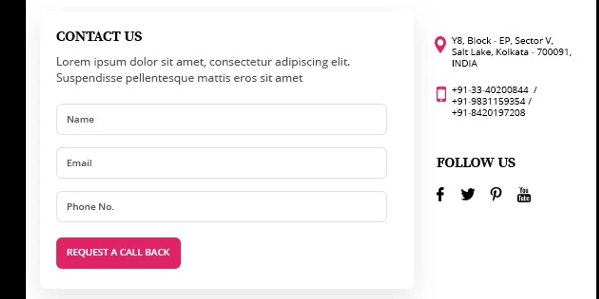
#1 Less is More: Imagine staring at a Contact Us page with endless lines to fill information, possibly about a survey. Chances are you will skip filling it altogether, right? The same happens to the visitors to your site as well. In fact, reducing the number of fields in your Contact Us page can increase the conversion rate by a good measure (Source: Hubspot). Hence, reduce the space for information that makes no sense to your business or has the potential to frustrate the visitor. To begin with, the most important pieces of information in your ‘Contact Us’ page are the phone numbers and email id. The rest can be deemed as add-ons. If at all you want to collect a detailed information about your potential customers, do so after the initial contact by sending a survey form or link.
Less Is More!
#2 No CAPTCHA please!: Yes, spamming is an issue that can overwhelm your database but there are better ways of dealing with it rather than by placing the irksome CAPTCHA in your Contact Us page. A visitor prefers a seamless way of contacting you rather than going through barriers like CAPTCHA. So, avoid the same and make the Contact Us interface seamless. And as far as avoiding spam is concerned, make use of the anti spam plugin software.

No Captcha Please!
#3 Attractive CTA buttons: A beautifully designed CTA button can be another way of keeping visitors glued to your website. This is needed for there will always be visitors who are not interested in filling up the fields in your ‘Contact Us’ page. To keep them interested in the site, it is better to include a secondary CTA button that directs them to the blog, portfolio, explainer video, or product demo section of your site.

Attractive CTA button
#4 Allow customers to describe their query/project: The visitors to your website come with a purpose – to get information, know about your product or service or engage your company for a project. To help their cause, the ‘Contact Us’ page can have a small section wherein visitors can describe their project. This way, you get a potential customer who can be converted.

Describe the Requirement in Detail
#5 Avoid clutter: A neatly designed Contact Us page with all the relevant information creates a positive vibe. On the other hand, a haphazard placing of icons can leave a bad impression on the visitor. The aim is not to leave out information but present them in a neat and easy to understand manner.

No Clutter
#6 Include social media login option: As people are mostly seen to browse the internet to visit social media sites, it is better to add social media logins like Facebook or Google instead of asking them to create an account to fill personal information. The ultimate aim should be to enhance the user experience rather than limiting it.

Use of Social Media Logins
#7 Brand consistency: The ‘Contact Us’ page should reflect the style and layout of your site’s pages. The display of information on the page should be in a similar pattern as in other pages. Ensure the typefaces and colours are consistent with your brand. The idea is to etch your company’s brand image into the mind of the user and highlight your attention to detail.

Brand Consistency
#8 Use pictures: Great visuals like pictures can create an attraction, which visitors can find difficult to shake off their minds. It is better to include a picture related to your brand/product/service in the ‘Contact Us’ page. For example, if the picture shows people bonding or chilling out, it gives an impression of them being approachable.

Use of Picture
#9 Use of Map: Including a map in the ‘Contact Us’ page showing the way to your office or an aerial shot of your facility can help create inquisitiveness in the minds of visitors. This can be of great help in generating leads or driving conversions, for people can easily search the location of your company on their smartphones. Viewing the physical presence of your company can help create the trust factor, an important enabler to drive conversions.

Use of Map
#10 Humour: Humour has the potential to break barriers and build bridges. It can create that instant connect, which even copious lines of text may not be able to create. So, include funny lines like inviting the customer to a cuppa of coffee and show him or her the way to reach (use a map.) Humorous quotes can bring a smile and induce a customer to stay longer on your site.

Humour!
Conclusion: A well designed ‘Contact Us’ page goes a long way in creating interest in the minds of visitors about the company and its products and services. The objective should be to create a seamless and attractive user interface leading to a better user experience. Whether you design your Contact Us page in-house or hire a professional website design company, your ‘Contact Us’ form should figure at the top of your priorities.