
Wireframe vs Mockup vs Prototype for the Best Design Flow
Before any line of code is written, there is the pre-development design phase every project usually goes through. That’s when wireframes, mockups, and prototypes are created.
Mockup vs prototype vs wireframe is a subject that needs clarity, as it is seen differently by designers and clients.
There’s a common misconception that you can easily craft your design omitting a stage or two. We’ve created tens of thousands of designs and want to present our vision of the wireframe vs mockup vs prototype subject. So let’s elaborate on what wireframes, mockups, and prototypes mean and how they make design pixel perfect.

SOURCE: TAPPTITUDE.COM
What is a wireframe?
Simply put, a wireframe is a draft or a sketch by a designer. The purpose of wireframes is to show the structure of an application with basic elements and content placement. This structure helps developers see the functional side of the app. Designers can bring order to scattered ideas and present them schematically. Wireframes serve as a foundation for a website or app.
What does a wireframe consist of?
Wireframes show the logic of a website or app. They present the product at its inception stage and consist of:
- boxes or circles
- lines
- text
Below, you can see a screenshot of clickable wireframes we created for one of our clients. The wireframes are for an eLearning website that helps users pass a driver’s license test in California. We used Axure, a special design tool, to create wireframes.

SOURCE: STEELKIWI.COM
You can also check out these interactive wireframes for a social app we created.

When to use wireframe architecture
You can use wireframes when you want to:
- discuss ideas or concepts
- show the structure of pages
- see how related pages work together
- see how information will be presented on individual screens
- mimic interface behavior
- visualize the general layout of a website or app
- prepare a detailed project requirements document
- test usability within your team to adjust your product
What is a mockup design?
The next step after wireframing is creating a mockup. A mockup transforms the schematic layout into a colorful, static representation of the future product. With mockups, you can see shapes, fonts, and the color palette. Sometimes, you can even see content instead of dummy text. The main difference between wireframes and mockups is that mockups don’t skip details; on the contrary, they’re all about details, giving the feel of an actual app and showing how elements go together.
What are the components of a mockup?
With a mockup, you shape the way your app will look like. A mockup may include:
- buttons
- text bars
- content layout
- colors and graphics
- typography
- spacing around components
- navigation graphics
- other visual parts
Here’s a collection of website mockup examples we created for one of our projects. We experimented with layouts and colors in Sketch, a popular piece of website mockup software, until our client approved the designs.

SOURCE: DRIBBBLE.COM BY SERGEY SHEVCHENKO
When to use mockups
You can use an architecture mockup when you want to:
- decide on the product’s color scheme, visual style, and typography
- experiment with the look of the product
- present the user interface to stakeholders and potential users
- be confident about your design
- decide on your brand identity
What is a prototype?
A prototype is a high-fidelity interactive manifestation of the final product. Even though prototypes aren’t put into code yet, they look like actual applications. Users can easily interact with prototypes and test the user flow.
What are the main features of prototypes?
A prototype should be as similar to the final product as possible in order to model the user experience. Therefore, a prototype should:
- connect all elements in an interactive flow
- be a basis for new insights
- encourage further development
- be a testing and learning tool
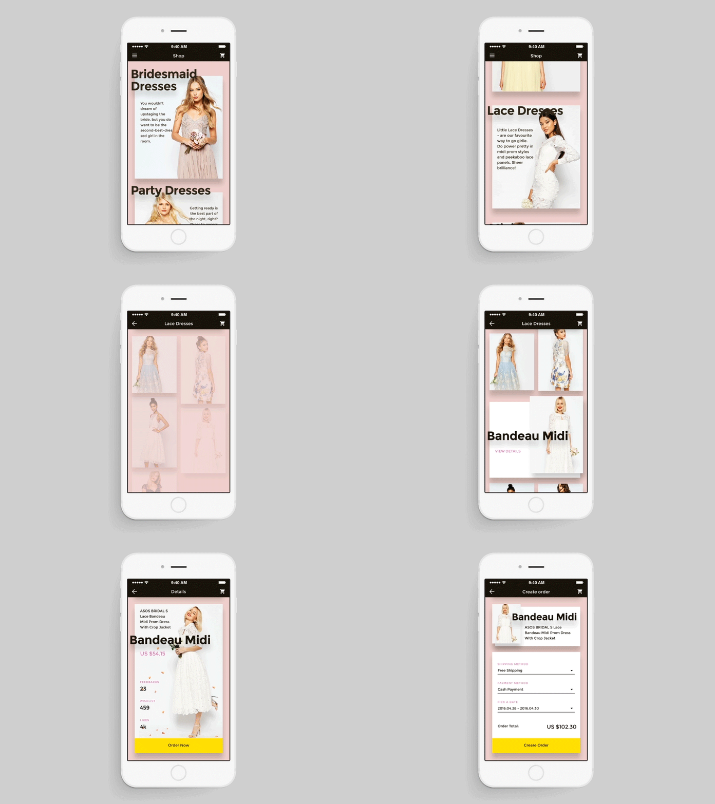
Here’s an example of a prototype for an ecommerce website we created. Below, you can see how a user can scroll through items, choose a dress they like, view details, and place an order.

SOURCE: DRIBBBLE.COM BY YVETTE MOSIICHUK
When to use prototyping
You can use prototypes when you want to:
- show more than just product visuals
- try your product’s capabilities before going live
- gather valuable feedback on usability from users and stakeholders
- perform A/B testing
After discussing prototypes, wireframes and mockups individually, let’s see how they’re connected.
How do wireframes, mockups, and prototypes orchestrate the design process?
All three stages ― creating a wireframe, prototype and mockup ― should find a place in your design process. Don’t underestimate the importance of every prototype, wireframe, and mockup, since they’re your foundation to build on.
When you come to a development team, you have an app idea in mind. But it’s your idea, in your mind. You need to convey this idea to your developers and designers. The first thing they should do once you tell them about your product is turn your idea into wireframes ― a language that helps designers translate your idea into designs and lets developers understand the app’s architecture and the best coding solutions.
Your application should acquire structure over time and gradually translate into a mockup. At this stage, you get to finalize your design and see how structural elements turn into buttons, graphics, and content layouts. But the work isn’t done yet.
Ultimately, this leads to prototyping. With a prototype, you get to walk in your users’ shoes. You get to feel what it’s like to interact with your product.
Design process at Steelkiwi
At Steelkiwi, designers pay special attention to clickable wireframes, interactive mockup samples, and prototypes. Over the years, we’ve come up with a scheme that lets our clients win over the development time and resources and build meaningful products for users. We’ve learned by experience that successful design can only be achieved if you’re willing to go the whole way from wireframes to mockups to prototypes without skipping anything. This leads to an optimal app design that doesn’t require costly rework down the road.
To begin, we create wireframes that let us understand the structure, user flow, and core interactions in the website or app. Because we link the pages and screens, our clients get a visual and functional representation of their product at an early stage.
We usually hold demo meetings where we show the flow to our clients. We also share links to wireframes so our clients can test them on their own. This mean both we and our client can follow the user journey. What’s more, this keeps us from getting lost among all the pages and screens later, during development.
Once our client approves the wireframes, we focus on mockups, which represent the UI part of the project. Building mockups is the stage where our designers give the structure a pretty face. The detailed structure of wireframes makes the work of our UI designers easy and helps our clients save time and resources.
Again, we want to be sure that our clients like our design solutions. When clients tell us we’re good to go, we create high-fidelity prototypes using Sketch UX prototyping software. These prototypes closely resemble the final product. Clients can interact with their website or app via a link in Invision and can even perform testing to understand how effective the product is.
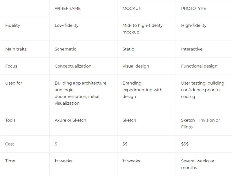
Below is a table that highlights the essence of each method in the design process.

By building your design from wireframes to mockups to a prototype, you save money and time. It’s easier to change the logic and structure at the wireframing stage than at the prototyping stage. If you make changes later on, they will affect your design, code, or even business logic.
Steelkiwi advice: Don’t skip anything. Take a step by step approach; otherwise, every mistake or change will cost you development time and resources. Once you’ve set in stone your design and UX, put them into code with confidence, knowing that your product is pixel perfect.
Push your design process to the forefront
If you’re creating a project from scratch, there’s no way you can skip design. Be on the safe side and go with wireframes, mockups, and prototypes. Your risk of getting things wrong will be lower and your chance of developing a high-quality product will rise.
We’re in the business of saving our clients’ time and money. We speak through well-designed consistent visuals and if you need a team to design and build your product, contact us!


![Get more Views on YouTube for FREE [Complete Guide]](https://images.yourstory.com/cs/1/c0899f40-0509-11e9-9820-1f4fb7912c4d/Get_more_Views_on_Youtube_complete_guide1561245757751.jpg?mode=crop&crop=faces&ar=1%3A1&format=auto&w=1920&q=75)

