8 Tips for Creating a Great Mobile Experience
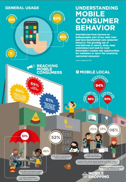
The discipline of design remains largely misunderstood in the business world. Today’s mobile users are looking for information that is easy to access and quick to find, on the go, all on a screen one-twentieth the size of their traditional monitor. One of the most important aspect of mobile information is the way it is presented to the user. Design is a straightforward and repeatable problem solving process that encircles customer needs, employee creatives and thoughtworks by business stakeholders. Design isn’t simply about picking right shades of colors but it's an organizational art of focusing on making and refining tangible design solution to meet or exceed their customer needs and desires. So don’t expect the great mobile experience to evolve magically, it should be actively designed to spring into existence. It is predicted that, by 2012, more people will be searching the web on their mobile phones than on a desktop or laptop.In the interesting fact-stats of the mobile OS, Android and iOS powered 85% of all smartphones shipped in the second quarter of 2012 according to International Data Corporation(IDC). These stats itself involve companies to build design decision that just make use of the platform services to build applications or m-websites. To align those decisions, employees and partners need a shared vision: a customer experience strategy. To build the strategy, make sure you aren’t missing any of the following steps :

1. Keep it short and simple
Since mobile screen is significantly smaller than a traditional desktop screen, do not try to cram all the information you provide on your m-website. Keep it simple. You may have to filter the content by re-organizing or re-prioritizing your information to keep it easily accessible on the small screen. Don’t make users to dig into the content to find the information. Make sure on any given screen, the users can easily spot what he/she is looking for. Use “Minimal clicks to read contents” thus enticing mobile audience to seek contextually relevant information.
2.’Touch’ - That’s all it takes
Rapid revolution has brought touch-based smartphones evolved over the type ones. Smartphone devices make it possible to do just about everything on the go - Communication, Working, Learning, Banking, Entertainment and much more. Then why to pain users with navigation? Strategy should include best navigation logics that suit best for users. This would also build a great user interface whereby user can navigate and input information easily rather than having to fill in long forms. Don’t make users to come to you saying “Your MWebsite is not THUMB friendly”.
3. Don’t Make ‘em Wait
When you have M-Website, it automatically incurs plenty of expectations from users. Loading time is a major contributing factor to page abandonment. The average user has to patience for page that takes too long to wait. Slower response time results in an increase in page abandonment. Some M-websites load as fast as in 2-3 seconds while some take more than 10
seconds which is ideally longer than ace athlete Usain Bolt’s 9.63 sec stats in 100 mts sprint performance at Olympic 2012.Don't play with patience of mobile users, most users would wait approx 6-10 secs before abandon pages. Every 1 second delay in page response results in a 7% reduction in conversion.
4. Switch to Smart Development
Success of your m-website largely depends on retaining users.Build M-website using the most relevant and smart technology. Make sure you have a team that develop M-website using only the minimum set of javascript and css files. Be sure your images and videos are rightly sized and naming conventions are properly set. Use caching and CDN’s for performance and evaluate the performance using statistical tools. Use HTML5 and its rich feature set depending on needs and equirement. Don’t expect users to zoom out to view the images. Use “best fit in” concept to resize automatically to fit mobile device’s smaller screen size. Avoid using heavy-duty flash files on your M-website.
5. Are you redirecting mobile visitors ?
Don’t expect user to go to your m-website remembering the URL of the same (say m.yoursite.com or mobile.yoursite.com). You should allow automatically allow your M-Website to load. Some people may want to access to more information. Don’t neglect them. Include a link in footer of every page so that allows visitor to view the full site. Don’t make internal links to M-Website which directs users to full site, forcing users to navigate back to the desktop page which should ideally to be viewed on mobile.
6. Avoid Mobile Dead Blocks
Your mobile users are interest driven users. They are actively seeking out for information which include jumping with hopes via various navigators in your M-Website. Worse case is, if the content they wish to see, is not what they get, then chances of they returning back reduces drastically. Two most common aspect to tackle this are : 1 ) Map your mobile pages providing best navigation track 2) Don’t use any redirect scripts to lead users to dead end zone.
7. The ‘Target Device’ Plan
Always keep in mind that your M-Website should work flawlessly on devices with various screen sizes running a particular mobile OS like Android, iOS, RIM, Windows and others. The M-Website should also be optimized and should run irrespective of mobile browser type. Best approach is to identify device detection to determine what end user is using. One of example of this approach is Mobile Edition of Facebook which automatically detects device and renders a compliant version automatically.
8. Tracking your Mobile Users
When building out a mobile website, it’s important to pay attention to the user’s approach and usage.Use Google Analytics account to track mobile traffic. This would allow you to understand how your users behave differently from that of desktop website.

With a veritable rush in app, which company won’t get tempted to drive into M-Development. However, Design is just one of six disciplines that organization must master to achieve the full potential of customer experience. The others include Strategy, Customer Understanding, Measurement, Management, and Mobile Culture. These term are not new to business, but they do take on a slightly different twist when it comes to customer experience.
Remember “Make users to feel the mobile as the desktop.”


