Keep it simple, silly, and other useful tips to get your product’s UI/UX design perfect
A door with a handle will make you want to ‘pull’, even if the instruction stuck on it clearly says to ‘push’. This is a recurring case of bad design in the physical world. Imagine all the mistakes you can possibly make in the online realm. Here are some simple, but effective suggestions to live by.
How often have you pulled a door, failed and only noticed the ‘push’ sign after? Or vice-versa.
A lot can happen after: you feel sheepish, embarrassed even. Have a laugh, or maybe on a bad day, feel irritated or angry. ‘Why does this happen to me,’ you may cry out.
All this, and you are yet to step through the door.

When it boils down to the crux of the issue, you will notice it isn’t your rush or clumsiness causing these embarrassing interruptions. It is actually caused by one simple factor: bad design. The best, most functional designs are those you see, interact with, depend on, and yet do not notice. This is especially the case when it comes to designing user interfaces and user experiences (UI/UX).
The invisibility measure of good design stems from the fact that UI/UX design is meant to ensure a seamless experience. This ensures that your mindspace is reserved for better, more important tasks, and not restricted to assessing how to use a particular product. The usability of any interface – real or digital – is directly related to the quantum of cognitive load that is undertaken during use.
One doesn’t have to look too far into the past to notice activities we spend little to no time on today. Think back to when using Internet Explorer was a thing. To ‘Google’ something, you would have to type in the right URL, wait for the search engine to load, type in your query and then finally search (or decide to feel lucky). Today, across browsers, you can search your query directly in the search bar above any tab. This immediately eliminates all the steps it used to take to reach your search results. In fact, Google’s commercial success can be credited, to a large extent, to really understanding the end user, where they face cognitive load, and implementing measures to ease this load. As creators of Material Design, they have also exhibited innovation based on these factors.
Similarly, Netflix changed the way people consume video content through their product and – more crucially – their design. Few interfaces are as conducive to binge-watching as Netflix is (arguably the one that gave birth to the binge culture). Seemingly simple features – the option to skip opening credits, move to the next episode during the credit roll, or resume watching content left mid-way, for example – go a long way. They aid in redirecting user attention to where Netflix wants it to go – to the content.
There are several aspects that are the hallmark of low-cognitive load of UI/UX design. The intention behind each of these steps is to ensure the product becomes as intuitive as possible.
Know your consumer
User research is imperative. Knowledge regarding consumer requirements, behaviour and preferences is key to crafting functional UI and UX. It lays the groundwork for the design. Once a beta product is ready, running a pilot test with prospective users will aid in discovering potential flaws, before the final release. Netflix would be a classic example of a company that applies its user research in design effectively.
Declutter
A wise person quite aptly said, ‘Keep it simple, silly!’ While minimalism isn’t the only way to go, it is best to keep out anything that isn’t absolutely necessary. It is tempting to add elements as you go. However, the cleaner your design, the faster the end user will be able to adapt to it. It is also far less likely for them to be overwhelmed by the visuals.

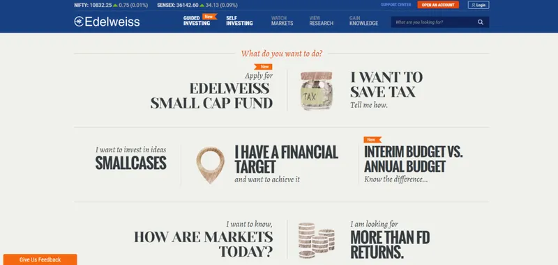
Financial services firm Edelweiss has a clean interface that leads customers to choose the service they need
Simplify steps
When crafting UI/UX, it helps to make things as simple to understand as possible. Irrespective of how “smart” the target audience is expected to be, ensure that the design acts as their guide through the product. Let the medium act as the instruction. And with actual, literal instructions, keep the language easy to understand. Use phrases and icons that are or allude to universally accepted designs wherever possible. In-app tutorials also help acclimatise new users to the UI and its features.


Medanta’s website makes booking appointments with doctors instinctive and easy
Maintain visibility
If the end consumer needs to interact with any element, it needs to be visible and accessible. Whether this is regarding specific pages or features, they should be positioned in such a manner that no effort is spent in searching for them. Hidden or hard-to-access features, tabs and images are counterproductive to both the consumer and the product.

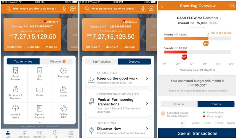
ICICI Bank’s iMobile app effectively showcases information/features that are relevant for the user
Be predictable
Predictability has received a bad reputation over the years – of being boring. But, the more predictable your design, the more intuitive it would be to the end user. Layouts that are most familiar with the user are ideal (there is a reason most computing devices today use the QWERTY keypad). They prevent any hiccups caused by trying to figure out how to navigate or operate an app/website. The goal of all of the steps listed above is to increase the predictability of the product for the user.
The design of a door is also, in a way, under the domain of UI/UX. Doors that have a handle are likely to be pulled even if the word ‘PUSH’ is written in bold, all caps, and with any colour of the rainbow. The best doors are the ones you walk through without realising you have.
The best UI/UX designs ensure that the product opens its doors to the end user in much the same way – with no effort.
And thus, open more to newer possibilities.
(Disclaimer: The views and opinions expressed in this article are those of the author and do not necessarily reflect the views of YourStory.)


