

Hidden logo meanings: What top brands secretly tell you
Ever wondered what brand logos really mean? Dive into the hidden symbolism and brand psychology behind famous designs, and learn the secrets they reveal!

Think you know your favourite brand logos? Look closer. Much closer. Because what you see on the surface is just the beginning.
At first glance, they may seem like simple designs, but many of them hold fascinating hidden meanings that tell a deeper story. From subtle symbols to clever optical illusions, these logos encapsulate a brand's identity, history, and values in ways you may have never noticed.
Unveiling these hidden elements reveals the remarkable thought and creativity that go into crafting them. If you're a fan of brand psychology, marketing strategies, or logo design, you'll love uncovering the secrets behind these 9 famous brand logos! So, let's get right into it!
Brand psychology: 9 Famous logos and their hidden messages
1. Chupa Chups 2. Godrej
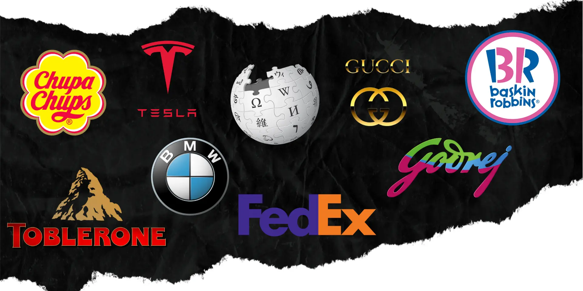
1. Chupa Chups: A surrealist's touch
Did you know this lollipop brand had a surrealist masterpiece on it? Popular Spanish painter Salvador Dalí himself designed the Chupa Chups logo in 1969.
Featuring a vibrant daisy, the logo was crafted to sit perfectly atop the lollipop wrapper, ensuring visibility and aesthetic appeal. A well-placed logo design enhances brand recognition and consistency.
2. Godrej: A signature of trust
The Godrej logo is derived from the signature of its founder, Ardeshir Godrej. This handwritten style sets the logo apart and makes it memorable, signifying the rich legacy and trust the company has built across diverse industries over the years.
It's a powerful symbol of the brand's longstanding reputation, inviting us to connect with its story on a more personal level.
1. Baskin-Robbins 2. Wikipedia 3. Gucci
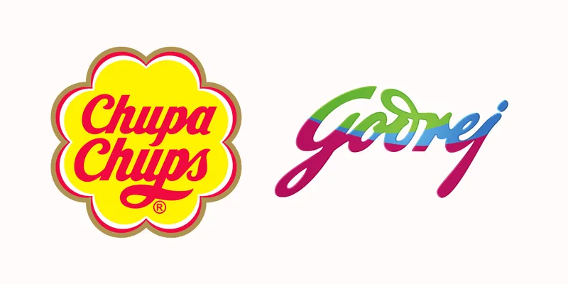
3. Baskin-Robbins: Thirty-one flavours
Baskin-Robbins, renowned for its diverse ice cream offerings, cleverly incorporates "31" into its logo. This number, subtly embedded within the letters "B" and "R," signifies the brand's original concept of providing a different flavour for each day of the month. This type of smart logo design reinforces brand identity and engages consumers visually.
4. Wikipedia: The incomplete globe
Wikipedia's logo features an unfinished globe made of puzzle pieces, symbolising the continuous and collaborative effort to compile and update knowledge.
Those missing pieces? They showcase that our understanding of information is ever-evolving, a collaborative effort from contributors around the globe. Knowledge is a never-ending journey!
5. Gucci: Interlocking G's of elegance
The elegance of Gucci’s logo hardly needs an introduction, but did you know that the two interlocking "G"s represent the founder’s initials, Guccio Gucci? This sophisticated design speaks volumes about luxury and has solidified Gucci’s status as a powerhouse in high-end fashion.
1. Tesla 2. BMW 3. Toblerone
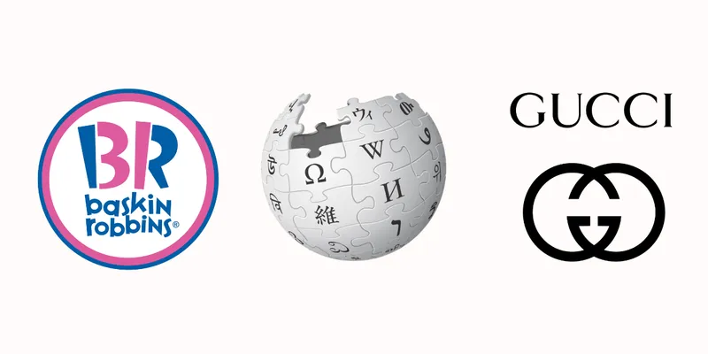
6. Tesla: The cross-section of innovation
Tesla’s logo is more than just a stylish"T"; it represents a cross-section of an electric motor. This logo design reflects the company's dedication to innovation in electric vehicle technology.
More importantly, it’s a fitting tribute to Nikola Tesla, the genius behind alternating-current electricity. Tech brands often use futuristic logo elements to align with their innovation-driven identities.

7. BMW: Beyond the propeller
Think you know the BMW logo? Surprise! That "spinning propeller" image everyone pictures? It's a myth. Those blue and white squares are actually a nod to Bavaria, BMW's home turf, straight from the Bavarian flag. How did the propeller story take off?
A clever old ad and BMW's aviation history. This whole thing proves: that a brand's story, even the mistaken parts, can become just as iconic as the logo itself.
8. Toblerone: The bear within the mountain
Who knew within the majestic silhouette of the Matterhorn mountain in Toblerone's logo lies something adorable? Established in 1908 by Theodor Tobler and Emil Baumann in Bern, Switzerland, Toblerone is famed for its distinctive triangular chocolate.
The logo features this iconic peak, but a closer inspection reveals a hidden bear within it. This subtle inclusion pays homage to Bern, known as the "City of Bears".
9. FedEx: The arrow of precision
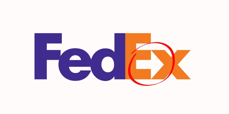
FedEx's logo appears straightforward with its bold lettering, but between the letters "E" and "x," there's a hidden arrow.
This cleverly hidden symbolic design element depicts speed and precision, representing the company's commitment to swift and accurate delivery of services. It's a prime example of effective branding and hidden symbolism in logo design.
The bottom line
These hidden elements in brand logos do more than catch the eye; they tell deeper narratives that resonate with audiences. By uncovering these secrets, you can find inspiration for your creative endeavour, whether you're a business owner, a graphic designer, or simply a branding enthusiast. So, next time you see a logo, take a moment to peel back the layers. You never know what stories lie beneath!