

This is a user generated content for MyStory, a YourStory initiative to enable its community to contribute and have their voices heard. The views and writings here reflect that of the author and not of YourStory.

Logo Evolution

This is a user generated content for MyStory, a YourStory initiative to enable its community to contribute and have their voices heard. The views and writings here reflect that of the author and not of YourStory.
A brand logo is something which is recognition gimmick for the public to discern their products. Logos Trademark registrations are the most recognisable part of company's brand. You can use graphic symbol or emblem or combination to build a sturdy logo.
Everything changes with the dynamic time, nothing will remain same, and businesses are no exception. To harmonise the dynamic needs, the company have to go with the flow. It does not mean change the policies or products are enough. The company's logo registration needs to evolve in the changing time. Let's evaluate some famous brand's logo evolution, to know how they looked in the beginning and now.
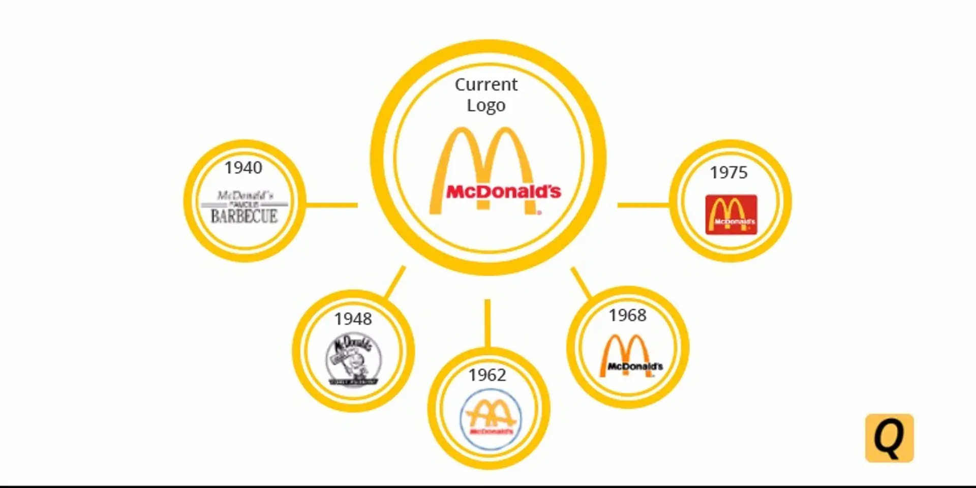
McDonald's

McDonald's, one of the top brand on planet represents more than fast food. It's become a cultural icon of America, and the largest chain of hamburgers fast food restaurants.
#Story of Evolution
In 1940's McDonald's was founded as a 'famous barbecue' restaurant operated by Richard and Maurice McDonald, serving barbeque and burgers but fries were not even on the menu.
In 1948's they come up with a new logo named 'Speedee Service' to improve the service time. The brothers designed the winking tubby chef character to communicate their speedy service.
In 1962's the two giant golden arches resembled the letter 'M', added a slanting line running through the arches were introduced as company's new logo. The iconic golden arches would define the company's logo throughout the decades.
In 1968's the version of new logo removed the slant line from the golden arches and the font was changed to the McDonald's text which is shown on the golden arches.
In 1975's the new version of golden arches was made by framing it in a rounded red square. Although the logo is almost similar to the previous one except for the colour of the text 'McDonald's'.
The current logo has the text McDonald's in red colour with the previous golden yellow 'M' iconic logo.
Coca-Cola
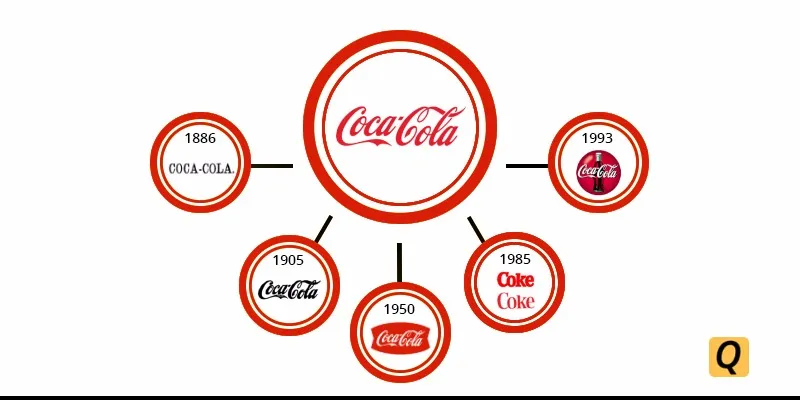
Coca-Cola, a carbonated soft drink widely recognised brand in the beverage industry. The name of the drink itself refers its ingredients, kola nuts and coca leaves. The coca cola logo has not looked exactly it does now.
#Story of Evolution
In 1886's Frank Mason Robinson created the iconic Coca-Cola name and logo. The first logo of Coca-Cola was a dull looking black font spelling out its name.
In 1905's the word 'trademark registered' appeared in the tail of the letter C. The white swirl font of logo make its appearance elegant.
In 1950's the logo got a fishy shape which was dubbed the Arden Square. The red fishtail featured a new classic Coca-Cola logo.
In 1985's company come out with the modified version of bold coke logo. Rebrand itself as Coke was a total flop.
In 1993's Coca-Cola brought back with a new 'Always Coca Cola' version. The new logo contained the bottle in a circular logo.
The current logo has the simple, bold approach with a single white ribbon which reflects the classic design.
Shell

Shell is the one of the America's largest oil and natural gas produces company which is a wholly owned subsidiary of Royal Dutch Shell. The products of Shell include fuels, oils, car services and production & refining of petroleum products. Their logo is something that managed to lodge in people's brain so brilliantly.
#Story of Evolution
In 1909's the Shell gas station brand logo was a poor version with low quality in white and black combination. The mussel shell took shape with the hard black background.
In 1948's the logo become the first red and yellow coloured shell with a text 'SHELL' in white colour but the design was still blurry.
In 1955's the company's logo was much cleaner than the previous one with the text 'SHELL' inside the logo matching with the rest of the colour scheme.
In 1971's the version of the logo is clear, crisp and minimalist design. That was a complete redesign of the logo with cutting out the clutter.
In 1995's when the company needed a new identity, the company choose the friendly shades of red and yellow which were slightly dimmed to lower the brightness. The logo was appealing to eyes while the basic design remained the same. The text 'Shell' mention outside the shell structure.
The current logo exactly resembles with the previous logo. The only difference is the text 'Shell' in red colour has been removed from the logo.
Volkswagen
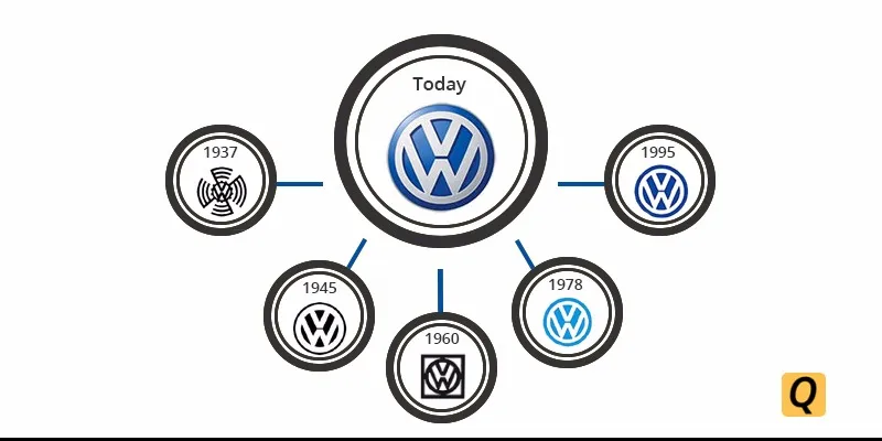
Volkswagen is the largest automaker worldwide established by the German Labour Front in Berlin. The Volkswagen logo is the most recognisable car logo and it been subtly changed over the years.
#Story of Evolution
In 1937's the first ever logo of the company featured a VW inscription in black colour which comprised of the Nazi flag designed in the shape of a swastika symbol.
In 1945's the logo was modified after the world war II ended, a circle with the VW inscription of the previous logo remained same but in white colour.
In 1960's the company modified its logo, contained the circular logo within a square and VW sign has been made in black colour.
In 1978's the emblem's colour was replaced by a new colour scheme as black was replaced with light blue colour and the VW letters become white which was placed on the blue background.
In 1995's the new logo was a shade darker of blue than the previous one and a little modified by making the outer ring thicker.
The current logo has semi 3D look with some silver shine, and 'V' letter was brought closer to the 'W' letter.
Pepsi
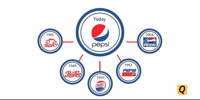
Pepsi is one of the most favourite beverage brands among people for its chilling taste. Pepsi, a carbonated soft drink manufactured by PepsiCo. Later, it was renamed as Pepsi-Cola for the time being. Pepsi logo contributed in a big way to the success of the brand.
#Story of Evolution
In 1905's the company had a swirly red script logo with text 'Pepsi Cola'
In 1940's the logo went back to a rectangular shape with letters 'Pepsi Cola' in red colour that had an entirely white background. The reason for the logo colour was to support the America's effort in world war ll.
In 1950's for the first time, the new design featured a serrated bottle cap, but the colour remained same red and blue with white in the middle.
In 1992's the logo has been redesigned by minimising the traditional spherical shape and placing it in the lower right corner. The word 'PEPSI' was placed at the top in bold uppercase letters.
In 2004's for the first time, the blue colour was used for wide background space. The word 'PEPSI' shifted in the blue background with white colour and the traditional spherical shape.
The current logo combines its traditional colours, shapes and font style. The spherical shape of the logo has a swirl in the middle with white space.