This is a user generated content for MyStory, a YourStory initiative to enable its community to contribute and have their voices heard. The views and writings here reflect that of the author and not of YourStory.

Top Dos & Don'ts While Creating a Mobile App UI/UX
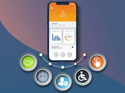
The first impression is the last impression. UI/UX is the make or break point for a mobile app. In this blog, let us check the things to keep in mind while developing a mobile app UI/UX.

This is a user generated content for MyStory, a YourStory initiative to enable its community to contribute and have their voices heard. The views and writings here reflect that of the author and not of YourStory.


Do you know how the demand for mobile applications is increasing with each passing year? According to a recent mobile app development stat, the number of mobile users worldwide is projected to grow to $6.95 billion by this year.
And you'd be surprised to know that 80-90% of app users don't give the app a second chance if they had a bad experience the first time. This means that apps should provide a seamless user experience that is personalized, up-to-date, and easy to use.
Creating mobile apps requires frequent updates and new versions with a constantly changing mobile technology landscape. For any mobile app, UI/UX is the key element.
When mobile UX design is attractively crafted, given all the requirements, it can develop a mobile app to rank in the top ratings. But when it is not done correctly, it can result in un-installation of the mobile app.
In this blog, I will discuss some dos and don'ts you must consider while designing a mobile app. Let's first shed light on what you need to do for a user-friendly and attractive mobile app. So, here we go!

The Do’s of Mobile UI/UX Design
It is commonly seen that mobile UI/UX design can be a difficult task, and you should consider many aspects while developing a mobile app.
With increasing competition in the application market and changes in consumer demands, it has become essential for businesses to build apps that rank higher based on user experience. And for this purpose, you can hire mobile app developers in India; they will help you attract and retain more customers.
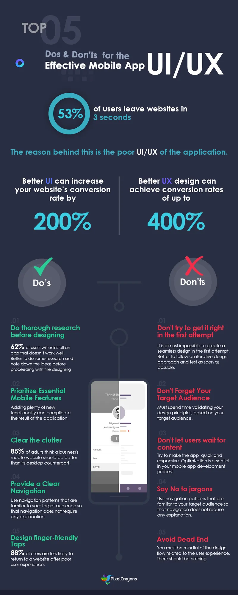
#1. Do a Thorough Research Before Designing
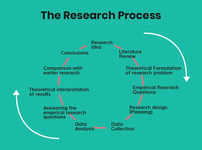
While working on a new mobile app project, most of you start designing UIs and prototypes immediately. However, it is always recommended to curb that greed because one must prevent the wrong-consensus effect. With timely research, you need to understand the users and their requirements.
It is necessary to perform a competitive analysis by searching for applications that are similar to the ones you already designed. The purpose behind conducting thorough research before the design is that it will create a valuable experience that resonates with your target audience.
It is also better to do some research and note down the ideas that you like before proceeding with the designing part of UX.
There is a need to pay attention to the parts of mobile apps that you like and dislike, along with the appropriate reasons. Build the personality of the user to understand the different ways in which users will interact with your mobile app.

#2. Prioritize Essential Mobile Features
After thorough research, the next thing you should do is to come up with priority features. It is always recommended for app developers to include many features in their app.
But, it blocks the primary purpose of hassle-free user experience. It is necessary to decide and follow essential features that will effectively influence your users.
Do not add plenty of new functionality as this can complicate the result of the application. The selected functionalities should have the features that are most important for the proper functioning of the app with a more simplified UX.

To make the application more attractive to users, many product designers try to add more and more features. Unfortunately, this does not result in a better user experience.
The most successful apps available in the market are highly focused and has limited features. Thus, limit the elements of your app to see what is more important.
You can consult a mobile app development company to determine the best features for your least viable product as they have experience designing mobile applications for different industries.
#3. Clear the clutter
Disorganizing the user interface overloads your user with too much information - each added button, images, and text makes the screen much more complicated. Clutter causes more damage to mobile devices where users have limited screen space compared to desktops that have more full screens.
Hire web developers whose aim should be to stick to minimalism. Regarding content, it is recommended to include content that can positively influence your users. Elements (text, random images, and buttons) that can negatively affect the mobile screen should be discarded.
A famous saying by Antoine de Saint-Exupéry can be applied to mobile UI/UX design: "Perfection is achieved when there is nothing left to take away." In mobile design, it is necessary to get rid of anything that is not necessary at all because reducing clutter will improve understanding.
You have to focus on content that is useful to your users. It is recommended to design each screen for only one thing, except for unnecessary calls-to-action.
#4. Provide a Clear Navigation
The term navigation can be referred to as how the user can navigate their way throughout the app. The compelling content in your mobile app must be explicit so that users can find it without any extra effort. The features of the app should be well-tailored with the application layout.
Another point is to consider that while building the smooth navigation of the app, it should not be the user's attention from the content of the app that is being displayed.
Ensure that navigation feels familiar to users. People are happy when an app meets their expectations. To do this, use navigation patterns that are familiar to your target audience so that navigation does not require any explanation. You should organize your information in such a way that a minimum number of actions are needed to reach the destination.
On top of that, your audience should always know where they are in your app so that they can navigate successfully. Do not move the navigation controls to a new location or hide them on different pages. This will confuse your users.

Don'ts of Mobile App UI/UX Design
Following are some points that you should refrain from doing while working on the UI/UX designs of the application:
#1. Don't Try to Get it Right in the First Attempt
When you work to design a mobile app, it is almost impossible to create a seamless design from the first attempt. Even if your plan meets all initial requirements, you may get a new set of conditions after user testing.
This signifies that the app designer should not follow the motto 'Getting it right the first time' as achieving such perfection is not the goal here.
Thus, it is always better to follow an iterative design approach and test as soon as possible. The design of a mobile application is not a process that you can complete in a single effort, and it requires several iterations to reach the level of perfection.
Furthermore, practically, it is best to emphasize prototyping and testing. Powerful prototyping methods such as rapid prototyping can allow designers to iterate faster.
#2. Don't Forget Your Target Audience
Keep trying until you succeed. Mobile app development specialists and designers aim to reach the maximum number of people with the app or service. This is the specific segment where professionals lose their grip on their target audience.
Only when you spend time validating your design principles, based on your target audience, you can work around a feedback loop that allows for reliable mobile app design.
#3. Don't Let the Users Wait for Content
A black screen that pops up when content is loaded can hamper the user experience, giving an impression like the app is frozen. This creates a sense of confusion and frustration among the users.
It is recommended to try to make the impression that the app is quick and responsive. Thus, optimization is essential in your mobile application development process.
Focusing on the practical aspect, use temporary containers to create a sense of quick loading. Work to quickly display the screen and use placeholders to indicate that the content is not yet accessible. Also, replace such placeholders with the actual content the moment it is loaded.
#4. Say No to Jargons

Sign-up is the first interaction of users with your app. So, make it simple. If you provide them with Jargon, they might not understand how to use your app and leave it after the first use.
Use icon names and symbols that people are comfortable with and easy to understand. Do not use technical or tricky words that affect your interactions with users.
When your app starts interacting with users in the language they are comfortable with, the interaction between the interface and users are simplified. You should avoid using words that are beyond the comprehension of the users.
#5. Avoid Dead End Pages
You must be mindful of the design flow related to the user experience. You should avoid creating dead-end app pages that interrupt the user flows. Pages that flow not only confuses users but also lead to unnecessary tasks.
There should be nothing dead-ended in your app. Error states and empty states should provide instructions and actions to proceed. Your app should, with every step, move towards accomplishing a goal.
Final Words
Designing an excellent mobile app is not that tough, but challenging to build the user's trust. People today expect a lot from mobile apps, and their expectations are getting even higher.
Improving the user experience is not a one-time task; it is an ongoing process. Just follow the above-mentioned dos and don'ts to come up with a great product that is useful for your target audience.
On this note, you should contact a web design company in India to implement the design guidelines and make the end product even more attractive to users. After considering all such points, you can successfully attract the attention of mobile app users in many ways.


