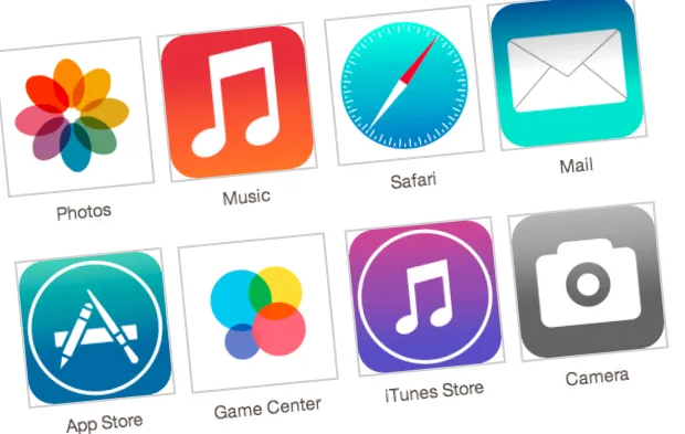
Design Thinking and Apple iOS7: Why Steve Jobs won't be rolling over in his grave
Apple announced it's much awaited iOS7 last week and everyone is talking about how good it is or it isn't. One of the common complaints is that it looks more like others - some say Windows Phone, while some say Android - and that Steve Jobs would not have let this happen.
But is it really true that Apple is where it is today because of its innovative and unique design? I don't think so. I don't think Apple designs were ever innovative, and I don't mean this as a negative.
Apple used skeuomorphism in 2007 because that was the logical thing to do
Think beyond design and you will realize that skeuomorphism was more about usability and about reducing the learning curve for new users. Touch interface on a small screen was not common when iPhone was first launched in June 2007. Taking advantage of users' existing associations was a smart way of dealing with no labels, hover text (tool tips), or physical buttons.
Apple's target users (and the rest of the world too) were not used to fully digital interfaces back then. As this article from 2007 mentions "According to Solutions Research Group, the average iPhone customer is a 31-year-old man with a college degree and an income of $75,600 per year".
Now, it is fair to assume that individuals who were 31 in 2007 had grown seeing leather bound calendars & address books and round wall clocks. Digital elements designed to resemble these real world objects made it easier for them to understand the function in the absence of additional on-screen help or physical buttons. Skeuomorphic design, combined with all the other things that Apple did right, got them the best results and iOS devices have long been considered the most easy to use.

Apple has to dump skeuomorphism because that is the logical thing to do, in 2013
This is from about a year back: "Since mid-July 2011, Apple's biggest supporters are consumers 35 years and older. Meanwhile, the younger age group of 18 to 34 - once the demographic segment most smitten with Apple- has trended downward since then." So probably the original target market of Apple (age 31, in 2007) still loves its products but they are missing out on the younger group. Not surprising that the user group that grew up using computers and mobiles doesn't need the help of skeuomorphic design. In fact, for most of the younger audience it would be just design and not a usability aid because they never used the physical leather bound calendars.
Apple is only doing what is right for its users - move away from the design that is not helping usability. And given the advancement in technology and usage of digital screens, even the age group of 35+ is not likely to find it difficult to use the non-skeuomorphic design.
But Apple isn't first this time
Apple is trading uniqueness for usability, and I think that's the right thing to do. I think that's what Steve Jobs would have done if he was still at the helm of Apple. Google and Android are already serving the users with their skeuominimalistic design and Microsoft on the other extreme is going for a true flat design with its Windows 8 interface.
I think skeuominimalism (and there is a lot of scope of different interpretations) is going to survive because that's closer to how we see things in real world. Our real world now is not just physical objects but includes a lot of digital screens - from desktops and laptops to mobiles and television displays. While, flat design is just that - design. It does not aid usability and this should only be used selectively.
Design, like all other aspects of a product, has to aid users in achieving their goals. That is good marketing and common business sense. Will this change help Apple stay at the top or not, only time will tell.
About the author

Nilesh Bhojani is the Co-founder of Markitty, an online marketing tool for small businesses. He has worked in and with small businesses managing projects, leading teams, and improving business processes. Nilesh writes also writes at Markitty.com/blog and you can find him on Twitter @nileshbhojani.


