How you can improve your conversion rate through checkout optimisation
Are you working towards increasing conversion rate of your site or app?
For every e-commerce company, conversion rate improvement is very likely to be on top of its priority list. A market study suggests that 55 percent of the online retailers consider conversion rate optimisation as the single most important item of their overall strategy. Unfortunately, very few companies are able to show baseline improvement in conversion. Tactical changes in marketing or sales efforts do boost the conversion rate, but they don’t sustain at a high level for long period.

Conversion rate depends on a lot of factors of your product offering, like brand trust, customer loyalty, marketing, traffic relevance, online experience, pricing, competition and many more. Hence there cannot be a universal mantra that can be applied to achieve this goal. But there is something that everybody can try: checkout optimisation, a data-driven approach that will surely give great results.
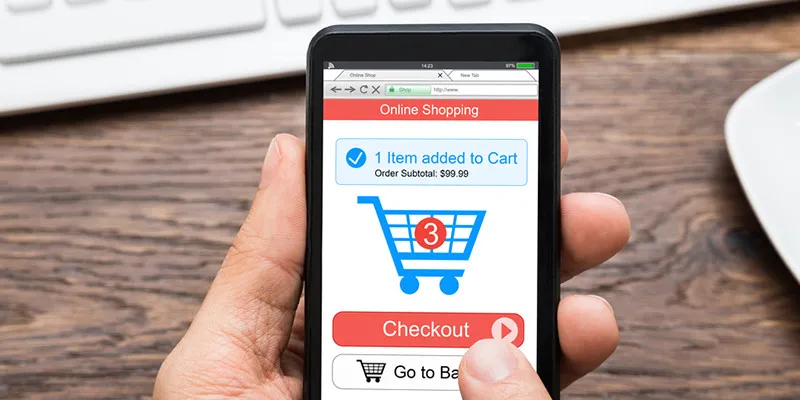
Checkout is the last and arguably most important step in conversion. But it also happens to be the step that can give great opportunity to improve conversion rate. When the shopper has added product to the cart or initiated checkout, they have already decided on the product, somewhere agreed on price, seller, and service-level agreement). But even after all this, if they experience any hiccups in the next few steps, the purchase process is derailed. Shoppers may not take well to such issues and you stand to lose an order, possibly a new customer.
E-commerce companies that have strong digital analytics practices use data to take product decisions. They have been continuously optimising their checkout experience and achieving their goal of conversion rate improvement. Here are a few steps you can take to achieve the same result.
Just don’t look at metrics, get into the details

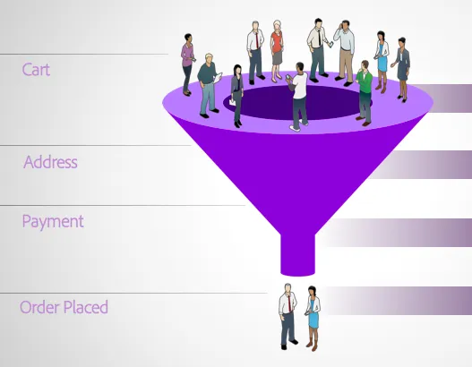
Checkout is a leaky bucket with every step causing significant drop in users. Most companies track checkout abandonment or checkout drop-off funnel. But just knowing high-level metrics does not help. One has to observe the step-wise drop-off funnel by every possible dimension:
- Mobile website vs. App vs. Desktop
- New users vs. Repeat users
- Category of product in the cart, price points, discount percentage
- Payment method
- System variables like device type, OS, browser.
- Network type like mobile carriers vs. Wi-Fi
Looking at these details will give you critical areas to consider and work upon. One can realise that checkout abandonment correlates with price of products in the cart. But, more than that, any unexpected fees during checkout impacts funnel adversely. Similarly, on mobile, a significant drop is observed at address page. Insights like these will give you clear directions for product roadmap and also help prioritise the most important action items on the list.
Design and messaging
Design and messaging are important aspects to improve checkout conversion. But, in the absence of analytics or testing framework, they are often overlooked. Product managers are clueless about user behaviours and reasons for drop-off. Best way to find out what works for your users is to frame a hypothesis and test it. There are plenty of design and messaging elements that can be tested. But before you get into changing the colour and size of buttons, here are a few high-level things to try:
- Single-page checkout – Makes it easy to go back and forth amongst the checkout steps
- Summary of order and progress bar – Assures shopper of purchase items and flow
- Safety and trust markers - Typically helps a new customer transact on unknown brand
- Avoid e-commerce jargon – Trust me, not everyone knows that COD stands for Cash on Delivery!
- Emphasis on call to action – Remove every other action apart from desired flow
Coupons?
If there’s one thing shoppers love most, it’s a good discount. So when you show them a coupon code field, they’re bound to go looking for one. Unfortunately, not everyone comes back to transact. Worse, a few come back with wrong, expired or fake coupon code. You then end up falsely assuming that coupons are boosting your conversion rate, but, in reality, you might be losing orders.
You should analyse and monitor the drop-off at the coupon code page and usage of wrong coupons. It is not easy to control coupon codes circulated in the affiliate sites. Hence, it is essential to track increase in usage of fake coupons on a regular basis. A few digital analytics tools like Adobe Analytics detect sudden drop in checkout completion and can analyse and throw contributing factors like excessive coupon usage among others.

Guest checkout
This one is tricky. There is no doubt that putting 'checkout' under 'login' will drop conversion rate significantly. But, at the same time, top retailers and marketplaces force users to log in. Why? And what should be your strategy?
In my opinion, one should take a very calibrated decision backed by data. Having login mandatory for checkout helps companies that have a good share of orders coming from return users. Mandatory login helps improve checkout competition rate of return customers significantly. Additionally, it increases share of users who log in during browsing, so one can provide better, personalised experience.
Time is the essence
Irrespective of your business and experience, one aspect would remain true - time required for checkout completion plays a great role in the checkout flow. Every second you can reduce in the checkout flow will result in extra orders trickling in for your business. So start measuring time spent on every step, keep track of time taken to load page or refresh screen, note every failure message (especially on the payment page), and reason for users to go back to previous step. You should be able to work on ideas to reduce average checkout time and increase conversion.
To conclude, I will say - take a look at your checkout completion rate. There will be good scope for you to optimise. I don’t know how much money you’ll make by improving your checkout process, but most companies I’ve worked with had a recovery rate of 15-25 percent.
Please feel free to add your comments, share experiences and ideas that have worked for you.
(Disclaimer: The views and opinions expressed in this article are those of the author and do not necessarily reflect the views of YourStory.)


