

This is a user generated content for MyStory, a YourStory initiative to enable its community to contribute and have their voices heard. The views and writings here reflect that of the author and not of YourStory.
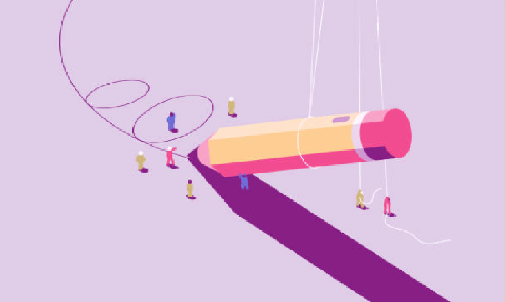
A Detailed Guide of Google Material Design

This is a user generated content for MyStory, a YourStory initiative to enable its community to contribute and have their voices heard. The views and writings here reflect that of the author and not of YourStory.
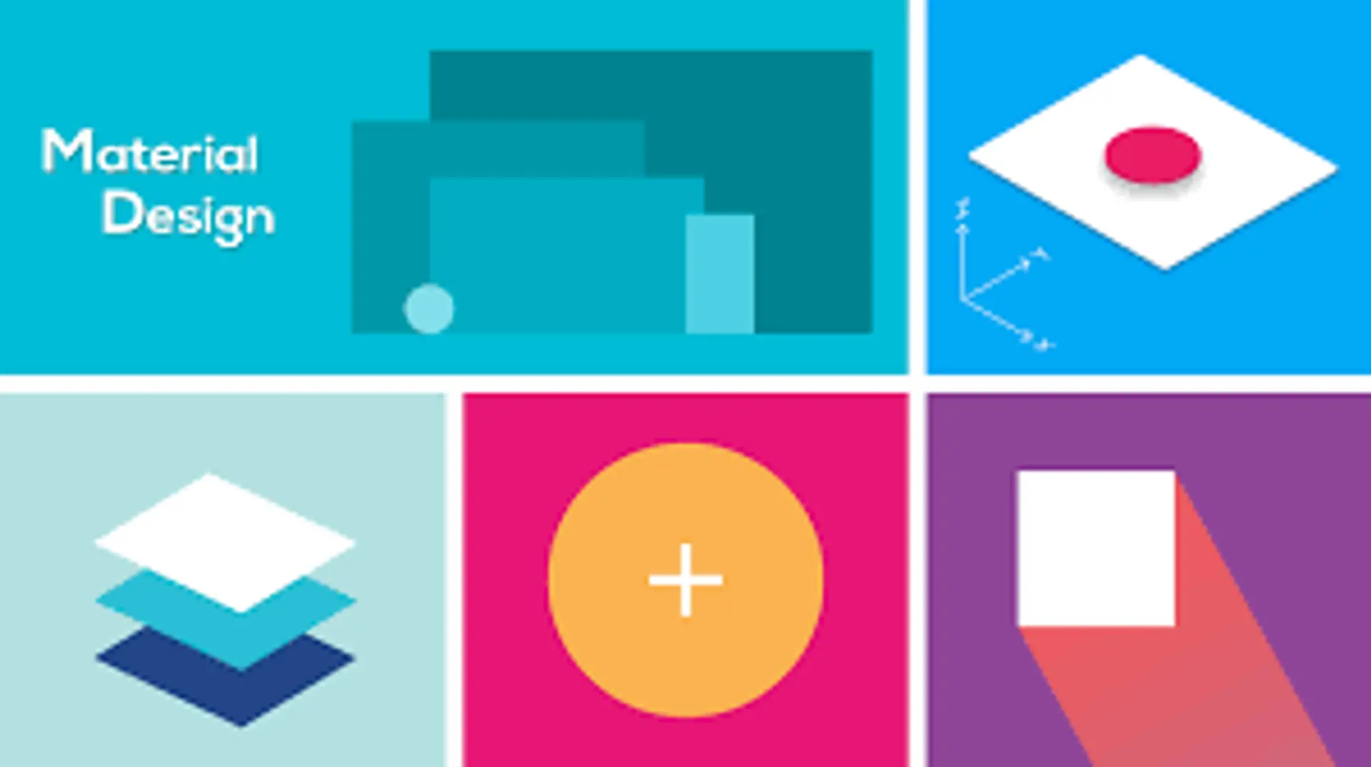
What is Material Design?
Material Design is a style, a code, a design language developed by Google natively supported starting from Android 5.0.
The Google material design is somehow also a language that instead of grammar and syntax uses transitions, padding, depth effects, typical printing: it is a complete design system, designed to provide a standard and unique resources for multi-device development (desktop, tablet or smartphone).
Its purpose is precisely to provide specific design standards for the development of applications on Web, Android and iOS devices.
The metaphor of material design
We mentioned the metaphor underlying the name of "material design": a real digital "material", based on a tactile reality, connected with the sense of space, with touch, inspired by the study of paper and ink but - compared to the physical cages of paper and ink - more open and creative in behavior and reactions to interaction.
Unlike the real card, the "material" can be divided, rearranged and moved if necessary.
But like paper, at the moment of interaction, the user's touch is able to offer a more realistic experience.
Attributes such as shadows and edges provide visual cues. The use of tactile attributes familiar to the human brain (clues to how the object is to be used) helps users to quickly and intuitively understand the possibilities of the object.
The reasons for Material Design
Why did Google feel the need to introduce material design?
I mean: there was already flat design, the skeuomorphic approach. Why introduce another paradigm, for what advantage?
Google responds quite clearly: flat design? Nice, minimal - maybe too much.
Interactions are limited, animations are almost non-existent. Skeuomorphism becomes critical in loading times.
Material Design wants to overcome these limits: to offer wide color palettes, a greater variety of iconography and shapes, more complex, animated, interactive touch points.
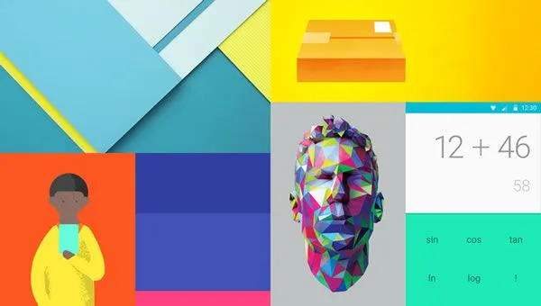
The basic features: typography, elements, animation
We come now to the details. What solutions does Material Design offer us in practice?
The elements of the typography, the tables, the use of spaces, the color scales are designed to create hierarchy, to attribute meanings, to focus attention.
The quality of the user experience increases thanks to color choices, end to end images and intentional white space.
Movement, animation, is not random, but underlies a meaning: it is perhaps the best part of the final design, as it does not interrupt the user experience in any way, but simplifies it, making it intuitive, flowing.
Animation plays the fundamental role of putting the user at the center, making him feel the main engine of the action as he moves through the application, starting the actions.
Thanks to the movement and the consequent visual feedback, the user feels really connected to what he has done, he becomes aware of the intentionality of his action.
In addition to the user interface components, the "material" approach also offers many models to improve the user interface: patterns that improve the user interface created with the basic components.
Some models available include navigation menus, confirmation / recognition checks, start screens, scrolling effects, search, settings, image upload, and scrolls.
Material design: colors and icons
ication.

Color is the most distinctive element of an application, and is therefore fundamental for both the designer and the user. The purpose of a color is definitely to "make the appearance of the application pleasant".
The colors have their own semantics, which the good designer knows and keeps in mind, and can help the user in functional navigation, as well as in aesthetic appeal or in the recognition of a brand.
The material design provides a collection of colors and relative palettes that can be used within the user interface.
Icons have become a universal communication tool: now present everywhere, they help us recognize the product with "emojis" instead of words.
Used correctly, they will improve the usability and design of the appl
Material design classifies icons as two sets:
Product icons: simple and friendly, sometimes daring. They communicate the basic idea and the intent of the product. 48dp in size.
System icons: represent a command, file, device, directory and / or basic and transversal actions. 24dp in size.
Material design: writing and typography It is difficult to imagine a world without texts.
A concise, legible and hierarchical text makes the user interface more navigable, the sliding reading, by fields. We also know the central role that texts play in SEO, being in fact the only data that we can say with certainty that search engines are able to interpret.
Roboto and Noto are the standard typefaces on Android and Chrome, designed and developed to manage cross-platform use and their translation into different types of typographic layout (full width, columns, labels, buttons, tags and whoever has more meta).
The material design does not fail to provide precise guidelines to manage the writing of the different elements of the user interface.
Components and layouts
The material layout is based on the principles of printed design.
It uses some tools such as basic grids and structural models to improve consistency between environments. These layouts are capable of creating scalable apps that can adapt to any screen size.
Among the basic components foreseen by the material design:
- Bottom navigation bar: simplifies switching between the top-level views app with a single touch
- Bottom sheets: Glide from the bottom to reveal more content.
- Buttons: the buttons communicate the action that will occur after the user has touched it. There are two sets of buttons in the Material design, one flat and the other in relief.
- Cards: they are "entry points" for further information.
- Chips: they contain complex objects in small blocks
- Dialogs: Contain specific information about the task to be performed.
- Dividers: is a vertical "rule" that groups content into page or list layouts.
- Expandable windows: allow you to edit the content. They can be independent or in combination with other cards.
- Lists: they structure the content by row and are a repetition in column of each row. They can be only text or text + image + additional texts.
- Menu: emerge from the buttons that are used to choose the action or option
- Progress bar: they give a visual and progressive indication when the app is loading content
- Cursors: allow you to select the value from the range of values by moving the thumb of the slider.
- Snack bar and Toast: provide feedback in the form of a message after performing the operation. Feedback can be positive or negative.
- Tabs: allow you to switch between views. Listed, grouped together.
- Tooltips: tooltips are text labels that appear when the user hovers over certain elements.
The advantages of Material Design
The advantages of Material Design? Why did we decide to use it in the design of web and mobile applications?
- Because it provides stable and minimal guidelines
- Because it is structured in various components that give graphic pleasantness and consistency to draw on
- Because it is easy to integrate, maintain thanks to the color palettes and global variables
- Because it is ready for use