

10 Knowledge Base Software Best Practice Examples
A great knowledge base usually follows a set of best practices. These will help you deliver useful content to your customers, and empower them to help themselves.
We’ll now go through 10 real-life examples of outstanding knowledge bases to illustrate each of the best practices.

Contents
- Getting started tutorials – MailChimp
- Information architecture – Slack
- Search functionality – Stripe
- Article formatting – Microsoft
- Article writing – Hubspot
- User Experience design – Shopify
- Branding – Uber
- Scalability – Twitter
- Navigation – Meetup
- Imagery – HelpScout
1. Getting Started Tutorials – MailChimp
For SaaS (Software as a Service) companies, your software onboarding stage is crucial for customer engagement and retention. It’s also significant when customers are signing up for a free trial and deciding if they like your product.
Your knowledge base must be accessible to new users. These types of users need to get up and running with your product quickly, and this is where documentation comes in.

Email marketing software company MailChimp makes its Getting Started tutorials (called MailChimp 101) into a memorable experience for its customers.
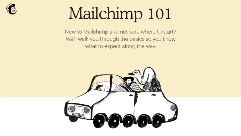
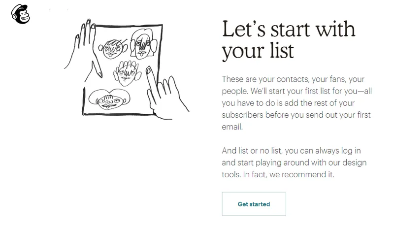
MailChimp understands that it is competing for its customers’ attention among many other products and services. It’s invested heavily in this crucial stage of its documentation.
A long scrolling page, appealing illustrations, and good use of whitespace form a design that is pleasurable to use.
2. Information Architecture – Slack
Your Information Architecture (IA) is the framework of your knowledge base content. It consists of a taxonomy of categories, button labels, navigation menus, and interlinking between pages.
This internal structure of your knowledge base is like a map that guides users to where they can find the information they need. Consistency in IA is your key to making a knowledge base that empowers customers to self-serve.
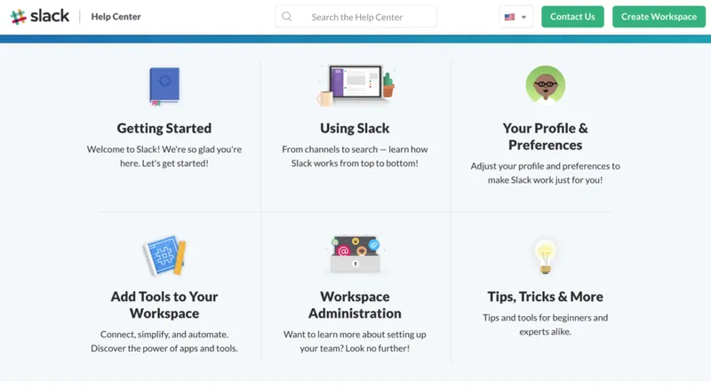
It’s clear from the beginning that team messaging software company Slack has several core help topics. It illustrates these topics with custom icons encouraging users to click through for more.
When you dive deeper into any topic, sections open out to reveal a handy list of subtopics and articles – while continuing to anchor the main navigation.
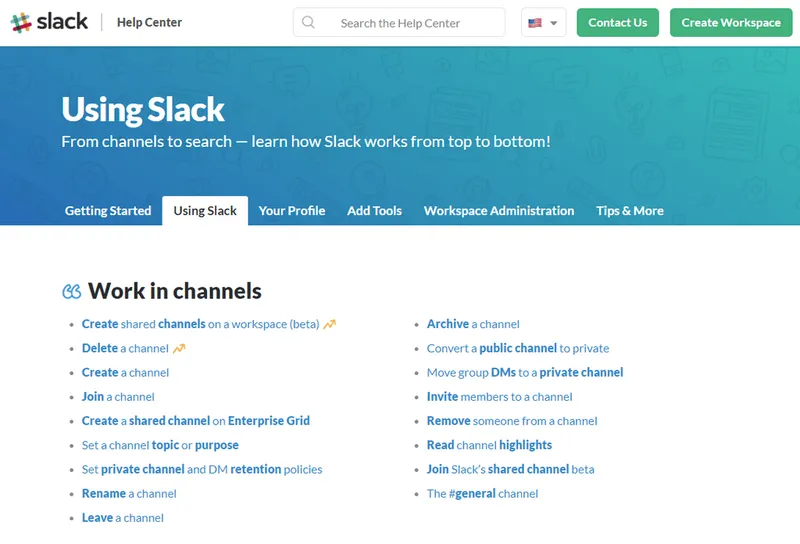
Users always know where they are in Slack’s knowledge base because of its use of Information Architecture.
3. Search Functionality – Stripe
A good search functionality is also essential for your knowledge base. Search relies on the software in the back end that comes built in with your knowledge base, and also the tagging and organising your content.

People search for content in a variety of different ways, so having the suggested search is an ideal way to help customers discover content.
Payment processing software company Stripe shows a list of articles when the user starts typing in the search bar along with previews of the content, which are also tagged with a category.
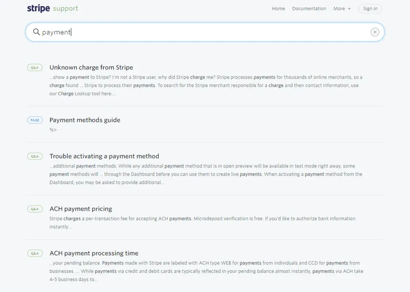
This means the user can refine their search without having to read through lots of irrelevant articles. For Stripe search, the essence is speed – essential for time-strapped developers. Discover more analysis of Stripe’s knowledge base.
4. Article Formatting – Microsoft
Article formatting means anything to do with how you present your articles that is distinct from your website design. Formatting is generally to do with font type, font size, font weight, page layout, and imagery.
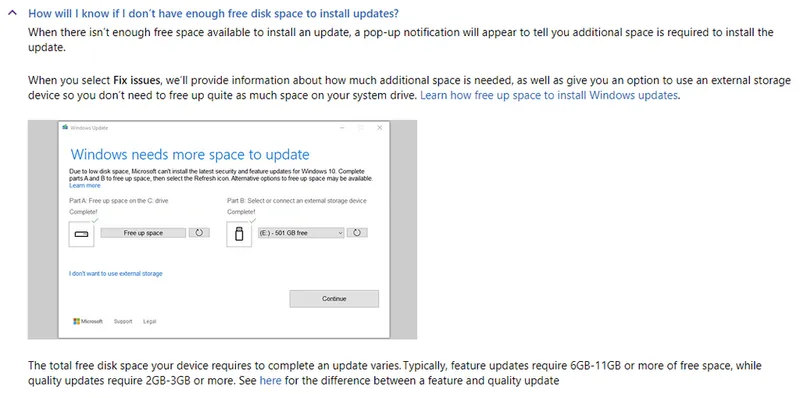
Microsoft documentation is complex and aimed at a variety of audiences. Formatting is key for making it accessible. Microsoft has broken up long articles into a list of smaller articles, and presents it as an accordion list of contents.
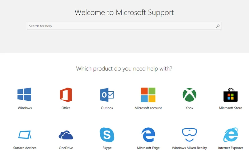
This breaks up the text to make it easier to scan, and helps the user pick out the important elements. Microsoft also makes good use of bold font weight to call attention to the most significant items on the page.
Microsoft keeps to one main point or action per paragraph, as this is a good rule of thumb for documentation. It makes information more digestible.
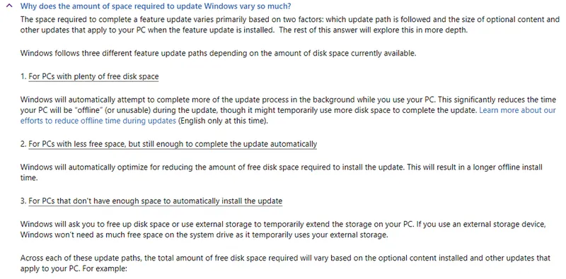
Finally, Microsoft uses an ordered list to explain the differences between the various types of setup. Users can pick the option that best fits them and ignore the rest.
5. Article Writing – Hubspot
Article writing refers the actual words you use on the page to explain your help topics to your users.
It’s good practice to make suggestions or guide users in your documentation, rather than using the imperative (ordering them to do something).
There are a few important rules to follow when writing documentation:
- Using the active voice
- Striking a casual but professional tone
- Simple wording that is easy to understand
Marketing automation software company Hubspot has written its documentation in a way that is easy to understand for the casual user. It doesn’t require any knowledge of technical terms.
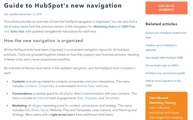
The language is simple and to the point, written in the active voice.
Documentation should be written in a way that your support team would speak to real-live customers – friendly, helpful, and polite.
6. User Experience Design – Shopify
User Experience (UX) design is the use of visual design principles to create a positive website experience for your users. It brings many elements together to help users achieve their goals, and it means putting yourself into your users’ shoes and designing from their perspective.
UX highlights which steps users need to take next and provides context for their actions.
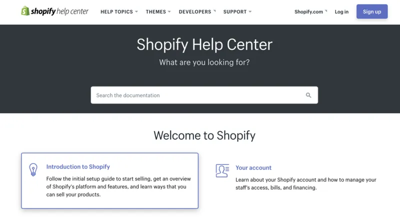
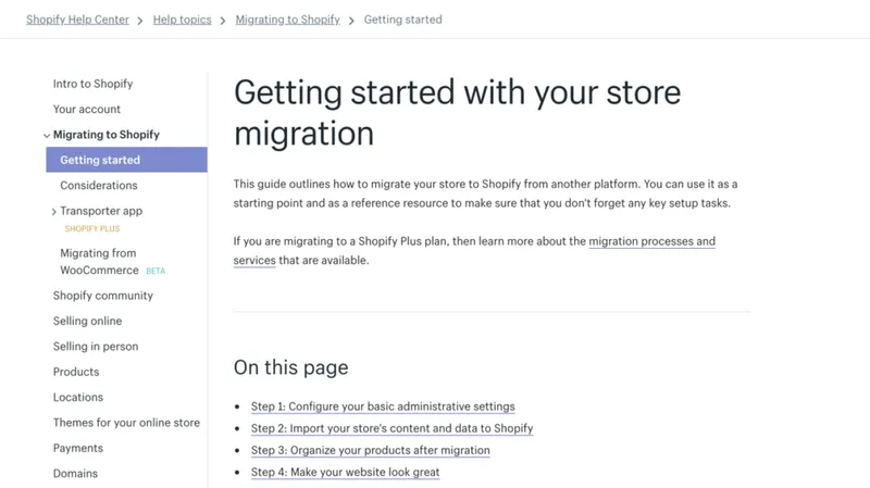
Shopify knows that its users are busy and under pressure to run their ecommerce businesses. Its documentation carefully outlines the real-life processes that users need to go through when using its software.
Shopify gives clear options to users and breaks complex processes down into steps. This increases the likelihood that users will successfully complete their tasks.
7. Branding – Uber
Customers always want to feel looked after, to know you think they are important, and like you are taking their concerns seriously. Branding your knowledge base makes sure it looks like part of your company, and contributes to the overall User Experience.

Ride-hailing software company Uber brands its documentation in the recognisable Uber style without detracting from the UX. Uber uses its customary fonts and colours while also making its knowledge base friendly and accessible.
The key is to keep branding subtle but recognisable – don’t overdo it.
8. Scalability – Twitter
Scalability means your knowledge base can handle a large amount of content. You must be able to regularly add to it as your product develops.
You should organise your help content so you can scale your knowledge base without the needing to massively reorganise it. Structure your categories so they are broad enough to contain all types of future content you intend to publish.
Social media app Twitter has gone for categories called:
- Using twitter
- Managing your account
- Safety and security
- Rules and policies
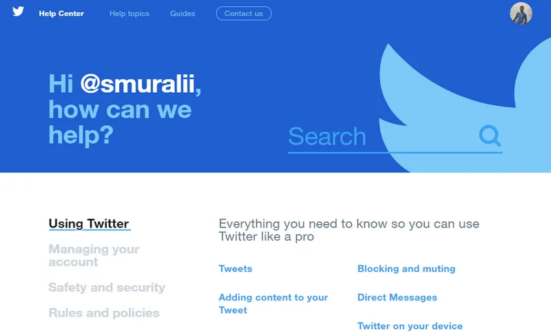
These are broad enough to contain all Twitter’s user documentation for the near future.
Our own knowledge base software Document360 allows you to structure your content in any way you wish, and it’s flexible enough for you to reorder it at any time.
9. Navigation – Meetup
Your navigation is the menu for your knowledge base. It contains all of your categories and content, and is usually accessed in a variety of ways.
Social discovery app Meetup chooses to display its navigation in the page body. It reveals every subcategory in the knowledge base, and lists the first few content pages in each category so that users can decide which link to click on next.
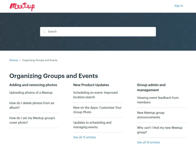
Meetup clearly labels its categories and content, and when you click on an article it also has quick links to direct users to related content.
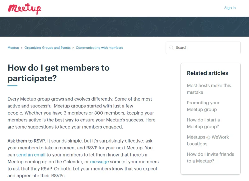
Combine your navigation with good search functionality as we mentioned earlier to provide an integrated self-service experience.
10. Imagery – HelpScout
Documentation that consists of only text and no images can be very boring and difficult to pay attention to. Illustrations can be very soothing and make your documentation more enjoyable to use.
Help desk software company HelpScout makes good use of imagery in its documentation by including custom icons for each category.
Help Scout also uses screencasts to show users what to do.
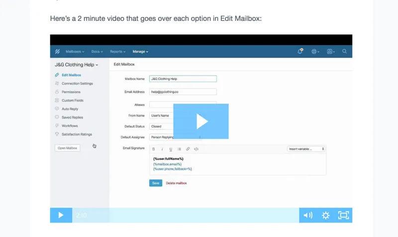
Use videos, screenshots and GIFs throughout your documentation to visually explain to users how to complete certain tasks.
Conclusion
If you use these ten best practices regularly, your documentation is sure to amaze your customers.
From investing in your Getting Started to tutorials to writing your documentation in an accessible way, your customers will appreciate your efforts to help them. Illustrating your text to make it more actionable is becoming more and more popular for knowledge bases.
Don’t forget to pay attention to the User Experience and how your customers are using your help content in the real world. Make it the default for your customers to be able to get what they need.
Taking a little time to plan your content in advance will make it easier to scale your knowledge base in the future. Now check out our ultimate guide to knowledge base software.
Originally published: https://document360.io/blog/10-knowledge-base-software-best-practice-examples/


